Technical Indicators:

Can you imagine entering an amusement park without a map? That’s what the world of finance feels like without indicators. 📊 Those magical tools are the ones that tell you if you’re riding the roller coaster of an uptrend or if you better buckle up because an epic downturn is coming.


🚀 Let’s break this down to make getting into the markets as fun as a fairground ride. 🎡

What are Financial Indicators? 📊✨


Financial indicators are essential tools in the trading and investment universe, acting as true compasses for those seeking to successfully navigate the often turbulent seas of the market. 🧭 Designed to analyze trends, spot opportunities and better understand what’s happening in the financial environment, these instruments are essential for beginners and experts alike.


If you’ve ever felt overwhelmed looking at charts full of lines, bars and colors that don’t seem to make sense, don’t worry: indicators are here to help you bring order to all that chaos. They are like your secret allies in the market, translating the languageof prices, volumes and trends into something you can understand and, more importantly, use to make informed decisions.


But they’re not just for analyzing numbers: financial indicators also give you key insights into human behavior in the market. Yes, markets are not just numbers; behind every price movement there are emotions, fears and ambitions. That’s why indicators not only measure data, but also capture the emotional pulse of the market.

And why are indicators so important? 🤔✨


Imagine driving a car with no GPS, no road signs and a broken speedometer. Sounds like a recipe for disaster, right? Well, the same is true in the world of trading and finance if you try to navigate without indicators. These small but powerful instruments are the eyes and ears of any investor, providing essential information to make informed decisions.


📈 Detecting clear trends


One of the biggest challenges when analyzing the market is identifying where it is heading. Indicators such as moving averages not only smooth out market noise, but also show you whether an asset’s price is following an uptrend, downtrend or sideways trend. Detecting these trends can make the difference between maximizing profits or suffering unnecessary losses.


📊 Pinpoint key action points


There are critical moments in the market that define your strategy, such as knowing when an asset is overbought or oversold. Tools like the RSI (Relative Strength Index) alert you to these situations, helping you avoid buying at the peak of a bubble or selling just before a rally. It’s like a proximity sensor that tells you if you’re too close to a danger or opportunity.


⚖️ Confirm moves before acting


Making impulsive decisions can be dangerous in the market. This is where indicators like the MACD (Moving Average Convergence/Divergence) come into play. This indicator helps you verify whether a trend is strong enough to justify a market entry or exit. It is like the wise companion that gives you the go-ahead before you make a major move.


🛠️ Customized to your needs


Every strategy is unique, and indicators are as flexible as Swiss Army Knife tools. Are you a short-term trader? Use the Stochastic for fast movements. Prefer long-term analysis? Try the ADX (Average Directional Index) to measure the strength of the trend. There’s an indicator for every trading style!


🚀 Reduce risk and increase confidence


Trading without a clear plan can be scary. Indicators give you a roadmap based on data, not emotions. This not only reduces the risk of making bad decisions, but also increases your confidence knowing you are backed by solid technical analysis.

Bottom line


Financial indicators are more than numbers on a screen; they are your strategic allies. They help you navigate complex markets with greater precision, minimizing risks and maximizing opportunities. Without them, trading would be like jumping into the void without a parachute. And now, ready to explore in detail how they work and which ones are the most useful?

Read on!

What do indicators do?🧐


Financial indicators are like that expert friend who always has a timely tip. 🏎️💨 They take market data such as prices, volume, and time and process it through mathematical formulas to turn it into useful, visual information. In other words, they transform numbers into clear signals that help traders decide whether it’s time to buy, sell, or wait.


Imagine you’re driving on a winding road: indicators would be the road signs that tell you when to brake, accelerate or turn to keep you on the right track. 🚦

Types of Indicators: More than Math📊


Although indicators are grouped into different categories based on their focus, they are usually divided into two main types:


1. Technical Indicators🛠️


These analyze historical market data, such as prices and volume, to identify patterns and trends. They are especially useful for predicting future movements and are often favored by short and mediumterm traders.


Popular examples:


    • Moving Average (MA): Smoothes price fluctuations to detect general trends.

    • RSI (Relative Strength Index): Indicates whether an asset is overbought or oversold.
    • MACD (Moving Average Convergence/Divergence): Helps identify changes in the direction of trends.


Here, we’ve looked at some of the most well-known examples. But watch out—these aren’t the only ones. Within technical indicators, we can also distinguish various subtypes based on their focus:


  • Trend indicators 🏔️

  • Momentum indicators


  • Volume indicators 📈


  • Volatility indicators 🌪️

In another section further down (patienceits coming soon!), we’ll dive into the details of the most important indicators in each category. Plus, we’ll explore the different variations you can use to fine-tune your analyses. This way, you’ll continue your education with WAFFT and become the investor you were meant to be.

Let’s go! 🚀

2. Fundamental Indicators🔍


These focus on analyzing economic and financial factors to determine if an asset has an attractive intrinsic value (that means being aware of Macroeconomics, Geopolitics and crumbling company data). They are used more for long-term investments and not so much for quick trades.


Key examples:


    • Price-Earnings Ratio (P/E Ratio): Assesses whether a stock’s price is overvalued relative to its earnings.

    • Return on Investment (ROI): Measures how much return an investment generates compared to its initial cost.


Although both types are important, here we will focus on technical indicators, as they are the most commonly used by those looking to take advantage of short- and medium-term price movements.


But for our community, there are no secrets. In another section of WAFFT: The Path to Wealth, we’ll dive deep into everything you need to know to understand what a fundamental analysis is. And that’s not all: in another article, we’ll teach you how to analyze a company based on those fundamentals.


Want to get started right away? Just go to the search bar and type fundamentals (or any other financial term that interests you), and that’s it! ⚡🔍✨


Let’s keep onbuilding the best f#@king financial guide on the web!🫣

How do Technical Indicators Help?🎁


1. Detect Trends📈 

An indicator can help you answer key questions such as:


  • Is the price rising, falling or moving in a sideways range?

  • Is the current trend strong or losing strength?

For example, a 200-day Moving Average can confirm an uptrend if prices are consistently above it.


2. Identifying Key Moments🕒


Is it a good time to enter the market or should you wait? Indicators such as RSI or Stochastic can alert you if an asset is overbought (potential downside) or oversold (potential rebound).


3. Confirm Signals


Don’t rely on a single piece of data; indicators work best in aggregate. For example:


  • MACD can confirm that the trend identified by a Moving Average is actually gaining strength.


  • Bollinger Bands can indicate whether the price is ready to break out of a range.


4. Manage Risk⚠️


In addition to looking for opportunities, indicators also serve to identify risks. If volume decreases dramatically during an uptrend, it could be a warning sign that buying strength is drying up.

Tips for Getting the Most Out of Indicators🧙‍♂️


1. Don’t abuse them: More is not always better. Using too many indicators can generate contradictory signals.


2. Customize the parameters: Adjust the periods and settings according to your trading strategy.


3. Use them as a complement: Indicators are not infallible; always use them together with other analysis, such as fundamental analysis or pattern analysis.


4. Test before use: Before applying an indicator to your real portfolio, test it on a demo account to understand how it works in different scenarios.

WAFFT Conclusion


Technical indicators not only make traders’ lives easier, they also offer a clearer perspective on market behavior. By understanding how to use them correctly, you can make more informed decisions and reduce the impact of emotions on your trading.💓❄️

Key Technical Indicators and how they work🎯


Financial indicators are essential tools for traders and investors. They provide valuable insights into market trends, price movements, and potential entry or exit points. Below, we’re going to break down the types of technical indicators in true WAFFTstyle, and you might be wondering, types? Yes, types: Trend Indicators 🏔️, Momentum Indicators, Volume Indicators 📈, and Volatility Indicators 🌪️. We’ll explore some of the most commonly used indicators in detail, explaining their purpose, calculation, and practical applications.

Trend Indicators🏔️:

These types of indicators help identify whether a market is rising, falling or moving sideways.

Momentum indicators⚡:

They measure the speed of price movements.

 Volume indicators 📈:

They analyze how many people are buying or selling. 

VWAP: The intraday trader’s compass

The VWAP is like that cousin who is not 100% of the family, but is always at the important meetings. It doesn’t measure volume directly like other indicators, but uses it as its main ingredient to calculate an average price with substance.” The result? A super useful tool that mixes price and volume to help you find key levels in the market. So yes, we can technically lump it into the volume indicators, though it has its own personality. 😎📊


Want to know what the famous VWAP is all about and why everyone is talking about it? 🤔 At WAFFTlabs, we love to break down these concepts so you can understand them like a pro. 🎓✨ Here’s what it is, how it works and why, even though it’s not 100% a volume indicator, it has everything to be in this category.

What is the VWAP?🎯


The VWAP (Volume Weighted Average Price) is basically the average price of an asset over a period of time, but with an important twist: it is volume weighted. This means that it does not just take random prices and averages them, but gives more weight to prices where more volume is being traded.


In other words, the VWAP is not just anyaverage price; it’s the price where the important things are really happening, where the big players in the market are moving their money. Think of it as thejust price of the day, the level that tells you where the real action is. 💰


And who are the big fans of this indicator? Intraday traders. 🎯 For them, VWAP is a key tool because it helps them identify whether they are buying or selling at competitive prices compared to the market average. They also use it to find potential support or resistance levels in their quick and strategic trades.


But it’s not just intraday traders who use it; fund managers and institutional traders also consider it an important benchmark to assess whether a trade is executed efficiently during the day. It’s like their compass in a market that never stops moving. 🧭


So when you hear about VWAP, you know: it’s not just another number, it’s a tool that combines price and volume to give you a key break-even point in the markets. Perfect for those looking for precision and efficiency. 🚀

How does VWAP work?🔎


As you may already know, thanks to WAFFT😁, theVWAP (Volume Weighted Average Price), or Volume Weighted Average Price, is a key tool in the financial markets. How it works is based on the idea of combining price and volume to get an average value that reflects where money is actually moving over a period of time.

Let’s break it down so you understand it 100%!

🧮Step-by-Step: How VWAP is Calculated


The VWAP calculation is based on a simple but powerful formula:

1️⃣ Key multiplication:


First, you take each price at which a trade is executed and multiply it by the volume traded at that price. This ensures that prices where there was more activity (more volume) have more relevance in the calculation.


2️⃣ Cumulative sum:


Next, all the results obtained in the previous step are added together. This is the weighting that gives strength to the indicator.


3️⃣ Magic division:


Finally, the total sum is divided by the total volume traded in the period. This results in the volumeweighted average price, i.e., the VWAP.


Complicated? Don’t worry, charting magic does the heavy lifting. You just need to know what it means. 🎩✨


💯Practical example of VWAP calculation

Imagine that a stock has the following prices and volumes traded for one hour:


  • Price 1: $100, Volume: 1,000


  • Price 2: $105, Volume: 2,000


  • Price 3: $110, Volume: 3,000

To calculate the VWAP:

  • Multiply:
    • $100 × 1,000 = $100,000
    • $105 × 2,000 = $210,000
    • $110 × 3,000 = $330,000


  • Add totals:
    • $100,000 + $210,000 + $330,000 = $640,000


  • Divide by total volume:
    • $640,000 ÷ 6,000 = $106.67

The VWAP would be $106.67, which means that this is the volume-weighted average price for that period.

 
🧑🏽‍💻What does the VWAP look like on a chart?


On charts, the VWAP is shown as a solid line that moves along with the price throughout the day. But it’s not just any line; it’s a reference point that indicates the weighted average price up to that point.


  • If the price is above the VWAP, it indicates that buyers are in control of the market.


  • If the price is below the VWAP, sellers are dominating.


🔄How is the VWAP updated?


The VWAP is not static, it changes in real time throughout the day as more transactions are processed. This makes it a dynamic indicator, ideal for intraday trading. However, once the market closes, the final VWAP remains fixed as the weighted average for the entire day.

Conclusion🏁


The VWAP acts as a compass for traders, helping them identify whether they are trading at advantageous prices compared to the market average. Whether for intraday traders looking for quick entries and exits or for institutional investors who need to assess the impact of their trades, the VWAP is a versatile and essential tool. 🌟


So, when you see that line on your charts, remember: it’s not just another average, it’s a reflection of the price where the money is really moving. 💰🚀

Types of VWAP (in this case, Variations)📚

VWAP itself does not have “types” like other financial indicators that come with multiple variations, but it can be adapted or calculated in different ways depending on the context or trading strategy, these adaptations allow VWAP to be useful not only for intraday traders, but also for swing trading strategies or more detailed analysis.

Below, I explain the most common variants or approaches related to the VWAP:

VWAP Intraday📈: The Key Tool to Optimize your Daily Trading

Attention, trading rookies and future wolves of Wall Street! 🐺💼 Get ready to dive into the fascinating world of intraday VWAP, the indicator that makes even the numbers exciting. 😎📊 If you trade intraday, this indicator is your best friend. Designed specifically to reset at the start of each market session, the VWAP accumulates data from the first trade to the last cross of the day.

Let’s take a look at how it works, why it’s so popular and how you can use it in your strategies.

🤔How does the Intraday VWAP Work?


1. Start of the Calculation:

When the market opens, the VWAP starts collecting data from the first trade of the day. It records the price of each transaction and the volume traded.


2. Continuous Update:

Throughout the day, the VWAP recalculates in real time. Each new transaction updates the volume-weighted average.


3. End of Day:

At the close of the market, the VWAP stops calculating and is reset for the next day. Therefore, it is ideal for analyzing movements within a single trading day.


Why Is It So Popular Among Intraday Traders?


  • Identifying Key Levels 📍:

    • The VWAP is used as a reference to determine whether the current price isexpensive (above the VWAP) or cheap (below the VWAP).


  • Quick Decisions ⚡:
    • Intraday traders need real-time signals. By constantly recalculating itself, the VWAP is perfect for this.


  • Volume and Price Based Strategies 📊:
    • Combines price and volume to provide a more complete view of the market, rather than being limited to price alone.


Common Uses of Intraday VWAP


1. Institutional Benchmark🏦:

Many institutions use VWAP to measure the efficiency of their trading. If they buy below the VWAP or sell above it, they consider that they have achieved a good price.


2. Algorithmic Trading 🤖:

This is a key tool for algorithms, which use the VWAP to execute orders without impacting the market too much.


3. Entry and Exit Strategies➰:

  • Buy: When the price is below the VWAP and starts to rise towards it, it can be a buy signal.
  • Sell: If the price is above the VWAP but starts to fall towards it, it can be a sell signal.

4. Dynamic Support and Resistance➖:

The VWAP acts as a dynamic line of support or resistance during the day, depending on whether price is above or below it.


🕒📈Practical Example: Using the VWAP Intraday 


Imagine you are trading Tesla stock and you want to use the VWAP (Volume Weighted Average Price) to make decisions during the day. Here I explain step by step how it works and how to apply it on a chart.


Step 1: Configure the VWAP in your trading platform 🛠️
  • Open your trading platform (e.g. TradingView or whatever you use).


  • Look for the option to add an indicator.


  • Type VWAP in the search bar and select the indicator.


  • Make sure it is set to calculate the intraday VWAP (it usually does this by default).
Step 2: Interpret the VWAP 📊

Suppose the market opens at 9:30 AM, and Tesla starts the day with a price of $200.

  • As the price fluctuates, the VWAP begins to be calculated considering both the price and the volume traded.


  • During the first few hours, the price rises from $200 to $210, but the VWAP remains at $205.
    • This means that, although the price is rising, most of the volume has been traded near $205.
Step 3: Identify signals using the VWAP 🔍

Scenario 1: Price bounces off the VWAP (Buy Signal) 💹

  • At 11:00 AM, the price starts to pull back from $210 and goes down towards the VWAP level at $205.


  • If the price touches the VWAP and starts to move up again, this may indicate that the VWAP level is acting as a support.


  • In this case, it could be a good opportunity to buy, as the price could resume its uptrend.

Scenario 2: Price breaks the VWAP downward (Signal of weakness) 📉.

  • At 12:30 PM, the price drops below the VWAP, reaching $202.


  • This indicates that the uptrend is losing strength and sellers are taking control.


  • Here you might consider closing long positions or even looking for a short-sale opportunity.
Step 4: Add confirmation with other indicators 🔗

VWAP is most effective when used in conjunction with other indicators. For example:

  • RSI (Relative Strength Index): if the RSI shows oversold when the price touches the VWAP, the buy signal is more reliable.


  • Volume: If the price breaks the VWAP with high volume, the move is more significant.
Step 5: Practical example in action 🎯


1. Initial situation:

  • Tesla opens at $200, and the VWAP begins to calculate.


  • At 10:00 AM, the price rises to $210, but the VWAP remains at $205.


  • This indicates that most of the volume has traded around $205, making it a key level.

2. Bounce in VWAP:

  • At 11:30 AM, price pulls back from $210 toward the VWAP at $205.


  • Right at the VWAP, the price starts to bounce upward.


  • You decide to open a buy position, as the VWAP is acting as support.

3. Breakout of the VWAP:

  • Later, at 2:00 PM, the price drops below the VWAP and reaches $202.


  • This breakout, accompanied by an increase in volume, indicates that the uptrend is ending.


  • You close your buy position and consider opening a short sale.


Advantages of the Intraday VWAP


1. Ease of Interpretation🤩:

Provides a clear and direct reference as to whether the current price is favorable to buy or sell.

2. Relevance for Intraday Trading🏆:

It is specifically designed for traders looking to optimize their intra-day trading.

3. Solid Basis for Algorithmic Strategies🦾:
Its simple yet powerful calculation makes it perfect for automated strategies.


Limitations of the Intraday VWAP


1. Only Relevant in the Short Term ⏳:
Since it resets every day, it is not useful for analyzing long-term trends.

2. Delay in Volatile Markets 🌪️:
During periods of high volatility, the VWAP may lag the current price due to accumulated volume.

3. Not Predictive 🔮:
While excellent as a benchmark, it does not predict future price movements.


🚀Final tips for using VWAP 


1. Don’t operate with VWAP alone: It is a powerful tool, but not infallible. Use it together with other indicators to confirm your decisions.


2. It works best in intraday: VWAP resets at the beginning of each day, so it is ideal for short-term trading.


3. Look for volume: Movements around the VWAP are most relevant when accompanied by high volume.


4. Avoid false signals in sideways markets: If the price is in a narrow range, the VWAP may generate less reliable signals.

Conclusion🏁


The intraday VWAP is a must-have tool for intraday traders looking for key levels in real time. It acts as a compass in the daily market chaos, helping you determine whether you are sailing with the current or against it. 🚤📊


If you’re just starting out in the world of intraday trading, the intraday VWAP should be on your list of favorite indicators. Learn how to use it, understand its limitations and combine it with other tools to maximize its effectiveness. 🚀

Now you’re ready to use VWAP like a pro! 🎉📈

Cumulative VWAP📈: A tool for the long term 

Want to take your analysis to the next level? 🚀 Then pay attention to Cumulative VWAP, an indicator that does not reset every day like intraday, but accumulates data from a specific starting point to the end of a defined period. This makes it an essential tool for traders looking for a broader perspective of the market, such as swing traders or long-term investors. 😎📊

Let’s break it down WAFFT style.


🧐What is cumulative VWAP?


Cumulative VWAP is a technical indicator that calculates the volumeweighted average price from a defined initial moment, such as the beginning of a specific period (month, quarter, year or even from the first day an asset started trading).


This indicator takes into account both price and trading volume at each moment 📈📉 but instead of restarting its calculation every day as the intraday VWAP does, it continues to accumulate the data from the chosen starting point. 🛠️ This allows for a broader, continuous view of how large trading volumes have influenced price over time.


Cumulative VWAP is useful for identifying key price levels where volume is concentrated over long periods, being especially valuable for assessing medium- and long-term trends.


🎯✨ It’s like having a giant magnifying glass to see the big picture of the market! 🔍🔥


🤔How does the cumulative VWAP work?


Cumulative VWAP is based on a simple idea: calculating the volumeweighted average price, but with a big difference compared to intraday VWAP: it does not restart every day! 🚫🔄. Instead of starting from scratch every day, this indicator accumulates data from a specific point and keeps updating it over time.

Here I explain how it works step by step, without boring technicalities:


1. Selecting the starting point📅


First, you have to decide from which point in time you want the calculation to start. This is the starting point of your cumulative VWAP, and it depends entirely on what you are analyzing. For example:

  • Start of the year: if you want to understand how the annual behavior of an asset has been. 🗓️✨


  • Start of the quarter or month: Perfect if you prefer to analyze shorter periods. 📊


  • From the first day of the asset: Ideal if you are looking for the full picture since it started trading. 🚀

This starting point is like telling the indicator,Start working from here!.


2. Continuous calculation🔄


Once the starting point is set, the cumulative VWAP gets to work. (it starts calculating the volume-weighted average price) As trades are made in the market, this indicator starts calculating:

  • Price: the value at which each trade is executed. 💵


  • Volume: The number of units traded in that trade. 📦

For each transaction, it multiplies the price by the volume (yes, math, but don’t worry, this is all automatic 🖥️), and adds this to the accumulated total. Then, it divides everything by the total accumulated volume up to that point.


👉 What does this mean? Basically, the cumulative VWAP shows you the actual average price, but adjusted according to where the most volume was traded.


3. Update without reset🛠️


Unlike the intraday VWAP (which resets every day at the close of the market), the cumulative VWAP keeps calculating non-stop from the starting point. This means that each time there is a new transaction, the indicator is adjusted and updated to reflect the most recent data.

The result is a super-accurate representation of how large volumes of money 💰 have affected the price over an extended period, without the distractions of daily ups and downs. 🎢


4. Completion of the calculation⏳


The cumulative VWAP keeps running until you decide to stop the analysis. This could be when:

  • A period is completed, such as a year or quarter. 🕒


  • You want to compare one historical period to another. 🔍


  • Or simply because you feel like closing the analysis. 🤷‍♂️


At the end, you’ll get an indicator that shows how the volume-weighted average price has changed since the beginning, giving you a clearer and broader view of the market. It’s as if you have a compass guiding you through large and significant trends. 🧭🔥


Now you know how this very useful indicator works! It’s simple, logical and gives you the power to analyze the market with more perspective. 🚀

Why is cumulative VWAP useful?


Cumulative VWAP has several advantages that make it perfect for those looking to understand the big picture and not just the daily market swings. Here’s why it’s so useful:


1. long-term analysis 📆


Intraday VWAP is great if you’re a short-term trader, but if you want to see bigger trends, cumulative is your ally. Unlike intraday, which resets every day, cumulative gives you a continuous view that accumulates over time, helping you spot broad trends that you don’t see in the short term. If you’re interested in how an asset has been performing for weeks, months or longer, this is the perfect indicator.


2. Stable benchmark 📍


Institutional traders and fund managers love cumulative VWAP because it gives them a reliable benchmark to evaluate how they are managing their trades over time. 👨‍💼👩‍💼 While smaller traders may get lost in day-to-day fluctuations, larger market players use it to see overall performance over longer time frames. It’s like having a map that tells you if you’re heading in the right direction during a long journey. 🗺️


3. Improve swing trading strategies⚖️


If you’re a swing trader, you know that the key is to identify the points where the market can change direction over days or weeks. This is where cumulative VWAP shines! ✨ You can use it to find support and resistance zones that are relevant for a good amount of time. It’s like you have an indicator that helps you see the boundaries of the market, giving you a better approach to planning your medium-term trades. 📈📉


In short, the cumulative VWAP gives you a broader and more robust view of market movements, ideal for those who want to analyze large trends and are not satisfied with the details of a single day.


It’s a powerful tool for traders with a long-term view! 🔮

🕹️Practical example: How to use the cumulative VWAP in your trading


Scenario:
  • You are a swing trader analyzing the performance of Apple stock since the beginning of the year. You set the cumulative VWAP to start on January 1 and observe how the price behaves in relation to this key level.


First weeks:
  • The cumulative VWAP begins to calculate and, after the first few weeks, you notice that Apple’s price remains consistently above the VWAP. This indicates a solid uptrend, as most major transactions occur at prices higher than the weighted average.


Pullback to VWAP:
  • In March, the price begins to pull back toward the cumulative VWAP level. If the price bounces off this level, it could be a buy signal, as the VWAP is acting as dynamic support.


Breakout of the VWAP:
  • If price breaks below the VWAP with an increase in volume, it could be a sign that the uptrend is losing strength, indicating a possible opportunity to sell or even take short positions.
🌟Advantages of cumulative VWAP


Cumulative VWAP is like a long-range lens that allows you to analyze the market calmly and accurately. Here are its main advantages, explained clearly and concisely (as always😅):


1. Broader view of the market 🌎🔍


This indicator is perfect for those looking for a long-term perspective. Unlike the intraday VWAP, it doesn’t reset every day, making it ideal for observing how the price is behaving over longer periods.

  • Want to know how the price has evolved since the beginning of the year? Cumulative VWAP is your tool! 📅✨


  • It is ideal for traders who are not in a hurry and prefer large-scale analysis.


2. Relevance over extended periods 📊⏳


Cumulative VWAP excels at keeping you focused on what really matters: the key areas that remain relevant for weeks or months.

  • It’s like having a map where important points don’t disappear the next day. 🗺️🎯


  •  If you’re a swing trader or a longterm investor, these support and resistance zones are your pure gold. 🪙💪


3. No intraday noise 🎢🚫


We know that intraday fluctuations can be a headache (they look like a meaningless roller coaster! 🎢). Cumulative VWAP helps you ignore those distractions and focus on the big picture.

  • It’s like muting the daily chaos to listen to the real symphony of the market. 🎶🎻


  • It gives you a much more stable benchmark for analyzing trends and evaluating performance.

In short, the cumulative VWAP is that reliable tool that gives you clarity and stability in a financial world full of ups and downs. 🚀📈

Perfect for those who prefer more leisurely, but equally effective strategies! 💼✨

⚠️Limitations of Cumulative VWAP


Cumulative VWAP is a fantastic tool for analyzing trends and key levels in the market, but like any indicator, it is not perfect. Just as a sports car is not ideal for all types of terrain, cumulative VWAP has scenarios where it may not be the best choice. Here I tell you about its main limitations, so you can use it strategically and knowledgeably. 🚗💡


1. Less useful for intraday 🚀📉


If you are an intraday trader (one of those who seek to take advantage in the fast movements of the day), the cumulative VWAP will not be your best ally.

  • Why? Its focus is on analyzing long trends, not capturing small daily peaks and valleys.


  • It’s like using a telescope to look at something right in front of you. 🔭❌


2. Dependence on the starting point 📅🤔


The cumulative VWAP needs a starting point to begin its calculation, and this decision can greatly influence the results.

  • If you choose a bad starting point (e.g., a day of low activity or an unrepresentative period), your analysis may be biased. ⚠️


  • It’s like starting a story from the wrong chapter: the data may not have the context you need. 📖❓


3. Less sensitivity to recent changes ⏳❄️


Because it accumulates data over an extended period, cumulative VWAP tends to be less reactive to recent events in the market.

  • This means that it may be slow to reflect abrupt changes, such as unexpected news or sudden price movements. 📰⚡
  • It’s like driving a giant truck: powerful, but not as agile. 🚛💨

In summary, while cumulative VWAP is great for seeing the big picture, it’s not perfect for all types of strategies. If you’re one of those looking for fast action or need high sensitivity to what’s happening today, you may need to supplement it with other indicators 😉✨

Conclusion🏁


The cumulative VWAP is like that compass that guides you through the long tides of the market. 🌊📊 Whether you’re a swing trader or a long-term investor, this indicator can be an incredibly valuable tool for analyzing key levels and trends more effectively.


Of course, like any indicator, it works best when combined with other tools and strategies. 🚀 So give cumulative VWAP a try and discover how it can transform the way you analyze the market.


Let’s conquer those long-term trades! 💼📈

Interval VWAP🔍: Your precision trading ally

Looking to sharpen your market insights? ⚡ Interval VWAP is here to guide you. Unlike traditional VWAP, which resets daily, this version focuses on calculating the volume-weighted average price over specific time intervals—whether it’s hourly, weekly, or custom periods. Perfect for traders who thrive on tailored strategies, it helps you spot key price levels and market trends with laser focus. 🎯📈


Let’s dive deeper and explore how Interval VWAP can give you the edge you need! 🚀

What is the VWAP by specific intervals?


The VWAP by specific intervals is a variant of the VWAP indicator that is adjusted to analyze shorter time periods within a trading session. Instead of being calculated for the whole day, this VWAP is applied only to a defined interval, such as an hour, the open, the close, or any relevant time frame.


This approach allows traders to gain a more detailed and accurate perspective on how price and volume behave at key times, especially in markets with volatility concentrated in certain hours. It is ideal for those looking for a more focused analysis rather than an overview of the entire day.

🤔Interval VWAP: How does it work?


Interval VWAP is based on calculating the volume-weighted average price, but limited to a specific time period. Here is a simple explanation of how it works:


1. Selecting the Time Interval (review)


First, you decide the period you want to analyze, such as:

  • One hour, one day or one week.
  • A custom period related to a market event (such as earnings announcements or technical breakouts).
    The interval acts as the framework where the indicator performs the calculations.
2. Calculation of the VWAP📊


During the defined interval, the VWAP is calculated as follows:

1. Multiply the price of each transaction by the traded volume.


2. Sum all the values obtained in the previous step.


3. Divide the sum by the total volume traded in that interval.

Basic formula:


VWAP = (Price × Volume) cumulative ÷ Cumulative volume


3. Continuous Update🔄

As new transactions occur within the selected interval, the VWAP is adjusted in real time. This means that the indicator always reflects the most recent data during the selected period.


🎯What does the VWAP by Intervals represent?


This indicator shows the volumeweighted average price over a specific time frame, helping you to:

  • Identify key levels where buyers or sellers have concentrated their activity.


  • Determine whether the current price is above or below the average for that period, which can indicate bullish or bearish trends.


It is an ideal tool for traders looking for accurate analysis within well-defined periods. 🚀

⏰📝Practical example: Using the VWAP for specific intervals


Imagine you are trading in the foreign exchange (Forex) market and you want to analyze how the EUR/USD price behaves during the first two hours of the European session. Here I explain step by step how to set up and use the VWAP for specific intervals to make the most of this key time frame.


Step 1: Set up the VWAP in your trading platform🛠️


1. Open your favorite trading platform (e.g. TradingView).


2. Go to the indicators section and search forVWAP.


3. Add the indicator to your chart and adjust its settings so that it applies only to the desired interval, in this case, 9:00 AM to 11:00 AM.


Step 2: Interpret the VWAP during the specific interval📊


Let’s assume that at 9:00 AM the price of EUR/USD is at 1.1000.

  • During the first hour, the price rises to 1.1050, but the VWAP for this interval remains at 1.1025.


  • This means that, although the price rose, most of the volume trading occurred near the 1.1025 level, making it a key reference point.


Step 3: Identify signals with the VWAP🔍


Scenario 1: Rebound on the VWAP (buy signal) 💹

  • At 10:00 AM, the price starts to pull back from 1.1050 towards the VWAP level at 1.1025.


  • If the price touches the VWAP and starts to rise again, it could indicate that the level is acting as dynamic support.


  • In this case, you decide to open a buy position, hoping that the price will resume its uptrend.

Scenario 2: Breakout of the VWAP (weakness signal) 📉

  • At 10:45 AM, the price breaks the VWAP and falls to 1.1000 with an increase in volume.


  • This indicates that sellers are gaining strength, and you might consider closing your long positions or opening a short position to take advantage of the drop.


Step 4: Confirm your signals with other indicators🔗


Although VWAP is a powerful tool, it works best in combination with other technical indicators. For example:

  • RSI (Relative Strength Index): if the RSI shows oversold when the price touches the VWAP, the buy signal is more reliable.


  • Volume: If the price breaks the VWAP with high volume, the move is more significant.


Practical example in action🎯


1. Initial situation:

  • EUR/USD price opens at 1.1000.


  • During the first hour, it rises to 1.1050, but the VWAP settles at 1.1025, signaling a key level.

2. Bounce in the VWAP:

  • At 10:15 AM, price pulls back toward the VWAP (1.1025) and bounces.


  • You open a buy position expecting the price to rise again.

3. Breakout of the VWAP:

  • Later, at 10:45 AM, the price drops below the VWAP and reaches 1.1000.


  • You close your buy position and consider opening a short position, as the trend seems to have changed.


Conclusion🏁


The VWAP by specific intervals allows you to focus on the most relevant moments in the market, providing key information on support and resistance levels in short time periods. It is ideal for traders looking to take advantage of concentrated moves at defined times, such as market openings or important economic announcements.💡📉📈

Advantages of VWAP at specific intervals


🌟**What is VWAP (Review)**


VWAP (Volume Weighted Average Price) is a tool that combines price and volume to show the average price at which assets have traded over a period of time. Ideal for understanding the “right price” and making informed decisions – a must-have for traders of all levels!🚀


🎯Easy to interpret:


The VWAP is like a compass on your charts. If the price is above the VWAP, buyers are in control, and if it is below, sellers dominate. A clear and simple reference for any interval!🧭


📈Works in any market:


Whether you trade stocks, cryptocurrencies, futures or forex, the VWAP is perfectly suited. Plus, you can apply it at specific intervals such as 1 hour, 4 hours or even daily, depending on your strategy.🌐


⏳Ideal for evaluating trends:


At longer intervals, the VWAP helps confirm whether a move is legitimate or if there could be a pullback soon. Perfect for traders looking for greater accuracy.🚦


📉Key tool for identifying reversals:


When price crosses the VWAP from down to up (or vice versa) in a specific interval, it could be a signal of a change in market direction.Opportunity alert!🚨


🔍Useful for institutional and retail traders:


Institutions use VWAP to avoid moving the market too much when buying or selling in large volumes. As a retailer, you can take advantage of it to trade smarter and align yourself with the strong hand.” (The smart money)🤝


⚡Configurable to your strategy:


Although the VWAP is a standard indicator, you can customize the intervals to adapt it to your objectives: intraday analysis, swing trading or long term. Flexibility to the max!🔧


👀Clear visual signals:


The VWAP is plotted as a continuous line on your charts. If price is touching or bouncing off the VWAP at key intervals, it’s a signal you can’t ignore.📊


🛠️Complemento perfect for other indicators:


The VWAP works very well alongside indicators such as RSI, MACD or supports and resistances. Use it to confirm your analysis and avoid false signals.🔗


📊Evaluate the buying/selling pressure:


With VWAP, you can tell if the market is buying above or selling below the weighted average price. This gives you an edge when deciding your entries and exits.📉


Another practical example:


1️⃣If the price is consistently above the VWAP on a 1hour interval, it could be a sign of a healthy uptrend.


2️⃣If it breaks down on a 15minute interval, there may be a correction on the way.


⚠️Always remember to analyze the market context and use other indicators for support before acting.


WAFFT Conclusion🏁:


The VWAP is like that friend that gives you the real average price to make informed decisions. It is clear, versatile and adaptable to any time interval. Use it wisely and combine it with other analytics to maximize your results.

You control the strategy.🌟

Limitations of VWAP at specific intervals


⏳Sensitivity to short intervals:


Over very short periods, VWAP can become unreliable due to insufficient data to reflect actual market volume. This can generate false signals.⚠️


📉It does not predict the future:


VWAP only shows the average of the past. While it is useful for evaluating the current price, it does not tell you where the market will move.🔮


🔍Less useful in markets without significant volume:


In assets with low trading volume, the VWAP loses relevance, as it does not accurately reflect price action.💤


⚡It can lag in rapid movements:


When the market moves explosively, the VWAP tends to react slowly, which could make you late entering a trade.🐌


📊Difficult to use in extended trends:


In strong, extended trends, the price may stay away from the VWAP for long periods, making it less useful as an immediate reference.📉


🔗Requires support from other indicators:


VWAP is not a stand-alone tool. It needs to be combined with other signals, such as supports, resistances or technical indicators, to avoid interpretation errors.👀


🛠️No always works in all markets:


Although versatile, some markets or specific intervals (such as 1 minute) may be too volatile for VWAP to be effective.🎢


WAFFT Conclusion🏁:


VWAP is useful, but not perfect. Its effectiveness depends on the context, the interval and the asset you trade. Understanding its limitations will help you use it more accurately and avoid relying on it alone to make decisions.


Always complement it with other analysis!🌟

🔧Strategies for Using VWAP: The Ultimate Guide to VWAP in Specific Intervals

The VWAP (Volume Weighted Average Price) is an essential tool for traders looking to optimize their market decisions. Easy to understand, extremely useful, and perfect for those who want to get the most out of technical analysis.

Here’s everything you need to know to use VWAP in specific intervals like a pro.🚀


💡Quick Overview! What is VWAP?


VWAP measures the volume-weighted average price of an asset over a specific time interval. It’s a line drawn on the chart that helps determine whether a price is above or below the average value.


Why does it matter?
  • Above VWAP: Indicates bullish pressure; might be a good zone to sell.


  • Below VWAP: Indicates bearish pressure; might be a good zone to buy.

✨Fun Fact! Large traders and algorithms use it to evaluate fair prices throughout the day.


📊Basic Strategy: VWAP and Price Levels


Ideal for beginners, this strategy uses VWAP as a key reference for entries and exits.


How to apply it?


1. Buy: When the price is below VWAP and shows signs of reversing upwards.🟢

2. Sell: When the price is above VWAP and begins to reverse downwards.🔴


Practical Example:
  • You observe Apple’s chart, and the price is below VWAP at $140.

  • The price starts rising towards VWAP and crosses it upwards.

  • You decide to buy at $142 and later sell at $150 when it’s clearly above VWAP.

  • Result: You earned $8 per share.


🔀VWAP in Specific Intervals: Adjust Your Strategy!


VWAP can be applied in daily, weekly, or even monthly intervals, depending on your trading style.

  • Daily VWAP: Ideal for intraday traders. Evaluates price movements in a single day.


  • Weekly VWAP: Better for swing traders looking for trends over broader periods.


  • Monthly VWAP: Excellent for identifying key levels in long-term trading.


Intraday Example:


  • You’re observing Tesla’s chart. The price falls below the daily VWAP in the morning.


  • You decide to wait until the price retouches the VWAP and crosses it upwards.


  • You take a long position and sell at the end of the day when the price is clearly above VWAP.

Result: A quick and effective trade based on price action.


📊Divergences Between Price and VWAP


VWAP can also help you identify important divergences that signal trend changes.

1. Bullish Divergence: Price makes lower lows, but VWAP starts to rise.

2. Bearish Divergence: Price makes higher highs, but VWAP begins to fall.


Practical Example:


  • On Bitcoin’s chart, the price drops to $95,000, but the daily VWAP rises.


  • This indicates a potential reversal. You take a long position.


  • Later, the price rises to $97,000, confirming your analysis.

Result: You earned $2,000 per BTC.


🔹Combine VWAP with Other Indicators


VWAP becomes even more powerful when combined with tools like RSI or Bollinger Bands.

  • VWAP + RSI: Buy when the price is below VWAP, and RSI indicates oversold (<30).


  • VWAP + Bollinger Bands: Buy when the price touches the lower band and is below VWAP.

Practical Example:


  • On Amazon’s chart, the price touches the lower Bollinger band at $110 and is below VWAP.


  • You take a long position and sell at $120 when the price rises above VWAP.

Result: Secured $10 per share.

🚀Extra Tips for Using VWAP Like a Pro:


1. Avoid Sideways Markets: VWAP can give false signals in such cases.

2. Configure It to Match Your Style: Experiment with daily, weekly, or custom intervals.

3. Confirm It with Other Analyses: Use supports, resistances, and candlestick patterns.

4. Practice Before Trading: Test these strategies on a demo account before using real money.🎮


VWAP is a powerful tool that allows you to identify key entry and exit points. With these strategies and practical examples, you’re ready to master it and take your investments to the next level. 🚀

Standard vs. eventadjusted VWAP🔍: which one do you need? 

VWAP (Volume Weighted Average Price) is like that multitasking friend that mixes the best of price and volume to give you a key benchmark in the markets. 📊 But did you know there are different ways to calculate it? Now we’re talking about standard VWAP and eventadjusted VWAP. Let’s break these concepts down so you understand which to use and when.🚀


🧭Standard VWAP: the classic reliable one


Standard VWAP is simply calculated by considering all transaction prices and volumes within a defined time period (usually intraday). This includes:

  • The trades during the entire trading day.


  • Every price movement, large or small, without filters.

🔑Advantage: It is straightforward and gives you an overview of the market as it is, without manipulations or exclusions.


⚠️Disadvantage: It can be influenced by abnormal transactions, such as giant blocks of buying or selling that distort the average.


🎛️Eventdriven VWAP: eliminating noise


Eventadjusted VWAP goes a step further and removes data that might not be representative of actual market activity, such as:

  • Unusual transactions: those giant purchases or sales that can skew the calculation.


  • Periods of low activity: pre-opening, after-hours or even certain days with lower volume (such as holidays).
🔧How to adjust:


  • Manual exclusion: analysts identify and eliminate outlier transactions.


  • Automatic filters: Software that detects and discards irrelevant data.

🔑 Advantage: Gives you a “cleaner” average that is more representative of typical market behavior. Ideal for situations where you are looking for accuracy and consistency.


⚠️ Disadvantage: You may miss valuable details in highly dynamic markets or if the filter excludes important data by mistake.


🤔Which to choose


The choice between standard and adjusted VWAP depends on your strategy:

1. Intraday traders: if you trade fast and need to catch every move, the standard VWAP is your best ally.


2. Institutions or long term analysis: If you are looking to evaluate behavior without distortions, the adjusted VWAP is ideal to avoid market noise.

Bottom line


The standard VWAP is like your panoramic view of the market, while the adjusted VWAP is the precision lens that eliminates distracting elements. Both are powerful tools, but choosing the right one can make all the difference in your analysis and results. 📈💡


Now you have a new tool for your trading box! 🎒 Ready to try them in action? 🚀✨

Static vs. dynamic VWAP🎯: What’s your style?

VWAP (Volume Weighted Average Price) not only has event-adjusted variants, as we saw above, but also changes its dynamics depending on how it is calculated and updated. Today we talk about static VWAP and dynamic VWAP, and how to choose the one that best suits your strategy.🕹️📊


🔄Dynamic VWAP: always on the move


Dynamic VWAP is a favorite of traders who need to react quickly to market conditions. This indicator is constantly updated during the session, incorporating each new transaction in its calculation. It is an essential tool for those who trade in real time, offering a fluid and adaptable perspective.


🔑Key features:


  • Immediate reaction: every trade directly impacts the calculation, meaning it always reflects the latest state of the market.

  • Continuous update: Offers a dynamic view that changes second by second, helping to identify key price levels in real time.

  • Ideal for scalping and day trading: If your strategy depends on making quick decisions based on market changes, this VWAP is your best choice.
⚠️Warning:


  • Market noise: It can be affected by unusual transactions, such as large orders or high volatility events. This can generate less clear signals if not properly filtered.

  • Technical learning: Requires a deeper understanding of the market and experience to correctly interpret fast movements.


Static VWAP: stability as a benchmark


Static VWAP, on the other hand, offers a much more stable and predictable view. This indicator is calculated only once at the start of the session (or at any specific predefined time) and remains constant throughout the day. It is the ideal tool for those looking for a fixed benchmark that allows them to evaluate their performance against a set average.


🔧How it works:


  • Single calculation: the volume-weighted average price at the beginning of the analysis period is taken.

  • No subsequent updates: The value obtained is used as an immutable guide for the entire trading day.
🔑Advantages:


  • Easy interpretation: Being constant, you don’t need to worry about fluctuations in the calculation.

  • Ideal for institutions: Many institutional traders and funds use this VWAP as a benchmark to measure the quality of their executions throughout the day.
      • (if you want to know what a benchmark is, don’t worry, take a look at the cube below, WAFFT explains it.)


  • Lower sensitivity: Avoids the impact of intraday fluctuations or isolated transactions that could skew the market reading.
What is a Benchmark?🧐

A benchmark is a reference or point of comparison used to evaluate the performance of something.🌟 In the context of investing and trading, the benchmark serves to measure whether a strategy, fund or asset is performing better, worse or the same as a pre-established standard.

Practical examples of benchmarks:💡


1. In mutual funds:


If you invest in a stock fund and its benchmark is the S&P 500, it means that the fund should be evaluated against the performance of this index.


  • If the fund is up 12% and the S&P 500 is up 10%: the fund did better than its benchmark!🚀


  • If the fund is up 8% and the S&P 500 is up 10%: The fund did not meet the standard.❌
2. In trading with VWAP:


Institutional traders use the VWAP as a benchmark to assess whether they executed their orders at an efficient price.

  • If you bought below the VWAP: Good job! Your purchase was efficient.✅


  • If you bought above the VWAP: Maybe you paid more than you should.❌


Why is a benchmark important?


1. Evaluates performance: Without a benchmark, you can’t know if your decisions were good or bad.


2. Sets clear goals: It gives you a measurable target to beat.


3. Helps you make decisions: If your performance is consistently below the benchmark, it’s a sign that you need to adjust your strategy.


So, in a nutshell, a benchmark is like the minimum floor or the standard against which you measure success.😉


Let’s continue with the disadvantages of static VWAP.

⚠️Disadvantage:


  • Out-of-date: Does not reflect dynamic market changes, which can be a problem in volatile sessions or in the face of important news.


🤔Which to use


1. Dynamic VWAP: Perfect for traders who need real-time information and trade quickly in active markets.


2. Static VWAP: Ideal for strategies that require stability and a fixed benchmark to evaluate performance or execute trades calmly.


🧭Summary: your compass in trading


1. Dynamic VWAP: To follow live market action, updated with each transaction.


2. Static VWAP: A solid, fixed benchmark to gauge performance and calmly make informed decisions.


Both have their place in a trader’s arsenal of tools. Choose according to your style and goals, and remember that we at WAFFTlabs are here to help you understand and use these indicators like a pro.🚀📊

🌎All the types we have analyzed of the VWAP indicator

At WAFFTlabs we have analyzed the following VWAP types so that you have a complete guide (if you want to visit any variant of the VWAP indicator click on the name ↙️):


WAFFTlabs, simplifying finance🎓💲


Our goal is to democratize financial knowledge and give you the tools to trade like a pro. 📈🎓 If you want to learn more about indicators and how to apply them, follow us on our networks and become part of this community. Let’s transform the trading world together! 🚀💰

Advantages of VWAP (in general)✅


🎯Easy and straightforward:


VWAP is very intuitive, even if you are just starting out in trading. It shows you the volumeweighted average price, helping you identify whether the current price is above (buying pressure) or below (selling pressure). ideal for quick and well-informed decisions!😊


🌐Works on any market:


Whether you trade stocks, cryptocurrencies, currencies or futures, the VWAP is a versatile tool that adapts perfectly. Moreover, you can use it on different time frames, from minutes to full days.🔀


📊Fair price reference:


VWAP helps you assess whether an asset is overvalued or undervalued compared to trading volume. It’s like a reliablemidpoint for your analyses.📈


🚦Identify entry and exit opportunities:


If price crosses the VWAP to the upside, it could signal bullish strength. If it crosses it downwards, it may indicate weakness.A key ally for spotting important moves!📉


🔍Popular tool among professionals:


Major investors and institutions use it to buy or sell without distorting the market too much. If you follow it, you could align your trades with the “strong hand.🚨


⚙️Configurable according to your style:


You can adjust the VWAP interval (intraday, weekly, etc.) to suit your strategy, whether you prefer to trade short or long.🔧


🤝Compatible with other indicators:


VWAP works very well alongside supports, resistances, RSI or moving averages. Use it as an additional filter to confirm your entries and minimize risks.🔗


👀Visually clear:


It is represented as a line on your chart that tracks the weighted average price. Its visual simplicity helps you maintain focus without overloading your analysis.📊


⚡Evaluate volume pressure:


It considers not only price, but also volume, making it more effective for interpreting market dynamics and making more accurate decisions.🏋️


🔄Variety of options and customization:


VWAP has useful variants such as intraday VWAP, ideal for quick trades, or intervalspecific VWAP, perfect for more detailed analysis. In addition, you can customize it with modifications such as applying multiple VWAPs on the same chart or adjusting the periods according to your strategy. This flexibility makes it an adaptable tool for any trading style.🛠️


⚠️Always remember to analyze the market context and combine the VWAP with other indicators to increase the accuracy of your trades.

WAFFT Conclusion🏁:


The VWAP is like that reliable friend that gives you a clear perspective of the market based on price and volume. It is versatile, easy to use and very effective when you combine it with other tools. Plus, its variants and customization make it even more powerful to adapt to any strategy – use it wisely and you’ll have a competitive edge in your trading!🌟

Limitations of VWAP (in general)


⏳Reluctance in volatile markets:


VWAP relies on cumulative price and volume data, causing it to be slow to adapt to rapid or sudden market movements. This makes it less useful in times of high volatility.🐌


📉It does not predict the future:


VWAP only analyzes historical data, which means it does not give clear signals about future price movements. It is not a predictive tool, but rather a descriptive one.🔮


🔍Less useful in assets with low volume:


In markets or assets with low liquidity, VWAP loses accuracy, as it relies heavily on volume to correctly reflect price action.💤


⚡Difficulty in prolonged trends:


In markets with a strong trend, the price may stay away from the VWAP for long periods, making it less relevant as an immediate reference for making decisions.📈


🔗Dependence on other indicators:


VWAP does not provide enough signals on its own. It needs to be combined with other technical indicators, such as RSI, moving averages or supports and resistances, to improve its effectiveness.👀


👨‍💻Curva learning for beginners:


Although it seems easy to interpret, understanding its real-time behavior and applying it in different market contexts can be complicated for novice traders.😵


📊Bias towards intraday:


The VWAP was designed primarily for intraday trading. Although it can be adjusted for other periods, its effectiveness decreases in longerterm trading.🔀


🛠️Lack of advanced flexibility:


Although you can change the VWAP interval, it does not have advanced customization options that some more experienced traders might need for complex strategies.🔧


🌐Does not consider external factors:


VWAP only uses price and volume data, but does not take into account external factors such as newseconomic events or sudden changes in supply and demand. This can limit its effectiveness in unexpected contexts.🌍


📉Problems in wide ranges:


In markets with very wide price ranges, VWAP can become less accurate as a benchmark, as it does not capture fluctuations within those ranges well.🎢


⚙️Dificultad during extended hours:

During trading outside of normal market hours (premarket or afterhours), volume is often lower, which can distort VWAP readings.🕒

WAFFT Conclusion🏁:


VWAP is useful, but it is not without its faults. It is important to understand its limitations to avoid relying solely on it in your strategies. Combine it with other tools, analyze the market context and use it as a complement, not as a sole solution. This way you will maximize its potential!🌟

📈Basic strategies for use with VWAP


1. Intraday strategy: Buy and sell based on VWAP


Ideal for traders who trade within the same day.

How to apply it:


1. Buy: when the price is below the VWAP and starts to cross it upwards.🟢


2. Sell: When the price is above the VWAP and starts crossing it downwards.🔴


Practical example:


You are looking at a chart of Apple and notice that the price drops to $140, well below the VWAP. Shortly after, it starts to rise and crosses the VWAP upwards.

  • Entry: You buy at $140.
    Later, the price rises to $150 and crosses the VWAP downward.


  • Exit: Sell at $150, locking in a profit of $10 per share.


2. VWAP as Dynamic Support and Resistance


The VWAP can act as a dynamic line of support or resistance.

How to apply it:

1. Support: when the price touches the VWAP from above and bounces, consider buying.


2. Resistance: when the price touches the VWAP from below and pulls back, consider selling.


Practical example:

On a chart of Tesla, the price rises to $210, but pulls back towards the VWAP at $200. This level acts as support and the price bounces.

  • You take a long position (buy) at $200.
    The price rises again to $220.


  • You close the position and secure $20 per share.


🔄Advanced VWAP types


1. Cumulative VWAP


Used for long-term analysis, accumulating data for several days or weeks.

How to apply it:


  • Use it to identify general trends in the market.


  • Ideal for traders with long positions.

2. VWAP by specific intervals


Divide the day into segments (e.g., open, midday, close) for more detailed strategies.


Practical example:

On the Microsoft chart, you notice that the opening VWAP is at $300, while the closing session VWAP rises to $310. This indicates buying pressure in the market.


⚙️How to set the VWAP on your charts


Adding VWAP to your charting platform is very simple. Here are the basic steps:


1. Open your charting platform (such as TradingView, MetaTrader, or ThinkorSwim).


2. Look for the Indicators or Analysis Tools option.


3. Type VWAP in the search engine and select the indicator.


4. Adjust the parameters according to your strategy (if necessary).


5. That’s it! The VWAPwill appear as a dynamic line on your chart.


🧩VWAP + other indicators


VWAP + RSI:
  • Buy: when the price is below the VWAP and the RSI indicates oversold (<30).


  • Sell: When the price is above the VWAP and the RSI indicates overbought (>70).

VWAP + Bollinger Bands:
  • Buy: When the price is below the VWAP and touches the lower band.


  • Sell: When the price is above the VWAP and touches the upper band.


⚡Tips for using the VWAP successfully


1. Avoid using it in sideways markets: In narrow ranges, the VWAP can generate false signals.
2. Use it as confirmation: Combine it with candlestick patterns, supports and resistances.
3. Test before you trade: Practice these strategies on a demo account before risking real money. 🎮


VWAP is a powerful tool that can take your trading to the next level. With these strategies and practical examples, you’ll be ready to make the most of this indicator – start using it today and make better trading decisions! 🚀

Conclusion on the VWAP🏁:


The VWAP is much more than just a line on a chart. This indicator combines price and volume to provide a solid perspective on the break-even point in financial markets. Its usefulness is especially relevant for intraday traders and fund managers, as it allows:


1. Assess fair prices: By reflecting the volumeweighted average price, the VWAP acts as a benchmark to identify whether current prices are overvalued (above the VWAP) or undervalued (below the VWAP).

2. Make informed decisions: Institutional traders use it to execute orders without distorting the market, while retail traders can integrate it into strategies as entry or exit points in trades.

3. Filter market noise: Unlike other more volatile indicators, VWAP offers a clear view and is less susceptible to false positives, helping traders avoid impulsive decisions.

4. Easy integration with other tools: Combined with supports, resistances and other indicators such as RSI or MACD, the VWAP strengthens any technical analysis.


Key points for optimal use:


  • Limited time: It resets daily, so it is not useful on charts longer than one day.


  • Volume context: Its effectiveness depends on liquid markets, where volume is representative.


  • Complement, not substitute: It is not a magic solution, but in skilled hands it is a powerful weapon.

In short, the VWAP is ideal for those seeking clarity in the chaos of the market, as long as it is used with a well-structured plan.


And speaking of clarity in the chaos… WAFFT is your ally in taking investments to the next level 🌟. Just as VWAP simplifies technical analysis, WAFFT democratizes investing, teaching you from the ground up how to master finance in an easy and accessible way. 🚀 The financial future is for everyone, and you can be part of the change!

The last types of indicators collected in the WAFFT laboratory are the following:


4. Volatility indicators 🌪️:

They tell you how much the price is varying over a period of time.

In our WAFFT Indicator Guide, we have carefully selected those that we consider most useful to enhance your strategies. However, the universe of indicators is vast and full of possibilities to be explored🤯


Bollinger Bands: Key Tools in Technical Analysis 🌊📊

Bollinger Bands are a technical indicator developed by John Bollinger in the 1980s (yes, the same era of high hairdos and walkmans 🎧). Designed to analyze price movements in financial markets, this indicator is especially valuable for assessing volatility and detecting potential trend changes. Its design is based on three fundamental elements that provide a dynamic visual framework for interpreting price behavior.


These bands have established themselves as an essential tool for traders and investors around the world, including those trading emerging assets such as WAFFT.🐶💰

What are Bollinger Bands?🤔 The Definitive Guide to Using Them Like a Pro 🚀

Bollinger Bands are a technical indicator consisting of three magic lines that wrap around the price on a chart:

1. Midline:


  • A simple moving average (SMA), usually calculated over 20 periods.
  • It represents the average of prices over a defined interval, providing a central reference point.
Too technical? As always, don’t worry, WAFFT makes it easy for you:


Okay, imagine you’re keeping track of your academic grades for 20 days in a row 📚. Every day, you have an assessment, assignment or exam, and you get a grade. The simple moving average is like you want to know what your grade point average is, but only considering the grades for the last 20 days.


It’s like you do this:


  • You write down the grades you get each day in a list 📝.


  • When you get to day 20, you add up all those grades 🧮.


  • You divide the total by 20 (because it’s 20 days) 🔢.

The number you get is your “grade point average” or your SMA. It’s like your usual level on assessments, without focusing too much on a super good test or a super bad assignment.


Now, the interesting thing is that, each new day, you add the new grade and remove the oldest one. So, you always have the average of the last 20 days‘ grades. It’s as if your academic performance is being updated little by little 📈.


In the financial analysis world, instead of academic grades, they use prices. But the idea is the same: see how your performance is doing overall, without worrying too much about a spectacular day or a disastrous one.


2. Upper band:


  • Calculated by adding two standard deviations to the SMA.


  • It indicates a high price level based on recent volatility.
Easy my friend, I’ll explain:


Okay, imagine you’re analyzing your academic grades and you want to understand not only your average, but also how far your grades tend to be from that average. This is where the “upper band” comes in, which is like taking your average (SMA) and adding to it twice the measure of how much your grades vary (the standard deviation).


It’s like you do this:


1. You calculate your SMA (the average of your grades over the last 20 days) 🧮.

2. You measure how far your average grades deviate from most other grades using something called standard deviation. It’s like calculating how much your grades typically deviate from the average (If you sometimes get much higher or lower grades, thatstandard deviationwill be larger) 🧮.

3. You take that standard deviation and multiply it by 2 (this amplifies the normal variation in your grades) 🔢.

4. Finally, you add this value to the average (SMA).


The result is the upper band.” It represents a high range of what you might expect in your grades, taking into account your good days but without exaggerating 📈.


For example, if your mean (SMA) is 8 and your standard deviation is 1, the upper band would be:


8 (SMA) + 2 × 1 (standard deviation) = 10.


This means that, even if your average is 8, it would not be unusual to score close to 10 on a particularly good day.


In the world of financial analysis, they do the same thing, but with prices instead of grades. The upper band helps them understand when a price is high, but still within reason, based on the usual variations.


3. Lower band:


  • Obtained by subtracting two standard deviations from the SMA.


  • It marks a low price level relative to recent movements.
WAFFTstyle explanation:


Okay, imagine you are reviewing your academic grades and you want to know how low your lowest grades can normally go. This is where thelower band comes in, which is like taking your average (SMA) and subtracting twice how much your grades usually vary (standard deviation).


It’s like you do this:


1. You calculate your average for the last 20 days 🧮.

    •  For example, if your grades are usually 7, 8, and 9, the average will be 8.

2. You measure how much your grades usually vary. Sometimes you get a little bit higher (9) or a little bit lower (7). That variation is called standard deviation (SD) 📏.

3. You take that standard deviation, multiply it by 2, and subtract it from your average.

This gives you the bottom band: a number that shows how far yournormal grades can go on a bad day, not counting things out of the ordinary.🙈

Example:


  • Average (SMA) = 8 🎯
  • Variance (SD) = 1 📏
  • Lower band =8 (average) – 2 × 1 (variance) = 6.

This tells you that even if your average is 8, it’s not uncommon on a bad day to score as low as 6. So you know what to expect and don’t worry too much if you have a little dip! 📝😊

These bands adjust dynamically based on market volatility. When volatility increases, the bands expand; when it decreases, they contract. This behavior allows traders to quickly identify changes in market dynamics.


Did you know that WAFFT could be using Bollinger Bands to predict its next moves? 🚀🙊

Interpretation in Technical Analysis with Bollinger Bands🔍

Bollinger Bands offer multiple practical applications:


1. Market Volatility🌊


  • Wide Bands: Indicate high volatility, suggesting significant price movements.


  • Narrow Bands: Signal low volatility, indicating market consolidation.

It’s like the market is breathing: when it’s choppy, the bands expand; when it’s quiet, they contract. It’s not magic, it’s math! 🧮✨


2. Trend Identification📈


When the price consistently stays close to one of the bands, it may indicate a strong trend in that direction. For example:


  • Close to the Upper Band: Potential uptrend.


  • Close to the Lower Band: Potential downtrend.


3. Price Reversals🔄


Prices tend to bounce between the upper and lower bands, which can signal potential entry and exit points. This property is useful for identifying overbought or oversold situations.


Remember, it is not recommended to bounce like a ball in a hallway, although it would be fun to watch that bounce in WAFFT! 🏓🤑


4. Breakouts💥


When the price breaks out of the bands, it may indicate the start of a new significant move. However, it is crucial to confirm these breakouts with other indicators to avoid false signals.


5.  Detect “Expensive” or “Cheap” Prices🧐


One of the key functions of Bollinger Bands is to assess whether an asset is overbought or oversold:


1. Overbought:


If the price is near the upper band, the asset could be overbought and susceptible to a correction.


2. Oversold:


When the price is near the lower band, it could be oversold and preparing for a bounce.


A breakout can be as exciting as watching WAFFT land on the moon, but it’s always best to have a backup plan! 🚀🐸

Important Considerations ⚠️


Although Bollinger Bands are a powerful tool, it is crucial to use them in a complementary manner with other indicators and analysis:


1. Additional Indicators: use RSI, MACD or others to confirm signals.

2. Fundamental Analysis: Consider news and economic context that can affect prices.

    • Just like any tool in technical analysis, Bollinger Bands depend on market context. Without fundamental analysis to back up the technical signals, decisions based solely on the bands can be risky.

3. Parameter Setting: Standard parameters (20 periods and 2 standard deviations) may need adjustment depending on the asset and its specific volatility.

    • For example, memecoins such as WAFFT often require more adaptive settings to optimize results due to their highly volatile nature.

📌 Note: Although they can’t predict the future, Bollinger Bands are like warning lights on a car: they alert you when something might be out of the ordinary.

Conclusion🏁: A Versatile and Essential Tool

Bollinger Bands are an indicator that combines visual simplicity with the ability to provide complex and valuable information, they are the treasure map you need to navigate the financial markets.🗺️ They allow traders to identify key price levels, assess market volatility, anticipate trend changes and potential entry/exit points.


Whether you’re trading stocks, Forex or cryptocurrencies, mastering Bollinger Bands can make a big difference in your technical analysis and decision making. 🛠️


Mind you, practice makes perfect! ⚡ Play with them on a demo account before you go for the real thing. And who knows, maybe soon you’ll be the one lecturing on trading as you watch WAFFT take off! 🚀💎

What are Bollinger Bands used for?🤔

Imagine you’re on a beach and you want to predict how far the next wave will go. Bollinger Bands are like those buoys that mark the boundaries: they show you how far the price could go up or down according to its volatility.Cool, isn’t it? 😎


In this section, I’ll tell you what these bands are for, how you can use them to identify opportunities in the market and how to make the most of them in your trading strategy. Let’s get to it! 🚀

As you may already know, Bollinger Bands are used to analyze the volatility of a financial asset and detect possible entry or exit points in the market. These bands help to identify:


1. overbought or oversold levels


When the price approaches the upper band, it could be overbought, which means that the price has risen a lot and fast, and could be corrected downwards. On the other hand, if the price touches or approaches the lower band, it could be oversold, suggesting that it could recover to the upside.


📌 Practical example:


  • Suppose the price of a stock like Apple (AAPL) rises to touch the upper band several times in a row. This could be a signal to sell or close a long position, as the market could be saturated.


  • Conversely, if the price of Bitcoin (BTC) falls towards the lower band after a prolonged decline, it could be a buying opportunity, waiting for a rebound.


2. Unusual price movements


When the price breaks one of the bands, it usually means that a strong and unusual move is occurring. This can be a sign that the trend is about to change or that it will continue with more strength.


📌 Practical example:


  • If a stock like Tesla (TSLA) breaks the upper band after a positive earnings report, it may be a sign that the uptrend will continue, as the market is reacting aggressively.


  • Conversely, if the price of a cryptocurrency like Ethereum (ETH) breaks the lower band due to negative news, it could be a sign of a prolonged downtrend.


3. Market consolidation


When Bollinger bands narrow (i.e. the distance between the upper and lower band narrows), it indicates that the market is in a period of low volatility. This usually precedes a sharp move, either up or down.


📌 Practical example:


  • Imagine that the price of gold (XAU/USD) has been moving sideways for weeks, with the bands getting closer and closer together. This could indicate that a major breakout is about to occur, and traders should prepare for a possible trade based on the direction of that breakout.


4. Trend Confirmation


If the price is holding near the upper band, it may be a sign that the uptrend is strong and likely to continue. On the other hand, if the price is sticking to the lower band, it indicates a downtrend.


📌 Practical example:


  • A stock like Microsoft (MSFT) that rises consistently and keeps the price touching or hovering around the upper band could be a good time to stay long, taking advantage of the uptrend.


  • If the S&P 500 index falls and its price is sticking to the lower band for several days, it could be an indicator that the downtrend is still firm and it would be better to avoid entering into buying.


⚠️Warning: They are not infallible


Bollinger Bands are a useful tool, but they should be combined with other indicators (such as RSI or MACD) to confirm signals. Sometimes, the price can move overbought or oversold for long periods before correcting, so it is not good to act based on this indicator alone.


In short, Bollinger Bands are like a market thermometer: they help you gauge when price action ishot or cold and make more informed decisions. use them wisely and don’t forget to manage risk! 📊🚀

Bollinger Bands Parameter Setting🌍⚙️

From the WAFFTLab, we are obsessed with giving you the tools 🔧 and knowledge 💡 that really matter to become the 🔥 absolute God of investing.

And, like any supreme power, this is achieved with constant and applied learning. 📚 So, without further ado, get ready to level up and conquer the markets like a true cracker!


So that you don’t make a mess, I’ll explain it clearly: in this section we focus on the classic Bollinger Bands because, in the other types, the parameter settings change a little bit. But don’t worry, at the end of this section I explain everything in detail. 🙌

⏮️Quick summary:


Bollinger Bands are a widely used technical tool to analyze market volatility and detect possible entry and exit points in trades.

These bands consist of:


1. Simple Moving Average (SMA): usually set to 20 periods.


2. Upper and Lower Bands: Calculated as two standard deviations (σ) above and below the SMA.

3. Price Source (Adjustable): You can use different price data for the calculations.


Setting the parameters of Bollinger Bands correctly is essential to adapt them to your trading style, the assets you trade and the market conditions. In this section, we explain how to do it effectively.🎯


🔧Parameters you can adjust


  • SMA periods: Defines how much price data is averaged to calculate the centerline.


  • Standard deviations multiplier: Determines the distance of the upper and lower bands from the SMA.


🎚️Setting the Bollinger Bands Parameters


1. Setting the SMA Periods


The number of periods affects the sensitivity of the bands. These adjustments are made according to:


(a) Your trading style


  • Short term: Use a faster SMA (1014 periods). This setting is useful for day traders or scalpers who need quick reactions to market movements. 🚀


  • Long term: Slower SMA (3050 periods). Ideal for those looking to identify larger trends and trade with peace of mind. 🧘‍♂️


(b) Asset volatility


  • Volatile assets: such as cryptocurrencies or tech stocks, may need a shorter SMA to capture quick movements.


  • Stable assets: such as bonds or large indices, often require longer periods to avoid unnecessary noise.


Example:


If you trade a stock like Tesla:


  • 20-period SMA: Capture general movements.


  • 10-period SMA: Responds quickly but may generate more false signals.


  • 30-period SMA: More stable and suitable for clear trends.


2. Setting the Standard Deviation Multiplier (σ)


The multiplier affects the width of the bands. By default, 2 is used, but you can modify it:


(a) If you want more signals:


Use a lower multiplier (1.5). The bands will be closer and more crossovers with the price will be generated. Ideal for sideways markets.🔄


(b) If you prefer less noise:


Choose a higher multiplier (2.53). This reduces false alarms and is useful in volatile assets.🚫📊


3. Price Source Adjustment


By default, Bollinger Bands use closing prices. However, you can experiment with:


  • Opening prices.
  • Highs and lows.
  • Price averages (HLC/3 or HL/2).

What is (HLC/3 or HL/2):

Refers to the data set used to calculate the moving average and standard deviations. By default, the bands use the closing price, but it is possible to adjust to:


    • Typical price (HLC/3): Average of high, low and close.


    • Average price (HL/2): Average of high and low.


    • Other: Opening, high, low or closing price.

How this affects the Bands:

  • HLC/3 (Typical Price): Provides a balanced view of the actual price, useful in volatile markets.


  • HL/2 (Average Price): Highlights intraday swings, ideal for short-term traders.


  • High or low price: Helps to detect market extremes in sharp trends.


Practical example:

If you trade commodities, such as gold, the typical price (HLC/3) can better capture daily dynamics by considering the highs and lows along with the close.


This setting is useful for specific strategies that seek to capture outlier movements or confirm trends. For example, you can use this approach for breakout strategies, where narrow bands indicate a possible burst of impending volatility. It is also ideal for consolidations, as the bands often reflect key support and resistance levels within narrow ranges.

 
4. How to Implement the Settings on your Charting Platform


1. Select the indicator:

    • Search for Bollinger Bands in your platform (TradingView, MetaTrader, etc.).

2. Access the parameters:


    • Configure:
      • SMA periods (10, 20, 30, etc.).


      • Multiplier (σ) (1.5, 2, 2.5, etc.).


      • Price averages (HLC/3), (HL/2).

3. Test different configurations:

    • Uses historical data to evaluate:
      • Do the bands capture key turning points?
      • Do they reduce noise in side markets?

4. ave your settings:

    • Once satisfied, save the settings as a template for use on other assets.


🤔Why Adjust Parameters?


  • Optimize inputs and outputs: Correct settings improve the accuracy of your signals.
  • Reduce noise: Especially useful in sideways markets or stable assets.
  • Adapt to the current market: Settings should evolve according to changing market conditions.


Practical Example


Imagine you are analyzing Bitcoin and you want to adjust not only the period and multiplier, but also the price source (HLC/3 or HL/2):


1. 10period SMA, 1.5 multiplier and HLC/3 (Typical Price):

  • Bands capture fast movements due to the shorter period and narrower multiplier.


  • By using HLC/3 as a price source, intraday noise is smoothed out when considering high, low and closing prices.


  • Result: High sensitivity to short-term price changes, ideal for scalping strategies in volatile conditions, although it may generate more false signals.


2. 20period SMA, multiplier of 2 and closing price:

  • The default setting provides a balance between capturing volatility and avoiding noise.


  • Result: The bands are well suited to typical Bitcoin market behavior, providing reliable signals in a trending market while avoiding excessive false breakouts.


3. 30period SMA, 2.5 multiplier and HL/2 (Average Price):

  • The wider bands and longer period provide a conservative approach, ideal for identifying long-term trends.


  • Using HL/2 gives more weight to the high and low prices, making it effective for capturing major market swings.


  • Result: a perfect tool for traders looking to avoid the noise and focus on significant long-term moves.

✨ Customize your Bollinger Bands by combining periods, multipliers and price sources to suit different strategies and markets. 🚀


WAFFT Conclusion🏁:


Adjusting the parameters of the Classic Bollinger Bands is essential to adapt the indicator to your strategy and market conditions. In each type of Bollinger Bands the parameters are adjusted in different ways, in the sections of each type we explain how to adjust them to get the best performance. Don’t miss it!


Experiment with different settings and evaluate their performance on historical charts, so you can get the most out of this tool! 📊🌐

Types of Bollinger Bands: All You Need to Know 📊✨

Bollinger Bands are one of the most versatile and popular indicators among traders of all levels. 🐺📈 These bands help you understand market volatility and identify possible entry and exit points. But did you know that there are 9 types of Bollinger Bands? Each one has its own purpose and unique characteristics, in this section we tell you about the 5 most important ones and here we will explore them in detail.

Classic Bollinger Bands🎩: Elegance in Charts

Ah, the classics! The bread and butter of technical indicators. 🍞🧈 They are the equivalent of the formal suit in technical analysis: they never fail and always look good.


😍What makes them special?


Classic Bollinger Bands are made up of three basic lines that work together to give you a clear view of price behavior:


1. Simple Moving Average (SMA):


  • This is the center line, usually set at 20 periods.
  • It acts as theoverall average of the price and marks the base trend.
2. Upper and Lower Bands:


  • Calculated at two standard deviations from the SMA.
  • These lines function as dynamic limits, expanding and contracting according to volatility.


🕵️How do they work?


Near the upper band:


If the price approaches or touches this band, it could be indicating that the asset is overbought. It’s like you’re climbing a steep hill; eventually, you’ll have to stop. 🏃‍♂️⬆️


Near the lower band:


Here the price could be oversold, a potential opportunity for buyers. Imagine a Black Friday sell-off; buyers start to get interested. 🛍️


The famoussqueeze”:


When the bands narrow, it means volatility is low. This is the time where the market is saving energy for a big move. It’s like that suspicious calm before a storm. 🌩️


Practical example:

Imagine you are analyzing Tesla stock:


1. Upper band:


  • Price is touching the upper band and volume is increasing. This could be a sign that the price is overextended and could pull back.


2. Lower band:


  • In another case, if price is touching the lower band while volume is also rising, it could mean that buyers are ready to move in.
3. Squeeze:


  • The bands are starting to get tighter and tighter. This could be a sign that the market is ready for a big move, either up or down.
 
Conclusion🏁:


Classic Bollinger Bands are a must-have tool for any trader. They are simple, effective, and adaptable to all types of strategies. Whether you are looking to detect overbought, oversold or explosive moves, these bands have something to offer.


So adjust your charts, keep practicing and let these bands be your compass in the sea of financial markets. 📊🌊 Now it’s your turn to use them like a true pro! 😎

Classic Bollinger Bands parameter settings⚙️

Bollinger Bands are a powerful technical tool for analyzing volatility and detecting possible entry and exit points in the market. However, to take full advantage of them, it is essential to correctly adjust their parameters according to your strategy and the asset you are trading.


Here is a complete guide on what parameters you can adjust, how to adjust them and what they are used for.🚀🎓


1. SMA periods


The SMA determines the indicator’s sensitivity to price movements.

  • Short term (1014 periods):
    Ideal for intraday traders or scalpers, as it allows you to react quickly to market movements.


    • 📌Usage: Captures small changes in volatile prices.


  • Medium term (20 periods):
    This is the default setting and a solid starting point for most assets.


    • 📌Usage: Provides a balance between sensitivity and stability.


  • Long term (3050 periods):
    Recommended for traders looking to identify larger trends with less noise.


    • 📌Usage: Ideal for more stable markets or long term strategies.


2. Standard Deviation Multiplier


Controls the distance between the upper and lower bands with respect to the SMA.

  • Low multiplier (1.52):
    The bands will be closer to the price, generating more signals.


    • 📌Usage: Good for sideways markets or breakout-based strategies.


  • Standard Multiplier (2):
    Works well in most situations. Captures 95% of the price movement range.


    • 📌Usage: Starting point for any asset.


  • High multiplier (2.53):
    Reduces noise and generates fewer false signals, but may be less sensitive to fast movements.


    • 📌Usage: Useful in highly volatile assets to avoid over-reactions.


3. Moving Average Type


Although classic Bollinger Bands use an SMA, you can experiment with other averages to adjust sensitivity:

  • Exponential Moving Average (EMA):
    More reactive to recent price changes.


    • 📌Usage: Suitable for markets with strong trends.


  • Weighted Moving Average (WMA):
    Gives more weight to recent prices, similar to EMA but more accurate.


    • 📌Usage: Useful for identifying reversals in volatile assets.


  • Adaptive Moving Average (AMA):
    Automatically adjusts its sensitivity according to volatility.


    • 📌 Usage: Ideal for variable market conditions (volatility).


4. Price Source


By default, Bollinger Bands use closing prices, but you can experiment with other values according to your strategy:

  • Opening prices: To identify early trends.


  • Highs and lows: Capture broader volatility levels.


  • Price averages (HLC/3 or HL/2): Smooth out extreme fluctuations.


    • 📌Usage: Changing the source can help in assets with high intraday volatility.


🧐How to Set the Parameters?


Step 1: Adjust the Values


1. SMA: Try different periods according to your time horizon.


2. Multiplier: Adjust between 1.5 and 3 to suit the asset and volatility.


3. Source: Switch between closing, opening, or high/low prices according to your strategy.


4. Type of Average: Experiment with EMA, WMA or AMA if your platform allows it.


Step 2: Evaluate with Historical Data


  • Do the bands capture key turning points?


  • Do they reduce false signals in sideways markets?


  • Do they work better with other indicators, such as RSI or MACD?


Step 3: Adjust for your Asset


Each asset has unique behavior. For example:

  • Cryptocurrencies: usually require short SMAs and high multipliers due to their volatility.


  • Stock indices: Long SMAs and standard multipliers work best.


📝Parameter Summary:
Conclusion🏁:

Adjusting the parameters of the Classic Bollinger Bands is key to optimizing their performance in different assets and market conditions. Experiment with each setting, evaluate results and adapt them to your strategy – with a fine-tuned approach, Bollinger Bands can be an incredibly effective tool for any trader! 🚀📊

Bollinger Squeeze Bands⚡: The Moment of Truth 

Ready to add a spicy touch to your charts? 🌶️ Bollinger Squeeze Bands are like that “secret signal” that warns you when the market is about to make a dramatic jump. Get comfortable and I’ll tell you about it! 📖


🤏What is the Squeeze?


The famous Squeeze occurs when the upper and lower Bollinger Bands begin to narrow so much that they almost “crush” the price. Visualize a balloon that, as it goes compressing, generates tension: at any moment Boom! it bursts or slips out of your hands. 🎈


🔎Why does it occur?


  • Low volatility: close together bands point to the price barely moving, as if it were taking a nap. 😴


  • Accumulation of energy: This is the key part. The market “builds up” strength and, when the bands can’t hold any longer, a sharp move occurs (it can be up or down). It’s like a pressure cooker: when you take the lid off, steam comes out with everything! ♨️


👨‍💻How does it look on the chart?


1. The Bollinger bands stick together: You will notice that, visually, there is less space between the upper and lower bands.


2. Price gets “locked in”: The asset trades in a narrow range; there are no large candlesticks or volume spikes.


3. Other indicators confirm the calm:The Bollinger Band Width (for example, it is another type of Bollinger Bands) usually shows a very low value, indicating little difference between the bands.


😏Why am I interested in trading the Squeeze?


  • Possible “breakout” opportunity: after so much stillness, the price usually “breaks out” strongly, so you could ride that wave. 🌊


  • Clear risk management: With the bands so close, you place tight stops. If the price breaks against you, you get out fast with controlled losses.


⛓️‍💥Where is it going to break to?


There’s the catch: the Squeeze doesn’t tell you direction (up or down), it just alerts you that the market is about to move strongly. That’s why many traders use extra indicators (RSI, MACD, volume, price action) to confirm the trend of the possible breakout.


🕹️Practical example with «Squeeze»


Suppose you are analyzing the price of Bitcoin (or any other asset you like):


1. Very tight bands: you notice that the price stays in a super tight range, there are almost nosharp jumps”. This is the prelude to something big.


2. Volume Indicator: You see it getting lower and lower, confirming that the market is off.


3. The Squeeze: Suddenly, a huge green (or red) candle arrives and breaks one of the bands with force and a lot of volume. Boom! The Squeeze is released and volatility returns with a vengeance.


To filter out “false alarms”, some add other indicators (RSI, MACD, etc.) or confirm with the volume: if the breakout goes with a lot of volume, greater reliability. If it goes without volume, watch out for a possible trap. 🕳️


😎Tips to trade the Squeeze like a Pro


1. Patience, young Padawan: Wait for the breakout. Don’t go in wildly while the bands are sticking together.


2. Confirm direction: Relying on indicators or price action. If it breaks up strongly, it is a bullish Squeeze. If it breaks below, the story is bearish.


3. Set your stop-loss: As the moves can be explosive, protect yourself! No one wants to stay in the dance if the music stops suddenly.


4. Clear targets: Define where you’re going to take profits based on previous support and resistance, or Fibonacci projections (if you’re into numerical mysticism 🌀).


Conclusion🏁:

The Bollinger Bands Squeeze is the moment when the market is about to “shake out” hard. When you see those bands getting dangerously close and volume takes a nap, stay alert: the party is about to begin. 🎉


Now that you know what the Squeeze is all about, check it out on your charts and get ready to hunt down those opportunities.


Ready to make your move? Adjust your indicators and may the Squeeze be with you – see you on the next explosive move! 🚀✨

Bollinger Squeeze Bands Parameter Settings⚙️

Bollinger Squeeze Bands are a variation of the classic indicator designed to identify periods of low volatility that often proceed significant market moves. While they share some aspects with classic Bollinger Bands, there are specific adjustments to keep in mind to get the most out of this approach.


Here’s a complete guide to adjusting the parameters of Bollinger Squeeze Bands, highlighting the key details you need to master.🚀🎓


1. SMA Period (Simple Moving Average)


 This setting is identical to the classic Bollinger Bands. Choose the period according to your strategy:

  • Short term (1014 periods): To capture fast movements.


  • Medium term (20 periods): Recommended starting point.


  • Long term (3050 periods): To spot broader trends.


    • 📌Note: If you already understand how to set this parameter for Classic Bands, you do not need to change anything here.


2. Standard Deviation Multiplier


As in Classic Bands, this parameter controls the distance between the upper and lower bands with respect to the SMA. However, in the Squeeze, the key is the ratio between the Bollinger Bands and the Keltner Bands.


  • Key Relationship: The Squeeze is triggered when the Bollinger Bands contract inside the Keltner Bands. This indicates low volatility.

  • Recommendation: Use the standard multiplier (2) for Bollinger Bands and a low multiplier (1.52) for Keltner Bands.


    • 📌Use: Adjust these multipliers to find a balance between sensitivity and stability according to the market.


If you want to know what Keltner Bands are take a look at the box below⬇️, and if you already know, then skip it and go on with the best Finance Guide out there🤩

 Let’s dig a little deeper into Keltner Channels and how they can be used strategically, as well as mention WAFFT, because we are the kings of educational content in finance.💸🔥


🧐Keltner Channels: Everything you need to know


Keltner Channels are like the less famous cousin of Bollinger Bands, but they have their own magic. They are super useful for measuring volatility and spotting potential key points in the market.


How do Keltner Channels work?


1. Exponential Moving Average (EMA): The center line of the channel is an EMA (usually 20period). This helps smooth out price movements, giving it a more up-to-date and relevant approach than a simple moving average.


2. Calculation of the upper and lower bands: Instead of using standard deviations such as Bollinger Bands, Keltner Channels rely on the ATR (Average True Range).

The bands are calculated as follows:

  • Upper band: EMA + (multiplier x ATR)
  • Lower band: EMA – (multiplier x ATR)


The multiplier is usually 2, but you can adjust it according to your strategy.


Ok, before I go on explaining you what Keltner Channels are, in the box below I explain you what is the ATR⬇️, if you already know what it is, skip it🐎

WAFFT, then, what is the Thought about ATR (average True Range)?


The ATR (Average True Range) is a technical indicator that measures the volatility of a financial asset. Basically, it tells you how crazy (or quiet) the price movements are in a given period. The higher the ATR, the stronger (or bigger) the price fluctuation; when it is lower, the market moves less intensely.


Imagine that the price is like a roller coaster🎢:

  • ATR high: lots of exciting twists and turns, heart pounding.


  • Low ATR: a quiet ride, no jolts.


This indicator is mostly used to manage risk and define where to put your stop loss or take profit, as a market with a lot of volatility can reach your target or stop level faster. The ATR doesn’t tell you if the price is going up or down, but how much it is moving on average.

Use it to avoid surprises! 🎊😵‍💫


And now that you know what the ATR is, let’s move on to the Keltner Channels 🌟✌️

Key Differences with Bollinger Bands


  • Measured volatility: Bollinger uses standard deviations; Keltner uses the ATR, which is more consistent in measuring price range changes.


  • Smoother Channels: Keltner Channels tend to be less reactive to sharp movements because the ATR reduces extreme spikes.


  • Clear trends: They are more effective for following long trends, while Bollinger Channels are great for identifying market extremes.


🧮How to interpret them


1. Near the upper band:


  • The price may be overbought, or simply reflect a strong uptrend.


  • If there is a breakout from the upper band with volume, you could be seeing a rally start.


2. Near the lower band:


  • Price may be oversold or in a strong downtrend.
  • A breakout of this band could be an indicator of a downward continuation.


3. Volatility Squeeze:


When the price moves within a very tight range and the bands narrow, watch out! This may mean a strong move is coming, either up or down. This is where you can combine Keltner Channels with Bollinger Bands to detect possible market “explosions.


🧑🏼‍💼Advanced usage tips


💡 Lethal combination: using Keltner Channels with Bollinger Bands can help you spot unique patterns, such as the famous Volatility Squeezes, which are perfect for detecting when the market is building up energy before a big move.


💡 Custom Settings: if you’re a WAFFT trader at heart 🐾 adjust the ATR multiplier according to the market you’re analyzing. For example:


  • High volatility markets: use a higher multiplier (e.g. 3 x ATR).


  • Low volatility markets: Reduce the multiplier (e.g. 1.5 x ATR).

💡 WAFFT ProTip: If you see the price break both Keltner and Bollinger bands, watch out! This may indicate that a new trend is starting, and it’s an opportunity to surf the wave as a pro trader. 🏄‍♂️

Keltner Channels explanatory chart

Conclusion🏁:


Keltner Channels are not just another tool; they are a strategic weapon for any trader who wants to better understand price action.

At WAFFT, we show you how to master these tools so that you not only trade, but trade with style and knowledge! 🎯🔥

3. Type of moving average


Although classic Bollinger Bands usually use an SMA, in Squeeze you can experiment with other types of averages to better reflect volatility conditions:

  • EMA (Exponential Moving Average): reacts faster to recent changes.


    • 📌Use: ideal for quickly identifying the start of a breakout.


  • WMA (Weighted Moving Average): Provides greater accuracy by weighting the most recent data.


    • 📌Use: Useful in markets with frequent pullbacks.


  • AMA (Adaptive Moving Average): Automatically adjusts its sensitivity based on volatility.


    • 📌Use: Excellent for markets with changing volatility.


4. Price Source


As with Classic Bands, you can customize what type of data is used to calculate the bands. Experiment with:


  • Opening prices: For initial moves.


  • Highs and Lows: To capture total volatility.


  • Price averages (HLC/3 or HL/2): To smooth extreme fluctuations.


    • 📌 Recommendation: When working with the Squeeze, closing data is usually more reliable, as it better reflects the end points of each period.


5. Setting Keltner Bands


The Squeeze does not work without Keltner Bands, which serve as a volatility filter:

  • Period EMA: Generally a 20-period EMA is used, the same as the SMA of the Bollinger Bands.


  • ATR Multiplier (Average True Range): Adjusts the width of the Keltner Bands.


    • Low (1.5): More sensitive to volatility.


    • Standard (2): Good balance for most assets.


    • High (2.53): Filters less significant signals in volatile markets.


🧐How to adjust the Squeeze settings


Step 1: Adjust Bollinger Bands and Keltner Bands


  • Bollinger Bands:
    • SMA of 20 periods (or adjust according to the asset).


    • Multiplier of 2 (or adjust according to volatility).


  • Keltner Bands:
    • 20-period EMA.


    • ATR multiplier of 1.52.


Step 2: Evaluate with historical data


  • Do Bollinger Bands contract inside Keltner Bands?


  • Does the Squeeze coincide with major breakouts?


  • Does it reduce false signals?


Step 3: Adjustment for the asset


  • Cryptocurrencies: Use short SMAs (1014) and high multipliers (2.53) due to their volatility.


  • Stock Indices: Standard multipliers (2) and 20-period EMAs work well.


  • Currencies: Adjust the ATR in Keltner Bands to reflect the volatility of the pair.


📝Parameter Summary:

This setting will allow you to master Bollinger Squeeze Bands and detect breakout signals accurately. 🎯 If in doubt, remember to test the settings on demo accounts before implementing them in real time. 💡


There you have it, champ! 💥 This section is straight-up designed to educate the WAFFT community on how to use advanced indicators without overcomplicating things. 🚀

Bollinger Bands %B⌚️: The all-in-one indicator

When it comes to technical tools, Bollinger Bands %B are like that multifunctional gadget you always need. If the Classic Bands are the formal suit, the %B is the smartwatch that completes the look and adds functionality. 🚀⌚


😎 What makes the %B unique?


The %B is a direct derivative of the classic Bollinger Bands, designed to measure where the price is relative to the upper and lower bands. It is expressed as a percentage between 0 and 1 (although it can exceed these limits). Basically, it tells you whether the price is “playing at the boundaries” or “wandering in the middle.


The formula is simple but powerful:

%B = (Current Price – Lower Band) / (Upper Band – Lower Band)

The %B indicator is distinguished by its ability to provide a detailed perspective on the price position within Bollinger Bands.

Below you have more information about its usefulness⬇️:


🧐How to interpret the %B?


1. Close to 1 (or greater):


When the %B is at 1 or higher, it means that the price has reached or exceeded the upper band. This can indicate an overbought state, and a correction could be just around the corner. Think of a balloon that is about to pop.🎈💥


2. Near 0 (or lower):


A %B at 0 or below implies that the price has touched or crossed the lower band. This suggests an oversold state, which could be an opportunity for bargain hunters.💸🛒


3. At 0.5:


Here the price is right at the moving average (the SMA). This indicates neutrality and calm, like that zen moment before the market decides its next move.🧘‍♂️


🔥Practical applications of %B


1. Trend confirmation:


The %B can confirm the strength of a move. For example, if the price is above 1 and stays there, there is probably a strong uptrend in progress.🚀📈


2. Identifying breakouts:


When %B rises rapidly from low values toward 1 (or higher), it could be indicating a breakout. It’s like that moment when WAFFT explodes in popularity, everyone wants to jump on the bandwagon!🚂🌟


3. Reversal strategies:


A %B that drops below 0 but then recovers could signal a possible reversal to the upside. Similar to when a memecoin like WAFFT finds its support and starts to roar back up.🐾🚀


🌩️Relationship to the famous squeeze


The %B is an invaluable tool for analyzing squeezes, which are critical moments of low volatility that often precede significant moves.

Here’s how %B complements this analysis:


1. It detects consolidations:


During a squeeze, the Bollinger Bands narrow and the %B stays near 0.5, oscillating slightly. This indicates that the price is in equilibrium and that the market is building up energy for a breakout.


2. Anticipate directions:


Although a squeeze does not reveal the direction of the move, a sharp change in %B can be a clue. For example:


  • If %B rises rapidly toward 1, the move could be to the upside.


  • If it falls toward 0, the movement is likely to be downward.


3. Accurate timing:


Using %B along with other indicators, such as volume or the relative strength index (RSI), can help you time your entries and exits better. It’s like being in WAFFTlabs watching for the first signs of a big launch: quite a scientific strategy.🧪⚡


🎓Practical example with WAFFT (or any asset):


Close to 1:


WAFFT price is dangerously close to the upper band. Buyers are euphoric, but beware, a break could be coming.


Near 0:


The currency is in the lower band. True investors know this is the time to act. Remember: the best investors see value where others see fear.💎🦾


Squeeze detected:


WAFFT bands narrow while %B is between 0.4 and 0.6. Get ready, because this lull could end with a big move, and you can lead it!


Conclusion🏁:


The Bollinger Bands %B is a versatile tool, ideal to complement your analysis and strategies. Whether you’re looking to confirm trends, anticipate breakouts or identify entry points, this indicator gives you the insight you need to act with confidence.


At WAFFTlabs, where the mission is to educate and empower new investors, we know that knowledge is the most powerful weapon. With %B, you now have another tool in your arsenal to navigate the market with the same precision as a pro trader. 🚤📊


To practice, master and take your charting to the next level!🌊🤑

Bollinger Bands %B: Parameter Settings and Strategies🧠

Bollinger Bands %B is an advanced tool that complements classic Bollinger Bands by translating their behavior into an oscillator. This indicator measures the relative position of the price within the bands, making it easier to interpret.


At WAFFT, we’re all about empowering you with financial tools, and this is one you can’t afford to miss!🎓👨🏻‍🦳

🎚️Key Settings for %B


1. Moving Average Periods (SMA or EMA)


The moving average period determines how sensitive the %B is to price fluctuations:

Short term (1014 periods):

  • Reacts faster, ideal for scalpers or intraday strategies.


    • 📌 Use: Detect microtrends in volatile assets like cryptocurrencies (including WAFFT!).

Medium term (20 periods):

  • The standard setting for most assets.


    • 📌 Use: A solid foundation for analyzing movements in stable or moderately fluctuating markets.

Long term (3050 periods):

  • Reduces noise, perfect for identifying larger trends.


    • 📌 Use: For markets like stock indices or lowvolatility assets.

2. Bands and Standard Deviation Multipliers


%B depends directly on the classic Bollinger Bands, so adjusting their multiplier impacts precision:

Low deviation (1.52):

  • Increases the sensitivity of %B, useful in sideways markets.


    • 📌 Use: Breakout or consolidation strategies.

High deviation (2.53):

  • Reduces false signals.


3. Price Source


The %B calculation can be adapted to the type of price you use:

  • Close (default): Measures the price at the end of each period.


  • Highs and lows: Useful for analyzing wider volatility ranges.


  • Averages (HLC/3): Smooths extreme fluctuations.


    • 📌 Use: Experiment with assets showing intraday spikes.


♟︎Strategies Using %B


Overbought and Oversold:


  • Values close to 0 indicate possible buy points.


  • Values close to 1 suggest sell zones.
Trend Confirmation:


  • When %B stays near 1, it confirms a strong uptrend.


  • Values near 0 during a prolonged drop reinforce a downtrend.
Divergences:
  • Detect trend changes if the price makes new highs/lows but %B does not support them.


🪛How to Set Up %B in Your Strategy


1. Adjust the Periods:


  • Short: 1014 periods.


  • Medium: 20 periods (ideal starting point).


  • Long: 30+ periods for less noise.


2. Evaluate Historical Data:


  • Does %B detect overbought/oversold zones?


  • Does it work better with other indicators like RSI or MACD?


3. Adapt to Your Asset:


  • WAFFT and other cryptos: Usually require faster settings due to their volatility.


  • Stocks or indices: Standard settings tend to work best.


📝%B Parameter Summary
Practical Example: Strategy Using %B in Cryptocurrencies (Including WAFFT!🎉)

Imagine you’re trading WAFFT in a volatile market and want to take advantage of price fluctuations to enter and exit at the best moments.💡


Initial Setup


We configure Bollinger Bands with:

  • Moving average period: 20 periods (standard).


  • Standard deviation multiplier: 2.


  • Activate the %B indicator to measure where the price is:
    • Close to 0: Price is at the lower band.
    • Close to 1: Price is at the upper band.


Scenario: Buy on Oversold, Sell on Overbought


  • Context: WAFFT has been dropping, and the price is touching the lower band.

  • Observation of %B: The %B value drops below 0.1, indicating the price is in oversold territory.
Strategy:


  • Entry: Buy WAFFT because the price will likely rebound toward the moving average or the upper band.


  • Exit: When %B approaches 0.9 or 1, sell because the price is in overbought territory and may pull back.


📟Trade Simulation


1. Day 1:


  • WAFFT Price: $0.0008.


  • %B: 0.05 (oversold).


  • Decision: You buy 1,250,000 WAFFTs with a $1,000 investment
2. Day 3:


  • WAFFT Price: $0.0010.


  • %B: 0.95 (near the upper band).


  • Decision: You sell the 1,250,000 WAFFTs.
Result:


  • Bought: 1,250,000 WAFFTs at $0.0008 = $1,000 invested.


  • Sold: 1,250,000 WAFFTs at $0.0010 = $1,250 received.


  • Profit: $250 or a 25% return in 3 days.🤑


💃Scenario: Trend Confirmation


  • Context: WAFFT starts rising, and the %B consistently remains above 0.8.


  • Strategy:
    • Instead of selling, you decide to hold your position because %B indicates a strong uptrend.


    • When %B begins to drop toward 0.5, you consider exiting as it might signal the end of the trend.


As you can see, %B not only helps identify entry and exit points but also confirms trends and maximizes profits. The key is to adjust the parameters to the asset’s behavior and combine %B with other indicators for better results.


WAFFT is a perfect example of how to apply these strategies in the crypto market!👨🏻‍🦳🚀

Conclusion🏁: Boost Your Strategies with WAFFT’s %B


Bollinger Bands %B is a powerful tool for measuring price strength within the bands and optimizing your entries and exits. Experiment with different settings, evaluate your results, and adjust it to suit the characteristics of your asset.


At WAFFT, we believe financial knowledge is the key to a fairer future. Keep learning and lead your investments like a pro! 🚀🐾

Bollinger Band Width (BBW): The King of Market Volatility👑

Bollinger Band Width (BBW) is one of the most useful yet underrated tools for traders seeking to make the most of market volatility. While classic Bollinger Bands focus on dynamic support and resistance levels, BBW specializes in measuring how «active» or «calm» the bands are. Simply put, it’s the perfect indicator for predicting when a big market move is brewing. 📈⚡


🤔What Is Bollinger Band Width?


BBW is a technical indicator that measures the relative distance between the upper and lower Bollinger Bands. Its main purpose is to quantify price volatility. This indicator is particularly useful for spotting low-volatility periods (squeezes) and anticipating explosive movements.


🧮Formula:

BBW = (Upper Band Lower Band) / Moving Average (SMA)

The result is a numerical value that reflects the relative width of the bands:

  • High values: Indicate high volatility.


  • Low values: Suggest consolidation and calm in the market.
🔑Key Features of BBW


1. Volatility in Numbers:


BBW translates the visual information from Bollinger Bands into an easy-to-read number.


2. Squeeze Detector:


When the bands tighten and BBW reaches a low value, it often signals a period of accumulation before a significant breakout.


3. Applicable to Any Asset:


From cryptocurrencies like WAFFT to stocks, indices, and commodities, BBW works equally well across all markets.🌍


4. Directionally Neutral:


BBW measures volatility, not the direction of the movement, making it an objective and unbiased tool.

👨‍🎨How to Interpret BBW


1. High BBW: High Volatility


  • Bands are widely separated.


  • This typically occurs after a breakout or during strong trends.


  • Example: Major news events causing significant price movements.


    👉 Action: During high-volatility periods, confirm trend direction with other indicators.


2. Low BBW: Low Volatility


  • Bands are tight.


  • This often happens before a major market move (the famous «squeeze«).


    👉 Action: Prepare strategies for a breakout. Use tools like MACD or RSI to anticipate movement direction.


3. Historical Squeeze: Critical Moment


  • When BBW reaches a historical low, the market is in extreme accumulation mode.


  • Example: WAFFT’s price consolidates, and BBW hits its lowest level in months. This could signal a major move, whether an uptrend or a sharp drop.🚀🌪️
✅Advantages of Bollinger Band Width


Early Breakout Detection:


BBW is exceptional at identifying squeezes, giving you an edge to anticipate market moves.


Simple and Visual:


No need for expert analysis—narrow BBW = consolidation, wide BBW = high volatility.


Absolute Neutrality:


By focusing solely on volatility, it avoids directional bias. Combine it with other indicators for informed decisions.


Fits Any Timeframe:


Whether you’re day trading or swing trading, BBW adapts seamlessly.


Ideal for Sideways Markets:


When an asset is stuck in a tight range, BBW helps detect when it might break out.

❌Disadvantages of Bollinger Band Width


Does Not Predict Direction:


BBW alerts you to significant movements but doesn’t indicate whether they’ll be bullish or bearish. Combine it with RSI, MACD, or ADX.


False Positives:


Sometimes, band contractions don’t result in major breakouts, which can frustrate inexperienced traders.


Context Dependency:


BBW needs to be part of a broader strategy to maximize its effectiveness.

Conclusion🏁: BBW, Your Volatility Compass


Bollinger Band Width is a powerful tool for identifying critical moments in the market. Whether you’re looking to anticipate major moves or confirm existing trends, this indicator is an essential part of your toolkit.


At WAFFTlabs, we believe in the power of knowledge to create great investors. Use BBW to navigate the seas of volatility with confidence and precision, and take your strategies to the next level. 🌊📊


Now it’s your turn to master this tool like a true professional! 😎

Bollinger Bands Width Parameter Settings📏⚙️

The Bollinger Bands Width (BBW) indicator is a derivative of Bollinger Bands that measures the distance between the upper and lower bands, normalized relative to price. This tool is ideal for identifying volatility squeezes (which often precede significant movements) and volatility expansions (during strong trends).


While it shares some characteristics with classic Bollinger Bands, BBW has specific parameters and approaches you need to master to fully unlock its potential.

📏Moving Average Period


This setting is identical to classic Bollinger Bands.

  • Short term (1014 periods): Captures rapid changes and is useful for intraday strategies.


  • Medium term (20 periods): The standard for most assets.


  • Long term (3050 periods): Best for analyzing broader movements in more stable assets.


    📌 Note: If you already understand this setting from classic Bollinger Bands, the same rules apply here.
✖️Standard Deviation Multiplier


The multiplier defines the distance between the upper and lower bands relative to the SMA. It directly affects the BBW calculation.

  • Low (1.52): Bands stay closer to the price, increasing BBW’s sensitivity to minor contractions or expansions.


  • Standard (2): Captures 95% of price movements, ideal for general analysis.


  • High (2.53): Reduces noise in highly volatile assets but may be less responsive to quick changes.

📌 Usage in BBW: Adjusting this multiplier alters the scale of contractions and expansions measured by BBW. For more precise signals in sideways markets, experiment with lower multipliers.

⛩️BBW Thresholds


To maximize BBW’s utility, it’s crucial to identify reference levels that signal significant contractions or expansions.


Contraction (Low Volatility):


  • BBW reaches very low values, indicating price consolidation.


    • 📌 Use: Anticipate potential breakouts.


Expansion (High Volatility):


  • BBW rises rapidly, signaling a strong trending move.


    • 📌 Use: Confirm market direction after a breakout.


Typical Values:


  • Low-volatility assets (e.g., stock indices): BBW < 5% often signals consolidation.


  • High-volatility assets (e.g., cryptocurrencies): BBW < 10% is a contraction alert.
⏰Contraction Time


Did you know that Bollinger Width Bands (BBW) not only tell us how much the bands tighten, but also for how long they tighten 🕒 This is key, because the time they spend in tight” (contraction) mode can give you clues that something fat is coming.💥


Why does contraction time matter?🤔


  • Long contractions = explosive movements⚡


    • If the bands are super tight for a good while, the market is building up energy like a pressure cooker. And, when it explodes…. BOOM, there can be a big breakout in either direction.
🛠️Tools to combine with the BBW


The BBW only tells you that the storm is forming, but it doesn’t tell you if it will rain up or down. 🌦️ So combine with other tools for clarity. Here are your allies:


ADX (Average Directional Index)📈


  • If the ADX is rising, the trend is strengthening, and the breakout could be more powerful.


  • If it’s down… the market may still be indecisive.


RSI (Relative Strength Index)📉


  • An RSI at extreme levels (overbought or oversold) can indicate the direction of the breakout.


  • If the RSI starts to break out of extreme zones just as the BBW is at lows, get ready for action!
🚀 Pro Tip:


Don’t jump in with just one indicator. Use several like a financial SWAT team 🛡️ to go in with confidence. Oh, and always remember to manage your risk, the market doesn’t forgive beginner mistakes.💼🔥


Let’s make WAFFT great by teaching things the elites don’t want you to know! 💪🫣

📝BBW Parameter Summary

BBW (Band Width)📖: The definitive guide to put it into practice

The BBW (Band Width) indicator, derived from Bollinger Bands, is an excellent tool for analyzing market volatility. Looking to identify periods of low activity or explosive price movements? The BBW can help you anticipate major market movements, and WAFFT shows you how to master this indicator and apply it like a seasoned professional.


👉 In the section below we’ll give a quick overview explaining what it is and how it works. If you’ve been following our WAFFT Finance Guide, you’re probably already familiar. And if not, that’s okay, that’s what friends are for! 😎 We’re here to give you that needed push and make you the next master of technical analysis – say no more, let’s keep learning!💡

🎯Express review: What is BBW?


the BBW (Band Width) measures the relative distance between the upper band and the lower band of Bollinger Bands. Unlike the Bollinger Bands, which are plotted directly on the price chart, the BBW appears as a separate line at the bottom of the chart.

💡Key data:

  • Low BBW: Indicates low volatility and periods of consolidation. These moments usually precede sharp price movements.


  • High BBW: Signals high volatility and periods of strong market movement.


From the WAFFTLab⚗️BOOM¡💥you will learn how to practice and make use of the BBW.

🧩How to Add BBW to Your Charts


The BBW (Band Width) indicator is easy to set up on major trading platforms, and here’s a step-by-step guide to do it correctly:


1. Choose Your Platform:


Select a platform that supports technical indicators, such as TradingView, MetaTrader, or any reliable software you use to analyze charts.


2. Add the BBW Indicator:


  • Go to the indicators section of your platform.


  • Type «Band Width« or «BBW« in the indicator search bar.


  • Select it and add it to your chart.


3. Set Up the Parameters:


The BBW requires some basic adjustments to work correctly:

  • Standard Period: 20 (this is the recommended value, but it can be adjusted depending on your strategy).


  • Standard Deviation: 2 (this defines the sensitivity of the Bollinger Bands).


  • Style: Customize the colors, lines, or thickness of the indicator to make it more visible and suited to your preferences.


4. How to Interpret It on the Chart:


Once added, the BBW will appear as a line at the bottom of the chart, representing the distance between the Bollinger Bands:

  • When the BBW is low, it indicates low volatility and possible price consolidation.


  • When the BBW starts to rise, it signals an increase in volatility and the possibility of a strong movement.


5. Tips to Make the Most of the BBW:


  • Combine it with other technical indicators to enhance your analysis, such as RSI, volume, or support and resistance lines.


  • Before trading, confirm breakouts or increases in volatility by observing candlestick patterns or volume increases.

Additional Tip: Practice first on a demo account. Setting up and using the BBW correctly requires familiarization, especially to detect key levels and major movements. With experience, you’ll master this tool and its use in different trading strategies.


🌟WAFFT Reminder: Don’t forget to apply WAFFT (Watch, Analyze, Focus, Follow Through) principles to fine-tune your strategy and ensure consistency.

📈Basic BBW strategies


1. Identifying Breakouts


Ideal for traders looking to capture large price movements.


How to apply it:

1. Watch when the BBW drops to very low levels (indicates band compression).


2. Wait for a price breakout up or down.


3. Take a position (long or short) depending on the direction of the breakout.


Practical example:


 Analyzing Tesla’s (TSLA) Breakout with BBW:


Imagine you are analyzing the chart of Tesla (TSLA). You notice that the BBW drops to 0.01, signaling an extremely low level of volatility and a likely price consolidation phase.

  • Current Price: $200.


  • After a few moments, the price breaks upwards, crossing $210 with increasing volume, indicating a potential breakout.

Stepbystep approach:


1. Observation: Recognize the low BBW level as a sign of consolidation.

2. Confirmation: Wait for the price to break a key level, like $210, supported by rising volume.

3. Entry: Take a long position at $210 to ride the upward breakout.

4.Exit: Set a profit target. In this case, the price rises quickly to $230, where you decide to sell.


🟰Outcome: You lock in a profit of $20 per share, having identified and acted on a key breakout anticipated by the BBW contraction.


💡Tip: To master these techniques and uncover more insights, explore the comprehensive guide «WAFFT: The Path to Wealth«—your companion for spotting key levels and maximizing opportunities.

2. Confirming trends with BBW


BBW is a powerful tool for confirming the strength and direction of a trend. It analyzes how volatility supports market movements and acts accordingly.


How to apply it:

1. identify key support and resistance levels on the chart, based on points where the price has previously bounced or stopped out.


2. Watch the BBW:

  • An increase in BBW indicates an increase in volatility, which generally supports the continuation or start of a strong trend.


  • If the BBW is low and begins to rise, it may be signaling the beginning of a significant move.

3. Look for additional confirmations, such as candlestick patterns, breaks of key levels, or increased volume.


Practical example:


You are analyzing a Bitcoin (BTC) chart and notice that the price is near $40,000, an important support level. The price finally breaks this level downward, and the BBW rises from 0.02 to 0.05, indicating an increase in volatility.


  • You take a short (sell) position at $39,800, anticipating a bearish continuation due to the break of support.


  • The price continues to fall to $38,500 as the BBW continues to rise, confirming that the downtrend is strong.


  • You close your position at $38,500 and lock in a profit of $1,300 per Bitcoin.
🧐Why this strategy works:


  • Breaking key levels, combined with an increase in BBW, indicates that market movements are not random, but backed by significant volatility.


  • Identifying these points helps you enter the market with greater accuracy and confidence.

💡Tip: Before entering a trade, verify that the rise in BBW is aligned with the direction of the trend you are watching. This reduces the risk of entering false moves and increases the probability of success.

🔄BBW + Other Indicators


The BBW pairs effectively with various technical indicators to provide more precise and reliable signals. Here are some popular combinations and how to use them:


1. BBW + RSI


  • How it works: BBW measures volatility, while RSI indicates overbought or oversold conditions.


  • Strategy:

    • Buy: Low BBW + RSI in oversold (<30).
    • Sell: Low BBW + RSI in overbought (>70).
Example:


In the Amazon (AMZN) chart, you notice the BBW is at 0.01 and the RSI at 25, indicating a possible bullish reversal. You take a long position and sell when the RSI rises to 70, securing your profit.


2. BBW + Support and Resistance


  • How it works: BBW alerts you to increases in volatility near key support or resistance levels.


  • Strategy:

    • Identify key zones where the price tends to bounce or break.
    • Watch for the BBW to start increasing, which could indicate an upcoming breakout.
Example:


On a Bitcoin (BTC) chart, the price approaches a support level at $30,000. The BBW rises from 0.02 to 0.05, signaling an increase in volatility. The price breaks downward, and you take a short position 🫣 to capitalize on the bearish trend.


3. BBW + Bollinger Bands (BB)


  • How it works: Since the BBW is derived from Bollinger Bands, analyzing both tools together can reinforce signals.


  • Strategy:
    • Buy: When the price touches the lower band and BBW is low.


    • Sell: When the price touches the upper band and BBW is low.
Example:


On the Tesla (TSLA) chart, the price drops to the lower band while BBW is at 0.01. You take a long position, anticipating a rebound toward the upper band, where you sell for a profit.


4. BBW + MACD


  • How it works: The MACD helps identify changes in trend direction, while BBW indicates whether volatility supports those changes.


  • Strategy:
    • Buy: When MACD crosses upward and BBW starts increasing.


    • Sell: When MACD crosses downward and BBW increases.
Example:


On the EUR/USD chart, the MACD generates a bullish crossover while BBW rises from 0.02 to 0.04. You take a long position, anticipating a strong upward move.


5. BBW + Volume


  • How it works: Volume confirms market participation, while BBW indicates whether volatility is sufficient for a significant price move.


  • Strategy:
    • Look for an increase in BBW combined with a rise in volume to confirm relevant price movements.
Example:


On an Ethereum (ETH) chart, the BBW starts rising while the volume doubles compared to previous sessions. You take a position based on the direction of the breakout and capitalize on the move.


💡Tip: Experiment with these combinations and adjust the indicator parameters based on your time horizon and strategy. Practicing in a demo account will help you identify which combinations work best for you.


These strategies are flexible and can adapt to different trading styles, from intraday to swing trading. Now you’re ready to get the most out of BBW and its combinations! 🚀


You need to share theWAFFT: The Path to Wealth guide with your circle and take them to the beginning of the path to financial freedom. Don’t go alone; go with company.👨‍👩‍👧‍👦

⚡Tips for using BBW successfully


BBW is a powerful tool, but like any indicator, it requires practice and understanding. Here are some essential tips for even novices to master it:


1. Avoid false signals🚫


  • In sideways markets (no clear trend), BBW can generate unreliable signals.


  • Combine it with support and resistance, or candlestick patterns, to confirm moves.

💡Practical example: If the BBW starts to rise but the price does not break a key level, wait before acting. Don’t get ahead of a move that is not yet confirmed.


2. Tailor the BBW to your trading style🎯


  • Intraday trading (short term): Use shorter periods to catch fast movements. A period of 14 may be more effective.


  • Swing trading (medium term): Use the standard 20 or even longer period to analyze broader trends.

💡Bonus tip: Experiment with different setups to find the one that best suits your style.


3. Practice before you risk real money🎮


  • Use a demo account to test how BBW works in combination with other indicators.
  • Learn to identify consolidation and expansion patterns without financial pressure.

💡Real progress: practicing will help you identify how BBW responds in different market conditions, which will give you confidence when trading live.


4. Adjust your expectations according to the market🎛️


  • In markets with high volatility (e.g. cryptocurrencies), BBW can be more dynamic and generate more signals.


  • In quiet markets (blue chip stocks), BBW signals can be more sporadic but reliable.

💡 Tip: Familiarize yourself with the asset you are analyzing. Each market has its own personality.


🚀Quick Overview for Beginners:


1. Use BBW as a volatility detector, not as a directional indicator.


2. Combine it with other technical analysis to confirm your trades.


3. Try different settings and practice on a demo before risking real money.


💡WAFFT Advice: Remember, patience and practice are key in trading. Over time, BBW will become an invaluable ally in your analysis – start practicing and make the most of its potential! 🌟

Double Bollinger Bands👯‍♀️: The Ultimate Tool to Fine-Tune Your Strategy

If classic Bollinger Bands are an essential weapon for technical analysis, Double Bollinger Bands (DBB) are like having a complete arsenal⚔️. This advanced approach combines two sets of bands to provide a more detailed view of price behavior, allowing you to pinpoint entry, exit, and consolidation zones with greater accuracy. 🛠️✨

👥What Are Double Bollinger Bands?


Double Bollinger Bands (DBB) are an extension of the classic Bollinger Bands, where two sets of bands are plotted on the same chart.📈 Each set uses a different standard deviation setting, providing a more comprehensive reading of price action. It’s like adding an extra layer of vision to your usual chart to uncover what’s normally hidden.🔎


🏗️Structure of the DBB


Inner Band:

  • A simple moving average (SMA) with bands at 1 standard deviation.


  • Acts as a filter for minor fluctuations, ideal for spotting quiet market zones where there’s little movement.🛋️

Outer Band:

  • A simple moving average (SMA) with bands at 2 standard deviations (the classic ones).


  • These bands guard the extremes: they define when the price reaches significant levels of volatility and alert you if something big is about to happen.⚡


🖇️What makes DBB so interesting is how they combine these two readings:


  • If the price moves within the inner bands, the market is calm, as if taking a reflective pause.😌


  • But if it starts breaking through the inner bands and moving toward the outer ones, it’s time to get ready: you might be witnessing the beginning of a trend or a major move you won’t want to miss. 🚀

The outer bands are also perfect for identifying when the market overextends itself and enters overbought or oversold zones—those key points where reversals or pullbacks often occur. 🔄📉📈


In the section below, we’ll dive a bit deeper to help you fully understand how they complement each other and work together. 😉

🔩How DBB Work Together:


When you combine the inner and outer bands, you get a highly comprehensive tool to interpret the market. Imagine this:


1. Neutral Zone (between the inner bands):


Here, the price moves calmly as if nothing is happening. This signals that the market is consolidating or lacking a strong trend. It’s ideal to wait and analyze before taking action.😌


2. Momentum Zone (between the inner and outer bands):


If the price breaks through the inner bands and starts heading toward the outer ones—watch out! 👀 This could indicate that the market is waking up and a significant move is on the way. If it moves toward the upper outer band, an uptrend might be forming; if it heads toward the lower one, you could be witnessing the beginning of a downtrend.📈📉


3. Extreme Zone (beyond the outer bands):


This is where things get interesting. If the price exceeds the outer bands, the market is at extreme levels, either overbought or oversold. This doesn’t last long and usually precedes a pullback or even a reversal. 🔄 This is the perfect moment to stay alert and adjust your strategy.⚡


In summary, the DBB work like an advanced radar. They allow you to spot calm zones, trend beginnings, and market extremes—all on a single chart. It’s like having a superpower to anticipate what’s coming. 🚀

🤔Why Use Double Bollinger Bands?


Double Bollinger Bands aren’t just a pretty chart; they’re a tool that gives you a strategic edge in the market. Their true power lies in their ability to segment price behavior into key zones and provide a more detailed perspective of what’s really happening. It’s like dividing the market into an interactive map: each zone tells a different story and guides you on how to react.🗺️


1. Bullish Zone (Outer Upper Band):


When the price consistently closes above the outer upper band, the bulls are in control. 🐃 This not only confirms an uptrend but can also signal renewed strength in the market. This is where traders often look for opportunities to go long, especially if the breakout is accompanied by increased volume. Double Bands also help measure whether the move is sustainable or if the price is overextended, which could lead to a pullback.


2. Neutral Zone (Between Inner Bands):


The neutral zone, the space between the inner bands, is where the market goes into pause mode. ⏸️ There’s no clear direction here, and the price moves more out of inertia than conviction. Why is this important? Because this zone often acts as a prelude to big moves. Traders watch it for signs of accumulation or distribution—clues that big players are setting the stage for a significant move. While it may seem like aboring moment,” trained eyes see it as an opportunity to plan the next move. 👀


3. Bearish Zone (Outer Lower Band):


When the price closes below the outer lower band, it’s time for the bears to celebrate. 🐻 This zone indicates significant selling pressure and often signals the start or continuation of a downtrend. However, the interesting thing about Double Bands is that they also help you evaluate when this move is losing steam. If the price begins to slow down near the outer lower band, it could be a sign that sellers are losing strength and a bounce might be on the way.


Strategic Advantage of DBB:


What makes Double Bands unique is that they don’t just tell you what’s happening—they help you interpret it. Their dual structure eliminates many of the false signals you might encounter with other tools. Plus, by dividing the chart into these clear zones, you can adapt your strategy to any scenario:

  • Buying in bullish trends: Taking advantage of confirmed breakouts.
  • Selling in bearish trends: Following the bears’ pressure.
  • Patience in the neutral zone: Waiting for clearer signals without unnecessary risk.


In summary, Double Bollinger Bands are an incredible resource for traders who seek precision in their analysis and don’t want to get lost in market noise. If you know how to read them, you essentially become a strategist who’s always one step ahead.🔥📊

🔥Key Applications of Double Bollinger Bands (DBB)


DBB isn’t just there to decorate your chart with pretty lines; these bands are a serious (and versatile) tool for understanding how the market breathes. When used correctly, they can become your compass for navigating any trend, reversal, or even explosive breakout. Here are their most important applications:


Breakout Detection⚡


When the price breaks one of the outer bands (either upper or lower), it’s as if the market is saying, Something big is coming, get ready!” These breakouts often signal the start of a strong move in that direction, especially when accompanied by an increase in volume.

For example:

  • If the price breaks through the upper outer band, it may indicate that buyers have taken control and are ready to push the price to new highs.


  • Conversely, a break below the lower outer band suggests that sellers are dominating, and a bearish trend may be underway.

⚠️ Important: Not all breakouts are real. A genuine breakout is usually accompanied by:

  • A significant increase in volume.📊


  • A clear price close beyond the outer band.🚀

When you spot one of these volume-backed breakouts, you’re looking at a golden opportunity to enter a trade. 💰


Trend Following📡


DBB is also excellent for guiding you in a clear-trending market. In a strong uptrend, for instance, you’ll see the price stay between the inner upper band and the outer upper band, moving confidently upward. This signals that buyers are in control and that there’s likely room for further price growth.💪


In a downtrend, the behavior is similar but in the opposite direction: the price tends to oscillate between the inner lower band and the outer lower band. In this case, sellers are in control, and the market may continue to fall until something changes.🐻👇


The great thing about using DBB for trend-following is that it helps you avoid exiting a winning trade too soon. As long as the price continues to respect the bands in the direction of the trend, you can stay in and maximize your gains without worrying about minor pullbacks.


Reversal Identification🔄


This is where DBB becomes your market mood detector. If the price starts moving from one outer band toward the opposite inner band, it’s an early signal that a reversal might be underway.

For example:

  • If the price was at the upper outer band but suddenly starts falling toward the lower inner band, this could mean that buyers are losing strength and sellers are starting to take control.🐻🔴


  • Conversely, if the price rises from the lower outer band toward the upper inner band, you might be witnessing a bullish shift.🐃🟢

🚨These types of moves are essential for traders looking to capitalize on market turns and enter right when a new cycle begins.


📌Tip: Reversals are often accompanied by divergences in indicators like RSI or MACD. Combining DBB with these indicators can make your analysis even more precise.


WAFFT MAKES THIS POSSIBLE🌟


WAFFT isn’t just a memecoin; it’s an educational project that equips you with the tools to interpret the market like a pro. With the knowledge you’re gaining through WAFFT, you can make more informed and strategic decisions, leaving uncertainty behind and moving closer to your financial goals. 🚀


After this brief mention, let’s continue with the financial guide: WAFFT: The Path to Wealth.😁


Essential Takeaways🔎:


  • Breakout Detection:

    • Outer band breakouts indicate strong moves.


    • Real breakouts are typically backed by high volume and price closes outside the band.


  • Trend Following:
    • In uptrends📈, the price moves between the inner and outer upper bands.


    • In downtrends📉, the price oscillates between the inner and outer lower bands.


  • Reversal Identification:
    • Moves from one outer band to the opposite inner band can signal reversals.


    • Using indicators like RSI or MACD enhances the accuracy of these signals.


Ready to apply all this? With DBB and WAFFT’s educational support, there are no limits to what you can achieve! 😎📊

✅Advantages of Double Bollinger Bands (DBB)


Double Bollinger Bands aren’t just another trick in a trader’s toolbox; they’re a real upgrade for those seeking precision, clarity, and versatility in their analysis. These bands are like that trusted friend who always gives you great advice at key moments. Here’s why you should consider them indispensable:


🎯Greater Precision


The magic of DBB lies in how they combine two sets of bands to give you a more detailed perspective. While the inner bands filter out noise and highlight subtle movements, the outer bands point to market extremesthose overbought and oversold zones where the real action happens.


With this dual setup, you can analyze more clearly whether a move is legitimate or just a false alarm. Is the price truly breaking key levels, or is it just a temporary bounce? DBB helps you distinguish between the two scenarios, reducing errors and boosting your confidence in decision-making. 💪


📈Clear Market Division


One of the biggest advantages of DBB is how they divide the chart into well-defined zones. These zonesneutral, momentum, and extremearen’t just labels; they’re clear maps of what’s happening with the price.

For example:

  • If the price is in the neutral zone (between the inner bands), you know it’s time to wait or look for accumulation.


  • If it’s near the outer bands, it alerts you to more significant movements.

🚨This simplified structure makes market reading easier, even for beginner traders


In short, with DBB, you’re not guessing—you’re navigating with a financial GPS. 🚀


🔄Versatility 


What makes DBB truly shine is that they aren’t limited by asset type or time frame. You can use them on stocks, currencies, futures, and, of course, cryptocurrencies like WAFFT. 🎉


Do you trade on 1-minute charts? Perfect, DBB works just as well as on daily or weekly charts. Their ability to adapt to any situation makes them an essential tool for traders of all styles, from scalpers to long-term investors.


🤝The Perfect Complement


Although DBB is powerful on its own, it also pairs perfectly with other technical indicators. For example, combining them with RSI (Relative Strength Index) or MACD (Moving Average Convergence Divergence) can help you confirm entry or exit signals.


  • RSI Example: If RSI shows overbought conditions and the price touches the upper outer band, that’s a strong signal to consider a reversal.


  • MACD Example: If MACD shows a bullish crossover while the price breaks the upper inner band, you’re likely seeing the start of a new trend.

By combining these tools, you get a more robust analysis with fewer errors. It’s like having an entire team of analysts working with you. 🤓


🗝️Key Summary


Greater Precision:

  • Distinguish real moves from false alarms.
  • Identify key overbought and oversold zones with more clarity.

Clear Market Division:

  • Separates the chart into well-defined zones (neutral, momentum, and extreme).
  • Simplifies decision-making, even for novice traders.

Versatility:

Perfect Complement:

    • Combines seamlessly with indicators like RSI or MACD.
    • Produces more robust and reliable signals.


Ready to use DBB like a pro? With WAFFT as your ally, there are no limits to what you can achieve! 🎉📊

⛔️Disadvantages of Double Bollinger Bands (DBB)


While DBB is a powerful tool, not everything is perfect in the world of trading. Like any other strategy or indicator, they come with challenges, especially for beginners. Here are the main drawbacks of using DBB:


😵‍💫Greater Complexity


If you’re new to technical analysis, DBB might feel like learning to pilot a plane before driving a car. Interpreting two sets of bands with different functions and purposes can be overwhelming at first, especially if you’re still grasping the basics of trading.


The challenge isn’t just understanding how the bands work but also interpreting the signals they generate correctly. This can lead to doubts and incorrect decisions if you lack experience. But don’t worrywith practice and patience, what seems complicated becomes routine. 🚀


False Signals


One of the biggest issues with DBB is that, in sideways markets or without a clear trend, they can generate confusing or even contradictory signals. For instance, the price might touch an outer band, giving the impression of a breakout, only to quickly return to the neutral zone without making a decisive move.


This can lead to premature entries or exits, resulting in missed opportunities or small losses that add up over time. To avoid this, it’s crucial to combine DBB with other indicators or tools that confirm the signals. 🛠️


🕒Need for Practice 


DBB isn’t something you’ll master on your first day. Like everything in trading, they require experience and, most importantly, patience to unlock their full potential. Knowing when to trust the signals and when to ignore them is something that only comes with time.


The key is to practice in simulated environments before risking real money. Spend time observing how DBB behaves under different market conditions (trending, sideways, high volatility) to develop a trained eye and avoid unnecessary frustrations.


🗝️Key Summary


Greater Complexity:

  • Two sets of bands can be difficult to interpret for beginners.


  • May lead to doubts and incorrect decisions if not well understood.

False Signals:

  • In sideways markets, they can generate confusing signals.


  • It’s important to combine DBB with other indicators to avoid mistakes.

Need for Practice:

  • They require experience and patience to use effectively.


  • Practicing in simulated environments is crucial for mastering their use.


    Ready to take your technical analysis to the next level and master DBB like a true professional? 🚀 With this guide, you’re not just learning to interpret the markets—you’re unlocking the potential of a tool that will put you a step ahead!💡


    Remember, knowledge is your best investment, and this space isn’t just a blog—it’s your financial companion, here to simplify the complex and help you build a winning mindset. 🌟

    So, take charge, apply what you’ve learned, and let these strategies bring you closer to your goals. Because here, we’re not just talking about finance… we’re preparing you to master it!💸🔥

📌When to Use Double Bollinger Bands (DBB)?


DBB isn’t a tool to be used carelessly at any time; their magic lies in knowing when and how to apply them. Here are the key scenarios where they truly shine:


1. In Strong Trends💪


When the market is in a clear and sustained trend, DBB is your best ally to:


  • Follow the trend: They confirm if the price is respecting the bullish or bearish structure.


  • Avoid exiting too early: As long as the price stays between the inner and outer bands in the direction of the trend, you can trust the movement will continue.


  • Detect accelerations: If the price stays near the outer band, it signals real strength in the trend.

📌Tip: Using DBB alongside volume can give you additional clues about whether the trend still has momentum or is losing strength.


2. In Consolidations⚖️


When the market is dull, moving in tight ranges, DBB helps you anticipate the next big move:


  • Detect accumulation: If the price bounces between the inner bands, the market might be accumulating before a breakout.


  • Prepare for breakouts: The outer bands act as boundaries, and breaking them often signals the start of a new trend.


  • Avoid false signals: They filter out market noise, helping you ignore insignificant movements.

🔍Remember: In consolidations, patience is key. Wait for the price to break the inner bands to confirm something significant is happening.


3. For Reversal Strategies🔄


If you like trading against the flow, DBB can be your compass:


  • Detect major turns: When the price moves from one outer band to the opposite inner band, you can spot potential trend changes.


  • Capitalize on extreme zones: If the price touches the outer band but starts retracing toward the inner band, it could signal that the extreme move is running out of steam.


  • Avoid traps: Combine DBB with indicators like RSI to confirm the reversal is real and not just a temporary pullback.

⚠️ Advice: Trading reversals requires experience, as entering too early can lead to losses if the price decides to continue in the original direction.


🗝️Key Summary


Strong Trends:

  • Confirm and follow the trend direction.


  • Help detect accelerations and avoid premature exits.

Consolidations:

  • Anticipate breakouts and filter insignificant moves.


  • Detect accumulation before a breakout.

Reversal Strategies:

  • Signal trend changes when moving between outer and inner bands.


  • Identify extreme zones where the trend might exhaust itself.


DBB is so versatile that they can adapt to your trading style, whether you trade trends, breakouts, or reversals. With patience and practice, you’ll become an expert at taking full advantage of these bands! 🚀


In the upcoming sections, we’ll explore how to set up the ideal parameters for DBB and analyze practical examples, such as their use in dynamic assets like WAFFT, so you can apply them to your trading with confidence. 📊🚀 Get ready to take your trading to the next level! 😎


Let’s dive in! 🚀

Double Bollinger Bands (DBB): Setup and Strategies🪛🔧

Double Bollinger Bands, known as DBB, combine two sets of bands on the same chart. What’s the goal? To get a more precise reading of volatility and, most importantly, to detect trend strength and identify buy/sell zones with greater reliability.


At WAFFT, we love giving you tools that thebig players don’t want you to know about, so you can generate your own returns. DBB might just become one of your best allies! 💪

🕵️‍♂️Quick Recap: What Are Double Bollinger Bands (DBB)?


Traditional Bollinger Bands consist of:


  • A moving average (default: Simple Moving AverageSMAof 20 periods).


  • An upper and lower band, calculated as X standard deviations from the moving average (typically 2).

With Double Bollinger Bands (DBB), we add a second set of bands with a different standard deviation multiplier, creating twovolatility channels” on the same chart.


For example, the typical DBB setup is:


  • BB1: 20period SMA + 1 standard deviation (narrower bands).


  • BB2: 20period SMA + 2 standard deviations (wider bands).

This creates four lines in total (twoinnerbands and twoouterbands) that provide valuable insights into trend strength and potential overbought or oversold zones.


🤷🏻What Are DBB Used For?


Noise Filtering:
  • Inner bands (±1 standard deviation): Highlight normal price fluctuations.


  • Outer bands (±2 standard deviations): Indicate more extreme movements.


Defining the Trading Range:
  • The space between the inner and outer bands identifies compression orexplosion zones in volatility.


Distinguishing Strong Trends:
  • When the price stays between the upper inner and upper outer bands, it often signals a strong uptrend.


  • When the price moves between the lower inner and lower outer bands, it typically indicates a clear downtrend.


More Precise Overbought/Oversold Detection:
  • Being outside the outer bands (±2 standard deviations) reinforces the idea of a potential market reversal.
🎛️Key Configurations for DBB (Double Bollinger Bands)
1. Moving Average Period


▫️Standard (20 periods):

  • The classic setting recommended by John Bollinger.


  • Commonly used for most assets: stocks, forex, crypto, etc.


    • Easy translation: If you’re not sure where to start, stick with 20. It’s like the “onesizefitsall” of bands.

▫️Shorter (1014 periods):

  • Captures quick moves (ideal for crypto scalping).


  • The price adapts quickly to recent candles—perfect for sudden spikes in WAFFT.


    • Easy translation: If you want lightning-fast action ⚡, go shorter. More adrenaline, but also more risk.

▫️Longer (3050 periods):

  • Filters out noise better. Shows more “macro” or long-term trends.


    • Easy translation: If you’re more zen and don’t want to be glued to the screen, use longer periods for the bigger picture.


2. Standard Deviation Multipliers


▫️First Set (BB1): ±1 standard deviation

  • These bands aretighter,” so the price crosses them more frequently.


    • Easy translation: BB1 is your reference for if the price drifts slightly from the average.

▫️Second Set (BB2): ±2 standard deviations

  • Traditional configuration. Indicates when the price moves “above or below what’s typical.


    • Easy translation: If the price breaks BB2, watch out—it could be an opportunity (or a surprise!).

▫️±2.5 or ±3:

  • For hyper-volatile markets (like WAFFT on a crazy day! 🤯).


    • Easy translation: If your favorite crypto jumps 20% one day and drops 30% the next, you need wider bands to stay sane.


3. Type of Moving Average


▫️SMA (Simple Moving Average):

  • The “classic” for Bollinger Bands.


    • Easy translation: It sums the prices of the last X periods and divides by X. Simple as 1+1=2.😅

▫️EMA (Exponential Moving Average):

  • Gives more weight to recent data. Ideal for assets in rocket mode 🚀.


  • Easy translation: If the price goes crazy today, EMA will show it faster than SMA.

▫️WMA (Weighted) or AMA (Adaptive):

  • Adjust calculations based on the latest price or changing volatility.


  • Easy translation: Like a smarterGPS that adapts in real-time, giving you fresher signals.
😍Why Are These Configurations So Cool?


Because you decide how you want to view the market. DBB allows you to play with different layers of bands to get a more detailed view—like wearing augmented reality glasses in the investment world. 🕶️

  • Love fast action? Shorten the periods and use slightly looser multipliers.
  • Prefer a relaxed perspective? Lengthen the periods and stick to ±2 standard deviations to focus on normal moves without freaking out over every candle.

📌Pro Tip: WAFFT, our favorite memecoin 🦊🚀 (yes, were fans, and we’re not hiding it), can move unpredictably. Adjust your bands wisely and manage your risk. If the elites prefer you don’t know this… we’re shouting it loud and clear. Long live financial freedom!💸


Summary🏁:


  • Moving Average Period: Start with 20 as your base, shorter if you’re a scalper, longer for bigger trends.


  • Standard Deviations: Begin with ±2, and if there’s extreme volatility, bump it up to ±3.


  • Moving Average Type: SMA is the classic; EMA and WMA/AMA are quicker for sharp changes.


And that’s it, champ! Go make the most of DBB and don’t let anything catch you off guard. Remember: WAFFT is more than a memecoin—it’s education, financial mentorship, and a slap in the face to the elites. Let’s go! ✊✨

✍️Practical Interpretation of DBB


1. Buy Zones


Break of the Lower Inner Band:
If the price crosses the inner band and, more importantly, breaks the lower outer band, it’s a clue that the market is oversaturated with selling (oversold).

Simple Example: Imagine WAFFT👨🏻‍🦳 goeson sale; the price is so low that it might be worth considering a buy.


Return to the Channel Confirmation:
After this break, if the price re-enters the lower inner band, it could signal that the worst is over and buyers are stepping in.

Recommended Action: Consider a long position. Not financial advice, but… it might be a good move.


2. Sell Zones


Break of the Upper Outer Band:
Here, the price has gone to a party and is flying high. 🕺💃 If it “explodes” above the outer band, the market might be overbought.

Simple Example: When WAFFT goes from 0 to 100 in two candles, the euphoria could be temporary, and it might be time to take some profits.


Return to the Upper Inner Band:
If the price falls back and closes within the upper inner band, it means the party might be ending, and a pullback could follow.

Recommended Action: Consider a partial or total sale (depending on your strategy) to protect your profits.


3. Strong Trends


Bullish:
When the price lives primarily between the upper inner band and the upper outer band, it signals bullish strength.

  • 📸Mental Picture: The price is strolling along the top of the channel, flexing its muscles.💪


  • 📌Pro Tip: As long as the price doesn’t break downward with force, it’s likely to maintain its upward trajectory.

Bearish:
If the price stays comfortably between the lower inner band and the lower outer band, it’s a sign of a bearish trend.

  • 📸Mental Picture: The price is hanging out in the low zone of the channel, and it may stay there unless it breaks upward.


Key Tips for Applying This to WAFFT (and Beyond):


  • Patience: Don’t buy or sell just because the band was broken; always wait for confirmation.


  • Combine with Other Indicators: RSI, ADX, Volume… Whatever gives you an additional perspective.


  • Always Use Stop Losses: Protect your capital—this isn’t a kamikaze mission.


  • Manage Your Risk Like a Pro: Not everything is “to the moon🚀.


Epic Closing


DBB is like an opportunity radar. Whether you’re hopping on the train when WAFFT is cheap, or selling when it’s acting like a Ferrari and everyone’s jumping on the hype train, these bands can guide you.


Knowledge is power. Let’s learn, grow, and, of course, shout to the world that WAFFT is a different kind of memecoin. It’s more than just ameme; it educates, shares financial mentorship, and breaks down the walls of ignorance the elites want us to maintain. Let’s go! ✊✨

Strategies with DBB


1. Rebound Trading (Mean Reversion)


What’s the goal? Catch those moments when the price goes off the rails to the outer band (either above or below) and eventually “rebounds” toward the inner bands.

For which markets? Ideal in scenarios where the price moves within relatively stable ranges. If the market isn’t making huge swings, this strategy helps catch small ups and downs.


Simple Example: Imagine WAFFT 🦊 hits the upper outer band (overbought) and starts pulling back slightly toward the inner band. That’s when you say, Hmm, maybe it’s time for a short-term sell and then buy back cheaper.


2. Trend Continuation Trading


What’s the idea? Trust the momentum. If the price stays firmly near the outer band (upper for bullish trends or lower for bearish ones) without signs of pulling back, it’s telling you: I’m still going strong!”


Basic Strategy:

  • Hold your long position (or short if it’s bearish) and ride the trend.


  • Raise your stoploss gradually to secure profits and sleep better at night.

Why it works: If the asset doesn’t stray from the “strong zone” of the DBB, it means the momentum is alive. In other words, people are either still buying heavily (bullish) or selling aggressively (bearish).


3. False Breakout Detection


What’s a false breakout? That moment when the price looks like it’s going to break out dramatically past the outer band, only to reverse quickly and return to the mean.


How DBB helps you:

  • If the price slightly moves past the outer band and then quickly returns to the channel, it could be a fake breakout (a whiplash or spike).


  • With DBB, you can clearly see when the price settles outside the channel (real breakout) or if it was just a temporary scare.

Example with WAFFT: Imagine WAFFT makes an unexpected pump (as memecoins often do). It reaches the upper outer band, crosses it, and then, faster than you can blink, returns to the range. Be cautious with thatleap of faith unless there’s volume or additional confirmation!


Conclusion and Final Tips


1. Combine with other indicators: RSI, ADX, Volume—let them be your backup crew.

2. Watch volatility: If the market is chaotic (huge swings up and down), adjust the bands (maybe ±3 deviations) to avoid unnecessary scares.

3. Don’t stick to just one strategy: Sometimesmean reversion works, other timestrend continuation is better. It all depends on market conditions.

4. WAFFT is our golden child: Remember, it can move unpredictably—like any high-volatility crypto—so stay vigilant.


The beauty of financial education (which some people don’t want you to know) is that it opens a world of opportunities. So enjoy trading, keep learning, and always protect your capital. Don’t let anything stop you, champ! 🚀✨

🕹️Using DBB with WAFFT


1. High Volatility


The Case of WAFFT: As a memecoin, WAFFT can make significant price jumps overnight ⚡. The beauty of Double Bollinger Bands (DBB) is that they reveal whether those movements are truly wild” (when the price moves outside the outer bands) or just regular ups and downs (between the inner bands).


Why it’s useful:

  • You can separate noise from real movements.
  • You know when a potential panic or party is brewing in the market.


2. Maximize Gains


Bullish Trend:
If WAFFT comfortably stays in the upper zone (between the upper inner and outer bands), this typically signals strength in the price.

🔣Translation: Are people buying heavily, and the price keeps climbing? Hold your tokens a bit longer—you might be able to squeeze out more gains.


Avoid Selling Too Early:
Sometimes, you see profits and feel tempted to cash out. However, if the price isn’t moving away from that upper zone of the DBB, it might be wise to wait a little longer. ⏳


3. Risk Management


Watch the Lower Outer Band:
If WAFFT’s price approaches the lower outer band, it could indicate oversold conditions.

  • Potential strategy: Consider buying a bit, expecting a rebound. But…


  • Friendly warning: The crypto world is like a safari full of hungry lions🦁. Use stop losses and check other indicators (like RSI, MACD, or Volume) before jumping in blindly.

Protect Your Capital:

  • Place a stop loss slightly below the lower outer band if you enter the market expecting a rebound. This way, you limit losses if things take a turn for the worse.


  • Combine with volume to see if there’s real support behind the movement or if it’s just a passing breeze.


Final Tips (From OneF*ing Proto Another):**


1. Know Your Market: WAFFT is a unique memecoin (it educates and awakens minds), but the volatility is very real.

2. DBB Isn’t Magic: It’s cool, but it’s not a Harry Potter wand👨‍🎤. Use it alongside trend indicators, oscillators, and, of course, your common sense.

3. Practice Is Key: Don’t marry just one approach. Test mean reversion, trend continuation, and observe how WAFFT behaves during different periods.

4. Learning = Power: Sharing what you learn breaks the cycle of ignorance that the elites prefer to keep. This is how we build a stronger, freer community!


Conclusion🏁:


DBB and WAFFT are the perfect pair for navigating a wild market, spotting buy/sell opportunities, and, most importantly, protecting your money. Keep educating yourself and remember that WAFFT isn’t just any memecoin—its mission is to educate and empower people to take control of their finances!

Go crush it, champ! 🚀✨

💥Explosive Conclusions: DBB = DualBand Vision


Double Bollinger Bands (DBB) provide thatextra layer of insight that single bands can’t offer. They allow you to:


1. Observe Two Volatility Zones: It’s like having two layers of filters to separate noise from the movements that really matter.

2. Improve Your Aim for Overbought and Oversold Levels: Think of them as traffic lights:🚦 the outer band says, “Watch out, you might crash,” while the inner band signals potential opportunities.

3. Adapt Your Strategy to the Market: Sideways? Bullish? Bearish? DBB adjusts to any environment like a glove.


At WAFFT (the memecoin that goes beyond memes, betting on financial education), we believe that education is the master key🗝️ to becoming an investor who knows what they’re doing.


Experimenting with DBB, reviewing past results, and combining them with your fundamental analysis will help you better capitalize on trends and protect your capital when the market gets bumpy.


So, keep learning, combine technical data with fundamental logic, and most importantly, don’t get stuck in one way of thinking. Always stay one step ahead, and as the wise say🧙‍♂️: May the candles light your path, and the DBB guide you toward profitability!” ✨🚀


(And if you give a little boost to the WAFFT project, the elites will keep trembling. Let’s go all in, champ!)💪

Hello, fellow trader! Today, I have an exciting topic for you: Practical Examples of Double Bollinger Bands, a fantastic tool to refine your market entries and exits. And you already know it—here at WAFFT, the memecoin with an educational twist that’s breaking barriers, we love sharing these tricks that the “elites” would rather you didn’t know. Let’s get to it! 🚀

🎮Practical Example: Using Double Bollinger Bands

Imagine you’re analyzing Tesla (TSLA) on a daily chart and want to identify buying and selling opportunities based on trend strength. Here’s how you configure the Double Bollinger Bands:


  • Bollinger Band 1: 20period moving average + 2 standard deviations.

  • Bollinger Band 2: 20period moving average + 1 standard deviation.


Step 1: Set Up the Double Bollinger Bands on Your Platform🛠️


  • Open your favorite platform (TradingView, MetaTrader, etc.).


  • Add theBollinger Bands indicator twice.


  • Configure the first set with a standard deviation of 2 and the second with a standard deviation of 1.


  • Differentiate them with colors (e.g., red for the wider band, green for the narrower one).


Step 2: Interpret Band Behavior🎼


  • Outer Band (2 SD): When the price stays near the upper band, it indicates a strong bullish trend. If it lingers near the lower band, it suggests a bearish trend.


  • Inner Band (1 SD): Helps identify whether the price is in a more “normal” range (between the inner upper and lower bands) or moving strongly (exceeding the inner bands toward the outer ones).


Step 3: Identify Signals with Double Bollinger Bands🔍
🐂Bullish Signal (Buy):
  • If the price breaks above the upper inner band (1 SD) and closes several consecutive candles above it, it could signal a solid bullish momentum.
  • If it also touches or stays near the upper outer band (2 SD), the trend shows significant strength.
🐻Bearish Signal (Sell):
  • Conversely, if the price breaks below the lower inner band (1 SD) and closes candles there, it’s time to suspect a bearish trend.


  • If it consistently reaches the lower outer band (2 SD), the bearish movement could be strong.
↔️Consolidation or Range:
  • If the price moves between the inner bands (1 SD) without touching the outer bands (2 SD), the market might be in a sideways phase.


Step 4: Confirm Your Signals with Other Indicators🔗


Although Double Bollinger Bands are powerful, always combine them with other tools for added reliability:

  • Volume: An increase in volume near the outer bands shows conviction in the trend.


  • RSI (Relative Strength Index):
    • If the price is at the upper outer band and RSI signals overbought, a correction might follow.
    • If the price is at the lower outer band and RSI signals oversold, a rebound might occur.


Practical Example of Tesla in Action🎯


Here comes the good stuff. 🚀


Initial Situation:


Tesla (TSLA) is trading near $400.

  • Bollinger Bands (2 SD): Approximately between $380 (lower band) and $420 (upper band).
  • Bollinger Bands (1 SD): Approximately between $390 (lower band) and $410 (upper band).

In this range:

  • The outer band (2 SD) marks the extremes of volatility.


  • The inner band (1 SD) shows an intermediate zone that can indicate whether the price is gaining momentum or consolidating in a «comfort zone.«


Bullish Breakout:


The price of Tesla breaks strongly above the upper inner band (1 SD) around $410, showing that buyers are in control.

  • Volume increases significantly, confirming real interest in pushing the price higher.


  • Once it’s above $410, the natural target is the upper outer band near $420.

If you trade this breakout:

  • Place your stoploss (for example) below the 20period moving average or just under the inner band (1 SD) to protect yourself if the breakout fails.


  • If you already had a buy position, this move suggests you could hold it, adjusting your stoploss to secure profits.

Potential Correction:


After several days of climbing, TSLA finally touches the upper outer band (2 SD) around $420, coinciding with overbought conditions in the RSI.

  • You notice candles with long upper wicks, a sign that bullish momentum might be weakening.
  • Volume may start to decrease, signaling that buyers are struggling to push the price beyond $420.

In this scenario:

  • You could partially or fully close your position to lock in profits.


  • Alternatively, tighten your stoploss to protect your gains.

What to watch for:

  • If the price returns to the inner band (1 SD) near $410, it might rebound.


  • However, if it breaks below $410, it could move toward $390 (lower inner band) or even $380 (lower outer band).


In Summary:


Double Bollinger Bands provide greater clarity on where the price might find support or resistance and the strength of the movement.

  • A breakout above the inner bands with strong volume is often a more reliable signal.


  • Hitting the outer bands with the RSI in overbought territory can indicate a correction is imminent.

With TSLA trading around $400, these steps give you a more detailed framework to make conscious, well-grounded decisions. Keep refining your strategy! 🚀

Conclusion🏁:


Double Bollinger Bands are an excellent addition to your technical analysis arsenal. They help you visualize trend strength and anticipate potential turning or confirmation points. When combined with a solid risk management plan and other indicators, they can give you a significant edge in the market.


And remember! At WAFFT, the memecoin unlike any other, we always aim to provide educational value and tools to help you become an elite investor—even if the powerful don’t like it. So keep learning, keep growing, and don’t let market noise fool you. You’re the one in charge of your investments! ✌️⚡

📌Extra Tip: Experiment with different periods and standard deviations to fine-tune the bands based on your trading style (scalping, swing, etc.). The key is to understand how each movement between the inner and outer bands behaves.


That’s all for now, champ! With this strategy, you’re ready to level up your trading game and make the most of the markets. As always, see you at «WAFFT: The Path to Wealth,« where financial knowledge is our daily bread. Until next time! 🚀✨

We’ve reached the epic conclusion of our guide on indicators in
WAFFT:The Path to Wealth! 🎉


Within the fascinating world of volatility indicators🌪️,
we couldn’t miss the chance to include one of the most impactful and insightful tools:

Average True Range (ATR): The Final Piece of the Puzzle🧩

Throughout this series, we’ve explored some of the most important indicators used by professional traders: Classic Bollinger Bands, RSI, volume, and others. Each of these tools is designed to answer specific questions about trends, volatility, and market opportunities.


Now it’s time for the ATR, an indicator that not only measures volatility but also provides a straightforward and effective approach to risk management. 🎯

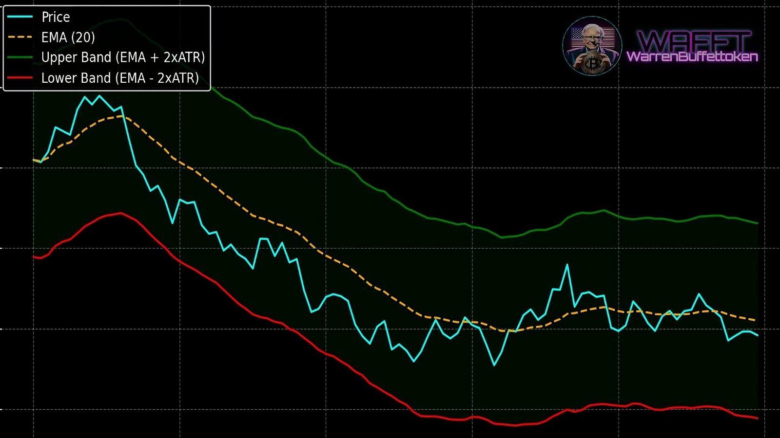
🤨What Is the Average True Range (ATR)?


The Average True Range (ATR) is a technical indicator created by J. Welles Wilder, one of the great pioneers of technical analysis, also known for other famous indicators like the RSI (Relative Strength Index).

The ATR doesn’t focus on predicting whether an asset’s price will go up or down. Instead, its job is to measure market volatility, showing you how active or calm price movements are.


Think of the ATR as a market thermometer


  • High ATR values: Indicate that the asset is experiencing large price swings, like those wild days where prices move rapidly back and forth.


  • Low ATR values: Suggest a calmer market with smaller, more predictable movements.

This information is critical for shaping your strategy, as it helps you:

  • Adjust your position size.


  • Place stoplosses effectively.


  • Gain a better understanding of the asset’s behavior.

It’s an incredible tool for any trader, helping you understand the “market weather.Is it raining volatility, or are the skies clear?


With this info, you can adjust your strategy like a pro. 🚀

What exactly does the ATR measure?

The ATR (Average True Range) is essentially the moving average of the True Range over a specific period, typically 14 days. What does that mean in plain terms? It takes the distance the price travels (between the high and the low, or with the previous close if it’s greater) and averages it to see how active the market is.


  • The higher the ATR, the greater the volatility;


  • the lower the ATR, the more the price is moving with less dancing.
 Why Is the ATR Important?


Unlike other indicators that focus on specific prices or trends, the ATR measures the intensity of the market. It’s like a “thermometer” that tells us how much the price is sweating:


Risk Management:


The ATR helps you adjust your position size based on volatility. If you see that the ATR is high (the price is in rollercoaster mode), you can reduce the amount you invest in each trade to avoid getting into trouble. On the other hand, if the ATR is low, you might be encouraged to take a slightly larger position.


Setting StopLosses:


 Traders use the ATR to place stops more strategically, taking advantage of the volatility measure it provides to more accurately protect their trades. If WAFFT’s price (our favorite memecoin) is very volatile, it’s better to set a wider stoploss so you don’t get stopped out on the first shake. If the ATR is low, you can tighten the stops and protect profits more effectively.


Detecting Changes in Volatility:


A spike in the ATR can indicate greater market participation or that a big move is coming. It’s like that feeling before a storm when the air is charged with energy. If you suddenly notice the ATR rising and WAFFT begins to move with more energy, it’s a good idea to be extra alert in case a big move (or a big scare) is coming.

In the end, the ATR is a super useful tool to understand the “character” of the market: whether it’s as calm as a lake or as rough as stormy seas. With this information, you can refine your strategy, adjust your risk, and set stoplosses so that sudden moves don’t knock you out of the game at the first shake.


Remember that, especially in cryptocurrencies like WAFFT, where volatility can be stronger than in other assets, the ATR becomes a great companion for “feeling” when the market is about to give us a big shake. That way, you can be prepared and make the most of every wave! 🌊✨

 Practical Applications of the ATR


Identifying Trading Opportunities:


  • When the ATR keeps rising, it means the price is moving more and more—volatility is at its peak. [̲̅$̲̅(̲̅ιοο̲̅)̲̅$̲̅]


  • Imagine the price usually oscillates within a small range, but suddenly it goes wild: that rising ATR suggests a major shakeup could be coming.
    • It could signal an explosive upward move, a massive drop, or even rapid swings perfect for scalping.


  • Remember: The ATR doesn’t indicate direction; it simply warns you that “something big is brewing.


Dynamic Trade Management:


  • With a low ATR, the market is in “chill mode” (fewer surprises). In these cases, range strategies (buying near support and selling near resistance) tend to work best.


  • A rising ATR signals heightened market intensity and wider price swings, making breakout strategies potentially more effective.


  • If the price breaks a support or resistance level in a high ATR environment, the chances of the move continuing are higher (the market is more dynamic).


  • Adjusting position size and stoploss levels according to the ATR is key to avoid getting shaken out of the market too soon by a simplewhiplash.


Complementary Indicator


  • The ATR measures volatility only; it doesn’t tell you if the asset will go up or down.


  • That’s why it’s great to combine it with Bollinger Bands, RSI, or other tools that give hints about direction.
  • For example:
    • If the RSI indicates oversold conditions and the ATR is rising, it could signal that the market is heating up for a stronger reversal.


    • The ATR acts as a filter, helping you assess whether a signal (e.g., from the RSI) is backed by significant volatility
Simple Example to Understand It:


  • If an asset has an ATR of 2, it means that, on average, the price moves $2 within the time frame you’re analyzing (daily, hourly, etc.).

🆘Let me explain it to you in detail so you don’t miss anything⬇️:

The ATR (Average True Range) measures, on average, how much an asset fluctuates over a specific period (e.g., 14 daily candles, 14 hourly candles, etc.).

  • If an asset has an ATR of 2, it means that during the analyzed period, the average range between the high and low (thelengthof the price movement) is approximately 2 dollars. [̲̅$̲̅(̲̅1)̲̅$̲̅], [̲̅$̲̅(̲̅1)̲̅$̲̅]

Would the ATR jump to 100 if the price moves 100 dollars in a single session?

Good question, WAFFT


Not immediately. The ATR is an average; it’s calculated using data from multiple candles (by default, usually 14). If the price suddenly moves significantly in one period, the ATR will rise, but it won’t instantly jump to 100 because it incorporates past data from several periods.

  • However, if the asset maintains movements of 100 dollars for a while, the ATR will gradually increase to reflect the higher volatility.


In Summary:


The ATR acts like a sensor for market swings during the configured period. A large price jump can cause it to rise, but since it’s an average, it won’t immediately reflect the exact value of the latest movement. Instead, it adjusts gradually as it accumulates more data from those movements.

  • If you suddenly see variations of $4 or $5, the calm is over: the price has broken out of its usual range, indicating increased volatility.


    • This movement could be due to major news, a shift in sentiment, or big investors making moves.


  • If the price barely moves $1, the market is “napping, with less excitement and fewer opportunities to profit from strong moves.


    • In this scenario, it might be better to trade supports and resistances until the ATRwakes up.


Conclusion🏁:


Using the ATR is like adjusting the volume on your music:


  • If it’s very low, you dance slowly (small trades or range strategies).🔇


  • If it’s very high, you prepare to dance with more energy (breakout strategies and wider stops).🔊
Advantages of the ATR


The Average True Range (ATR) is not just a tool for measuring volatility—it’s an essential asset for traders looking to make smarter decisions. Here’s why the ATR is so powerful and versatile:


💎Versatility


The ATR is like the «wild card« of technical indicators.

  • Works in any market: From traditional stocks to cryptocurrencies like WAFFT, as well as forex, commodities, and indices.


  • Adapts to any timeframe: Whether you’re trading on 1minute charts or weekly charts, the ATR adjusts to provide an accurate reading of volatility in that range.


  • Universal usability:
    • For scalpers, it helps set precise stops during quick movements.
    • For swing or longterm traders, it helps analyze sustained trends with less noise.

In summary: No matter your trading style or chosen asset, the ATR will always be a key tool to help you read the market. 🚀


😌Simplicity


While the concept of True Range may sound technical, the ATR is incredibly straightforward to interpret and apply:

  • Direct reading: If the ATR value is high, market volatility is high. If it’s low, the market is calm.


  • No directional bias: It doesn’t tell you if the price is going up or down; it simply measures the size of the movement, making it ideal for any strategy.


  • Easy integration: Nearly all trading platforms (like TradingView or MetaTrader) include the ATR by default, so no manual calculations are needed.


WAFFT Tip: Thanks to its simplicity, even beginner traders can start using it effectively on day one. It’s intuitive and practical, the perfect tool when you’re starting to decode the market.


⚖️Professional Risk Management


The ATR isn’t just a volatility gauge—it’s your go-to ally for managing risk like a pro:


  • Adjusting position sizes:

    • When the market is volatile, you can reduce trade sizes to protect your capital.


      • Example: if the ATR indicates wide movements, you wouldn’t want to risk too much on a single trade.


  • Smart stop-loss placement:


    • The ATR helps set realistic stops based on actual market volatility, preventing you from being stopped out by normal price fluctuations.


      • Example: If the ATR shows 20 pips in a forex market, setting a stoploss at just 5 pips is a recipe for getting stopped out quickly. A stop closer to the ATR value is much more effective.


  • Better planning:
    • Knowing how volatile the market is allows you to decide whether it’s time to make a bold move or wait for calmer conditions.

WAFFT Tip: Combine the ATR with other indicators like the RSI for a more comprehensive analysis of when to enter and exit trades.

Versatility: Works in any market, timeframe, or trading style. Perfect for volatile assets like WAFFT. 🪙


  • Simplicity: Easy to understand and implement, even for beginner traders.


  • Professional risk management: Strategically adjust position sizes and stoplosses based on volatility.


Key Takeaways:


GIF Cartman $WAFFT


The ATR is not just an indicator that provides a clear reading of volatility—it’s also a tool to take your trading to the next level. And just like the WAFFTguide, it helps you level up🔝(▀̿̿Ĺ̯̿▀̿ ̿).


With this knowledge, you’re fully equipped to conquer any market! 💪🔥

Drawbacks of ATR


The Average True Range (ATR) is a very useful tool for measuring the volatility of an asset, but like any indicator, it also has its limitations.


Below, we’ll look at some of its main drawbacks, accompanied by a ✨WAFFTTip after each section to help you get the most out of it in your strategy.


😵‍💫It doesn’t indicate direction


  • ATR focuses solely on volatility, that is, it measures how much the price «moves«, but it doesn’t tell you if the asset will go up or down.


  • This can be frustrating when you want a clear signal to enter or exit a position.

✨WAFFTtip: Accompany ATR with other indicators (for example, an oscillator like RSI or a trend indicator like Double Bollinger Bands) to get a more complete view.

  • This way you can know not only how strong the movement is, but also where it’s heading.


📰It requires context


On its own, ATR can generate confusing readings:


  • A high value may mean volatility, but it won’t tell you why it’s occurring or whether that volatility is bullish or bearish.


  • Without additional analysis, you could misinterpret the market situation.

✨WAFFTtip: Combine ATR information with support and resistance analysis, and don’t forget to review the overall market sentiment (news, social media, etc.).

  • Knowing the context will help you not to rely solely on the cold reading of the indicator.


⚡️It responds to rapid changes


ATR is very sensitive to volatility spikes:

  • In markets with extreme movements (for example, after important news), it can spike and give you excessively high readings.
    • This could lead you to think that volatility «from now on« will always be so high, which is not necessarily true.

✨WAFFTtip: If you trade in highly volatile markets (like certain cryptocurrencies), look at the historical behavior of ATR and put it into perspective.


  • Don’t make decisions based only on momentary spikes; use longer time frames to smooth out the indicator’s response.


Key Summary


  • Doesn’t indicate direction: It only measures the amplitude of movements, not whether the price will go up or down.


  • Requires context: ATR alone can give confusing signals; it’s vital to complement with other indicators.


  • Responds to rapid changes: In the face of volatility spikes, ATR can surge and give the impression that the market will move with the same intensity permanently.


WAFFT accompanies you in your training


GIF de ejemplo


Want to learn how to combine ATR with other technical analysis tools and get the most out of it?


With the WAFFTguide: The Path to Wealth, you’ll have all the information and advice needed to master the market and make more solid decisions.


Don’t stop learning and keep growing in the world of investments! 🚀

When to Use the ATR?


The Average True Range (ATR) is one of those indicators that truly shines in specific market scenarios. To get the most out of it, it’s important to know exactly when and how to apply it.

Here are some contexts where the ATR can become your best ally:


1. In Highly Volatile Markets


  • Assets with sharp movements: If you trade cryptocurrencies (like WAFFT, Bitcoin, Ethereum) or high-volatility tech stocks, the ATR is ideal for measuring the magnitude of price swings.


  • Avoid unpleasant surprises: A volatile market can easily blow through a tightly placed stop-loss. With the ATR, you can adjust those stops to the market’s actual dynamics, reducing the risk of being taken out of a trade due to minor price fluctuations.


  • Make quick decisions: When the ATR spikes, you know the asset is entering «roller coaster mode.» This information lets you decide more strategically whether to join the action or wait for calmer conditions.


2. To Adjust Positions🎯


  • Calculating position size: Advanced traders don’t leave things to chance. They use the ATR value to determine how much volatility they’re dealing with in a trade. If the ATR is high, they might choose a smaller position size to limit risk.


  • Professional risk management: Your risk/reward ratio can improve if you adjust stops and market exposure based on real volatility data. The ATR provides that “real” figure of how big price swings can be.


  • Standardize your strategy: By applying the same logic to all your trades (e.g., always risking a fixed percentage of your account relative to the ATR), your trading system will become more consistent and stable in the long run.


3. To Manage Automated Strategies🤖


  • Stop-loss placement: Many automated systems integrate the ATR to position dynamic stops. When volatility increases, the stop moves further to avoid sudden jumps, and when volatility decreases, it tightens to maximize profits.


  • Filter low-volatility periods: Some strategies avoid «sleepy« markets. With the ATR, you can program your bot to stop trading if volatility drops below a specific threshold. This way, you avoid entering trades where price movements are too small to make it worthwhile.


  • Constant optimization: Traders who manage automated systems often “finetune” their ATR parameters based on historical performance. This helps them adapt to current market conditions without losing focus on long-term goals.


Closing This Chapter🚪


With the ATR, we close this chapter on the most prominent indicators. You’ve learned how it works, why it’s useful, and when it truly shines. In the following sections, we’ll dive deeper into its various adaptations, how to configure ATR parameters, and explore practical examples so you can apply it with greater confidence in your strategy.


WAFFTlabs🧪, Knowledge at Your Fingertips


🌟 Remember that at WAFFTlabs🧪, knowledge is always within reach. Whether you want to better understand volatility in your trades or take your strategy to the next level, the ATR can make the difference between chaos and control in your trading. Use it to your advantage!


After this brief pause, let’s continue with the WAFFTGuide: Technical Indicators/Volatility Indicators/ATR/⬇️Variations⬇️

(๑˃̵ᴗ˂̵)ﻭ

Variations of the ATR: Adapting Volatility to Every Strategy


The Average True Range (ATR), while technically not having distinct «types,» has inspired a series of variations and specific applications tailored to modern technical analysis. These differences arise from how the ATR is calculated or used, depending on the trading style, the asset being analyzed, and the goals of each investor or trader. 🌟

In this section, we’ll break down the most popular variations of the ATR, highlighting how they’ve become essential tools for measuring and leveraging market volatility. But, as with any good strategy, we’ll start with the basics.

First, we’ll discuss the Classic ATR, the original version created by J. Welles Wilder. Here, we’ll focus on the essentials:

  • How to set up its parameters properly.⚙️


  • Practical strategies based on its readings.🎣


  • Real examples to show you how to apply it effectively.🎯

Once we’ve mastered the fundamentals, we’ll move on to three widely used variations favored by traders and investors. These adaptations not only enhance the ATR’s utility but also make it a more versatile tool for different analysis styles and markets.

Let’s dive in! 🚀

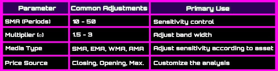
How to Correctly Configure the Parameters of the Classic ATR


The Average True Range (ATR) is one of those indicators that never goes out of style. Why? Because it measures an asset’s volatility, which is vital for adjusting stops, targets, and sizing our positions. Previously, we discussed what ATR is and why it’s so important; now we’ll delve into how to configure its parameters to get the most out of it.


At WAFFT – the memecoin with real educational value and a mission of financial empowerment, through our guide «WAFFT: The Path to Wealth« – we always bet on tools that help us become more effective traders and investors. So, let’s begin!


1. Integration in Trading Platforms🖥️


Good news! Most trading platforms, such as TradingView and MetaTrader, already include the ATR as a built-in indicator.


🔸What Do You Need to Do?

Simply add the indicator to your chart, and you’re ready to go!


🔸Customizing the ATR:

These platforms allow you to adjust various settings to tailor the indicator to your specific needs:


  • Calculation Period:
    Adjust the number of periods the ATR uses to calculate the average volatility.

    • Shorter periods: Make the ATR more sensitive.


    • Longer periods: Smooth it out for less noise.


  • Multiplier:
    Modify the multiplier used in the ATR formula to better define stop-loss levels or other trading strategies.


  • Type of Moving Average:
    Besides EMA, you can choose other moving averages, like Simple Moving Average (SMA) or Weighted Moving Average (WMA), to smooth the ATR according to your preference.


  • Indicator Visualization:
    Customize the color, line thickness, and style (solid, dotted, etc.) of the ATR to better align with your chart analysis.


  • Custom Alerts:
    Set up automatic alerts to notify you when the ATR reaches specific levels, helping you react quickly to market volatility changes.


🔸How to Adjust These Settings:

1. Add the ATR to Your Chart:

    • Go to the indicators section on your trading platform.


    • Search for «ATR« and add it to your chart.

2. Access ATR Settings:

    • Right-click on the indicator in the chart and select «Settings» or «Properties.«


    • Here, you can modify the calculation period, multiplier, moving average type, and visualization settings to suit your preferences.

3. Apply Additional Smoothing:

    • If you want to smooth the ATR with an EMA or another moving average, select the appropriate option in the indicator settings.


    • Adjust the moving average parameters to achieve the desired sensitivity.

And that’s it!

With these customization options, you can optimize the ATR to perfectly match your trading style and enhance your volatility analysis. 📈✨


Let’s break down each adjustable parameter in detail to fully understand its impact. 🧐💥

2. ATR Period: The Foundation of Everything⏰


The period defines how many candles (or bars) will be used for the ATR calculation.


🔸ATR (7 to 10 periods):

  • 🔵Use: Intraday trader or scalping.


  • 🟢Advantage: Captures quick movements; reacts swiftly to volatility.


  • 🔴Disadvantage: More prone to volatility «false positives.«


🔸ATR (14 periods):

  • 🔵Use: Classic and most used configuration.


  • 🟢Advantage: Balance between sensitivity and data consistency.


  • 🔴Disadvantage: Sometimes, it may delay in reflecting abrupt volatility changes.

🔸ATR (20 to 30 periods):

  • 🔵Use: Swing traders and longerterm vision.


  • 🟢Advantage: Better filters market noise, ideal for prolonged trends.


  • 🔴Disadvantage: Slower response to sudden rises or falls.


💭What’s the «ideal« then?


It depends on your strategy and the asset’s own volatility ( cryptos like WAFFT can be super volatile!). Many start with 14 and then experiment with higher or lower values.

3. Multiplication Factor (ATR Multiplier)✖️


The ATR is not only used «as is«, but sometimes it’s multiplied to adjust stop-loss or detect breakout levels:


  • 1x ATR: Tends to stay very close to price action; can «jump« with small movements.


  • 1.5x to 2x ATR: Common range for placing stops and avoiding sweeps; reduces the risk of exiting «too early«.


  • 3x ATR or more: Used when the asset is very volatile, to avoid jumping at every market swing.

You apply this factor by multiplying the ATR value and adding/subtracting it to the closing price (or high/low) to establish protection zones (stop) or targets (take profit).

4. True Range and Its Derivatives: Understanding the ATR and Beyond🔎


The ATR is based on the True Range:

🔸The True Range considers three factors to capture the true volatility of an asset over a specific period (daily, hourly, etc.):


🔹Distance from the high to the low of the current candle:

    • Think of this as the total height of the candle. It’s the difference between the highest and lowest price the asset reached during that period.

✨WAFFT Example: Imagine you’re looking at how gold’s price moved today. 🪙 This distance measures from the highest price it reached to the lowest price of the day. For example, if gold hit a high of $2,750 and a low of $2,700, the total height of the candle is $50. It’s like a summary of its daily journey! 📊


🔹Distance from the previous close to the current high:

    • Here, we look at how much the price has risen from the previous period’s close to the current high. It’s like measuring how far the price has pushed upward.

✨WAFFT Example: Let’s say Bitcoin closed at $100,000 yesterday. Today, it reached a high of $102,000. This distance tells us that the price climbed $2,000 from the previous close to its highest point. It’s like measuring the strength of that market «jump.«🚀


🔹Distance from the previous close to the current low:

    • Similar to the previous measure, but now we look at how much the price has dropped from the previous close to the current low.

✨WAFFT Example: Imagine that yesterday oil closed at $75 per barrel. 🛢️ Today, the price dropped to a low of $72. This means that from the previous close to today’s lowest point, the market lost $3. It’s a quick way to see how much it has pulled back! 📉

The True Range takes the largest value of these three distances to ensure it captures any extreme movement, whether upward or downward.

🔸In addition to the ATR, there are other derivative indicators that are based on the True Range or use similar concepts to offer additional insights:


  • Bollinger Bands: Use a moving average and standard deviation (another derivative indicator) to create a dynamic range around the price.


  • Keltner Channels: Based on the ATR, these channels are smoother and respond differently to extreme price movements.


  • SuperTrend: Another indicator that uses the ATR to determine trends and potential entry and exit points.
5. How the ATR Is Calculated🧮


Once you have the True Range for each period, the ATR simply averages these values over a specific number of periods (e.g., 14). This gives you an idea of how much, on average, the asset’s price moves during that timeframe.


✨WAFFT Example:  If you’re analyzing the daily ATR with a period of 14 days, the ATR will be the average of the True Ranges from the last 14 days.

6. Smoothing the ATR with Exponential Moving Averages (EMA)📉


Although the ATR is already an average that measures volatility, it is originally calculated using a simple moving average (SMA) to smooth values. However, some traders choose to replace that SMA with an exponential moving average (EMA). Why? Because the EMA gives greater weight to the most recent data, making it more sensitive to price changes.


🔸Advantages of Smoothing the ATR with an EMA


1. Faster Response to Volatility Changes

  • The market doesn’t always move steadily; volatility can shift quickly due to news, economic data, or sudden moves by large investors. By prioritizing recent data, the EMA makes the ATR more reactive.

✨WAFFT Example: Imagine you’re trading in a cryptocurrency market like Bitcoin , where prices can swing hundreds of dollars in minutes. If the ATR is calculated with an SMA, it may take longer to reflect these sudden changes. With an EMA, the ATR adjusts almost immediately, showing that volatility is increasing.


2. Less Signal Lag⏱️

  • The ATR calculated with an SMA can have «lag« because it gives equal weight to all data in its period, which can be problematic in fast markets. The EMA, by weighting recent data more heavily, reduces lag and helps traders react faster.

Before moving on, if you’re curious about what Lag is, check out the box below. If not, feel free to skip it 😁.

Hey WAFFT, What Is «Lag«?


«Lag« is an English word that means delay or lag . In the world of trading and technical indicators, «lag« refers to the time it takes for an indicator to react to changes in an assets price.


Imagine This:

Think of a bicycle 🚲:

  • When you pedal, there’s a small delay between the movement of the pedals and the wheel turning.


  • That small delay is similar to the «lag» in indicators.

Simple Example:

Indicator with a lot of lag:

  • It’s like the bike’s wheel takes a while to start moving after you pedal.


  • The indicator is slow to reflect changes, so you might miss the exact moment to buy or sell.

Indicator with little lag:

  • It’s like the wheel moves instantly as soon as you pedal.


  • The indicator reacts quickly, helping you make faster decisions.

Why Does «Lag« Matter?


Faster Decisions:

  • An indicator with less lag helps you spot price changes faster, so you can act quickly.

Up-to-Date Signals:

  • Less «lag« means the indicator is more up-to-date with what’s happening in the market right now.

And that’s it! Now you know that «lag« is like the delay between when you do something and when you see the result. In trading, less «lag» is better to move quickly with market changes. 🚀😊


Sorry if I’m being repetitive, but trust me, in the future, you’ll thank me for it. 🙇‍♂️🧠💲


Let’s continue with: 🔸Advantages of Smoothing the ATR with an EMA

✨WAFFT Example: Suppose you’re trading in the futures market, and prices start moving sharply due to an unexpected economic event, such as an interest rate hike. The ATR with EMA will alert you earlier to the increase in volatility, allowing you to adjust your stops or make entry/exit decisions faster.


🔸How Does This Impact Trading?


🔹Stops More Precise:

Traders who adjust their stoploss levels based on the ATR can benefit from a more sensitive ATR, as it reflects changing market conditions more immediately.

  • In highly volatile markets: Wider stop-loss levels to avoid being stopped out prematurely.


  • In calm markets: Tighter stops to protect profits.


🔹Better Trend Reading:

Smoothing the ATR with an EMA gives traders a clearer picture of how market volatility is changing, which can be key for confirming trends or spotting consolidations.


🔸When to Use an ATR Smoothed with EMA


  • Volatile Markets: Such as cryptocurrencies, tech stocks, or futures.


  • Short-Term Strategies: Such as scalping or day trading, where rapid market movements are crucial.


  • Unexpected Events: Such as news or economic releases, where volatility changes quickly.


In addition to using an EMA to smooth the ATR, you also have the option to apply different types of moving averages that will adjust the ATRs sensitivity and response to changes in volatility.

Here are some examples:


♦️SMA (Simple Moving Average):

  • How it affects the ATR: Produces a more stable line, less reactive to sudden volatility spikes.


  • Ideal for: Traders who prefer a “smoother” reading focused on long-term trends, minimizing market noise.


♣️WMA (Weighted Moving Average):

  • How it affects the ATR: Assigns more weight to recent data, making it quicker to react to changes in volatility, though less so than the EMA.


  • Ideal for: Those looking for a middle ground between the stability of the SMA and the reactivity of the EMA.

♥️HMA (Hull Moving Average):

  • How it affects the ATR: Its double-smoothing algorithm reduces lag while still filtering noise, offering fast reactions but without the abruptness of the EMA.


  • Ideal for: Traders who need prompt detection of volatility changes but prefer slightly more stability than a pure EMA.

♠️TMA (Triangular Moving Average):

  • How it affects the ATR: Averages the result of one SMA with another SMA, resulting in an even smoother and more stable curve.


  • Ideal for: Long-term strategies where quick price movements are less relevant, aiming to minimize false signals.

Summary:

Each type of moving average influences the ATR differently: some react faster to changes in volatility, while others take longer but are less likely to generate premature signals. The choice depends on your trading style, time frame, and risk tolerance.

As with the EMA, using any of these moving averages instead of the ATRs standard settings can help you better adapt it to the specific market conditions you’re trading in.

7. Timeframes and Suitability


When using the ATR (Average True Range), selecting the right timeframe is crucial. Calculating the ATR on 1minute charts is very different from doing so on 1day charts, especially in a volatile market like crypto (including our beloved WAFFT! 🚀).


Before diving in, let’s do a quick overview of some market strategies. Later, in another section of the WAFFT guide, we’ll go even deeper into the different trading styles you can explore, such as Day Trading, Swing Trading, Scalping, and others (think of these as thepersonalitiesof trading, each with its own vibe).


If you’re curious about any of them, just search their name in WAFFT’s browser   and you’ll have tons of info at your fingertips! 🕵️‍♂️💻


🔸Day Trading

  • Charts: Typically 5 to 15 minutes, although some scalpers even go as low as 1 minute.


  • Period Parameters: Usually short (714).


  • Objective: Quickly adjust stops and targets to capitalize on intraday moves.

📌If you love the adrenaline rush of entering and exiting trades multiple times a day, a short-term ATR will allow you to track volatility minute by minute. Just be ready to act fast when the market starts moving. ⚡


🔸Swing Trading

  • Charts: 4H, Daily, and even Weekly if you’re looking at a broader timeframe.


  • Larger Periods: 1420, or even 2130 for more conservative traders.


  • Objective: Protect positions and capture multi-day or multi-week moves.

📌If you prefer relative calm and don’t want to stress over every tick, a higher ATR period will help smooth out volatility spikes. This way, you’re less likely to be stopped out too early, allowing you to hold positions for bigger gains.


🔹Why Does This Matter for Cryptos Like WAFFT?


In the crypto world, prices can shift in seconds, making the choice of timeframe even more critical:

  • Using an ATR with a long period on 1minute charts could leave you behind, missing rapid moves.


  • Using an ATR with a short period on daily charts might result in overly sensitive signals, causing unnecessary panic.

📌The key is to experiment with different timeframes to find the one that suits you best and delivers the most consistent results. Every trader has their own style and risk tolerance.


🌟Extra Tip:

Many traders use a multitimeframe approach:

1. View the overall trend on a 4H or Daily chart.

2. Finetune entries and exits on a 15minute or 1hour chart, using the ATR in that more detailed timeframe.


📌This way, you benefit from thebig picture while refining your precision on the shorter-term view.


In Summary:


  • Day Trading: ATR on 515 minute charts, short periods (714), quick reactions.


  • Swing Trading: ATR on 4H or Daily charts, larger periods (1430), patient strategies.


  • Cryptos like WAFFT: Pure volatility—testing different timeframes is critical.


  • Multi-Timeframe: Combine the best of both worlds by observing the global picture and zooming in on the details.


Ultimately, the timeframe and ATR settings come down to personal preference, experience, and risk tolerance. Pick the one that best fits your lifestyle and trading style! 💪✨

8. Common Strategies with the ATR


The Average True Range (ATR) doesn’t just measure volatility—it’s also the key to adjusting your trading approach to whatever the market’s doing at any given moment.

If you need some ideas on how to make the most of it, here are a few popular (and very useful) strategies that rely on the ATR.

Let’s go! 🚀


1. Dynamic Stop-Loss (ATR Trailing Stop)

  • What is it? A stop-loss that moves along as the price moves in your favor.


  • Why does it work?
    • It protects you from sharp pullbacks when the market goes roller coaster 🎢.


    • It prevents you from closing out a winning trade too soon. Imagine the price keeps climbing and your stop-loss trails behind it, locking in profits as your trade progresses.


  • Practical application:
    • If the ATR goes up, you might give your stop a bit more breathing room to avoid getting stopped out by a typical market bounce.


    • If the ATR goes down, you could tighten it, since volatility is lower and price movements are narrower.

🌟Bonus Tip: Some traders multiply the ATR value (for example, by 1.5 or 2) to determine how far to place their trailing stop from the current price.


Want to know what a trailing stop is? Don’t miss the box below! 🤭📦

WAFFT, What Is a Trailing Stop?


A trailing stop is an essential tool in the trading world that helps you protect your profits and limit your losses automatically. It’s like having a guardian that follows your investments and acts on your behalf when needed.💂🏼‍♂️


How Does It Work?


▫️Basic Definition:

A trailing stop is an order that adjusts automatically with the movement of an asset’s price, maintaining a fixed distance or a set percentage below (for long positions) or above (for short positions) the current price.


▫️If it sounds too technical, let me explain:

Think of the trailing stop as a companion that follows your steps. If the price rises, the trailing stop rises with you, ensuring your profits grow. But if the price drops, the trailing stop stays in place and automatically sells to protect you from bigger losses. 🛡️📈 This way, you can let your investments work for you without having to constantly monitor the market.


💡Simple Example


▫️Long Position:

  • Buy: Let’s say you buy a stock at $100.


  • Set a $10 Trailing Stop: If the price rises to $110, the trailing stop adjusts to $100.


  • Price Rises to $120: The trailing stop now moves up to $110.


  • Price Drops to $115: The trailing stop activates the sell order at $110, locking in a $10 profit per share.

Advantages of a Trailing Stop


1. Automatic Protection:

    • No need to constantly monitor the market. The trailing stop works for you.

2. Maximizes Profits:

    • Allows your investments to grow while safeguarding your gains.

3. Trading Discipline:

    • Helps you stick to your strategy and avoid emotional decision-making.

4. Flexibility:

    • You can adjust the fixed distance or percentage based on your risk tolerance and trading strategy.


Why Use a Trailing Stop?


  • Capture Favorable Movements:
    If the price continues moving in your favor, the trailing stop adjusts, allowing you to benefit from trends.


  • Limit Losses Without Manual Intervention:
    If the market changes direction, the trailing stop automatically closes your position, avoiding significant losses.


  • Efficient Risk Management:
    Combines protection and opportunity in one tool, making it easier to manage your investments.


How to Set Up a Trailing Stop?


1. Choose the Type of Trailing Stop:

    • Fixed: A specific amount (e.g., $10).


    • Percentage: A percentage of the current price (e.g., 5%).

2. Set It Up in Your Trading Platform:

    • Add the Trailing Stop: On platforms like TradingView or MetaTrader, select the trailing stop option when placing an order.


    • Define the Distance: Set the fixed amount or percentage you want to maintain below or above the current price.

3. Monitor Your Trade:

    • Once set, the trailing stop adjusts automatically with the price movement.


    • If the price moves in your direction, the trailing stop moves along.


    • If the price reverses, the trailing stop stays in place and can trigger the sell order automatically.

🏆Practical Example 

The trailing stop is a tool designed to protect your investments and automatically maximize your profits. Its primary function is to close an existing position when the price moves against you beyond a specific margin. But how does it work in different types of positions?


1. Long Positions (Buy)📈

  • Main Function: Sell.


  • How It Works:


    • Initial Buy: Let’s say you buy Bitcoin at $100,000.


    • Set a 10% Trailing Stop:
      • If the price rises to $105,000, the trailing stop adjusts to $94,500.


      • If the price falls to $94,500, the sell order is triggered, locking in a profit from the highest point reached so far.


  • Summary: In a long position, the trailing stop only sells to protect your profits or limit your losses.

2. Short Positions (Sell)📉

  • Main Function: Buy to close the position.


  • How It Works:


    • Initial Sell: Suppose you short Bitcoin at $100,000 (expecting the price to drop).


    • Set a 10% Trailing Stop:
      • If the price falls to $90,000, the trailing stop adjusts to $99,000.


      • If the price drops further to $80,000, the trailing stop moves to $90,000.


      • If the price rises back to $90,000, the buy order is triggered to close the position, limiting your losses.


  • Summary: In a short position, the trailing stop only buys to close the position and limit losses.


Can the Trailing Stop Open New Positions?


No, the trailing stop is not designed to open new buy or sell positions. Its sole purpose is to manage and protect the positions you already have open.


Conclusion


he trailing stop is a powerful tool for managing and protecting your existing investments, whether you have a long or short position. It is not used to open new positions but to close the ones you already have when the market moves against you beyond the set margin.

Incorporate the trailing stop into your strategy and take your trading to the next level! 📈✨


Let’s keep going with the WAFFT: The Path to Wealth guide!

2. Detecting Abnormal Volatility

  • Why is it important? Sometimes the ATR spikes suddenly, indicating something big is happening: news, panic, or FOMO (Fear Of Missing Out). ⚠️


  • How to use it?
    • Exit before a potential reversal: If the ATR is through the roof, it might be time to lock in profits before the market turns around.


    • Take advantage of breakouts: A sudden ATR jump can signal a range breakout or the start of a new trend. Traders who play breakouts see this as a green light to jump aboard.

🌟WAFFTtip: Combine this insight with other indicators (RSI, MACD) to reinforce your decision, confirming whether there’s truly a major shift in market sentiment.


3. Trade Filters

  • What are they? Some traders choose to only take trades when the ATR is above (or below) a certain level. The idea is to filter market conditions to suit their strategy.


  • High Volatility (High ATR) The market is alive”


    • Quick trades, scalping, or day trading to capitalize on larger and more frequent moves.


    • Watch out for risk! The more volatile the market, the more careful you need to be with your stops.


  • Low Volatility (Low ATR) → “The market is asleep


    • Ideal for range or swing trading where you look for smoother, more predictable moves.


    • If the market’s taking a nap, it’s not worth expecting an epic rally (though there are always surprises in the crypto world).

⚡️Quick Example:

  • If you’re trading a crypto like WAFFT and see that the ATR is super low, you might opt for a range strategy: buying near support and selling near resistance within a defined channel.


  • On the other hand, if the ATR suddenly shoots up, you’d prepare for a breakout or a more defined trend.

Conclusion


The ATR is a hugely versatile indicator that helps you refine your stops, detect unusual moves, and decide whether it’s worth diving in when volatility is sky-high (or rockbottom).


Mastering these strategies can be the difference between sitting on the sidelines or truly capitalizing on the exciting—and sometimes turbulent—world of trading. Time to practice!⚡️✨

Conclusions: Adjust the ATR to Your Strategy and Your Asset


Configuring the ATR is not an exact science, but there are guidelines that will help you do it more efficiently:

  • Choose the period according to your trading horizon.


  • Decide if you’ll use multipliers to set stops and exits.


  • Remember the timeframe: an ATR value in 1 minute won’t be equally reliable in 1 day.

At WAFFT, we love spreading this knowledge that the elites would prefer you not to handle:😶‍🌫️

the more you learn to use indicators like the ATR, the better decisions you’ll make when investing and the closer you’ll be to being that investor with a winning mindset.Keep advancing in your training, adjust the ATR carefully, and let volatility work in your favor! ⚙️💸


WAFFT: The Path to Wealth – Your educational guide to becoming an all-terrain investor. There’s no blog like this, and you’re part of this financial revolution!

Exponential ATR: The Fastest on the Team🏃‍♂️‍➡️


The ATR (Average True Range) measures an asset’s volatility: essentially, how much its price moves within a given period. 📊 The higher the ATR, the greater the volatility and, therefore, the risk (and potential reward) of sharp price swings.

So far, nothing new. But, the Exponential ATR takes it a step further by applying an exponential moving average to its calculation. This means it gives more weight to recent data, helping the indicator react faster to market changes.The advantage? It allows you to spot significant jumps in volatility sooner and make quicker decisions.

How is it used in practice?


1. Identifying volatility trends:


When the Exponential ATR is rising, it means the market is very active, and prices are moving significantly. It’s like the market ison edge,reacting strongly to news and changes.

On the other hand, if the Exponential ATR is falling, volatility is decreasing, and prices are moving in a calmer and more stable manner. It’s as if the market is relaxing,with fewer sharp movements.

2. Adjusting stop-loss orders:


🔸Get the Exponential ATR Value:


First, calculate the Exponential ATR for the asset you’re trading. This value measures the average price volatility over a specific period.

(The Average True Range (ATR) is an indicator used to measure the volatility of a financial asset. It uses a smoothing method similar to an Exponential Moving Average (EMA). However, the Exponential ATR applies an EMA directly to the ATR, making it more sensitive.)


🔸Multiply the Exponential ATR by a Factor:


Choose a factor (e.g., 2, 3, etc.) that determines how far your stoploss will be placed from the current price.

  • Example: If the Exponential ATR is 5 and you select a factor of 2, then:
5 × 2 = 10.


WAFFT, what does this mean?


How Does It Work?


1. Get the Exponential ATR:

Let’s assume the Exponential ATR is 5. This value measures the recent market volatility.


2. Multiply by the Factor:

    • Choose a factor, for example, 2.


    • Calculation: 5 (Exponential ATR) × 2 (Factor) = 10.

3. Set Your StopLoss:

    • If you’re in a long position (buying):
      Place your stop-loss 10 units below the current price.


    • If you’re in a short position (selling):
      Place your stop-loss 10 units above the current price.

Why Do This?


1. Higher Volatility:

    • In a highly active market, the Exponential ATR will be high. Multiplying it by a larger factor (like 3) gives you a wider stop-loss, preventing it from being triggered by normal market fluctuations.

2. Lower Volatility:

    • In a calmer market, the Exponential ATR will be lower. Using a smaller factor (like 2) keeps your stop-loss closer, protecting your profits without giving too much room for losses.

💡Quick Example


Let’s look at a practical and simple example to understand how to use the Exponential ATR to effectively adjust your stop-loss and protect your investments.


Initial Data:

  • Initial Purchase Price of Bitcoin: $100,000


  • Exponential ATR: 5


  • Chosen Factor: 2

Steps to Set the StopLoss:

1. Multiply the Exponential ATR by the Factor:

5 (Exponential ATR) × 2 (Factor) = 10

2. Determine Your StopLoss After the Price Rises:


    • Initial Purchase: Bitcoin at $100,000.


    • Price Rises to $105,000:
      • StopLoss Calculation: $105,000 – $10 = $104,990


      • Action: Set your stop-loss at $104,990. If Bitcoins price drops to $104,990, the sell order will be triggered automatically, securing a profit of $4,990.


3. If the Price Rises Further:


    • Price Rises to $110,000:

      • Stop-Loss Calculation: $110,000 – $10 = $109,990


      • Action: Adjust your stop-loss to $109,990. If the price drops to $109,990, the sell order will be triggered automatically, securing a profit of $9,990.


4. Downward Scenario:


    • Price Drops to $109,990:

      • Action: The sell order is triggered automatically at $109,990.


      • Secured Profit: $109,990 – $100,000 = $9,990 per Bitcoin.
3. Filtering trades:


If you have a trading system (That is fundamental), you can use volatility data to decide whether or not to enter a trade. High volatility means higher risk but also greater potential rewards.

4. Intraday strategies:


The Exponential ATR is especially useful for shortterm traders because it reacts quickly to sudden market moves. ⏱️


Benefits of Using the Exponential ATR


  • Quick reaction:

    • By giving more weight to recent candles, any sudden market «swings» will show up faster than with the classic ATR.


  • Dynamic adaptation:

    • It helps you adjust strategies in moments of high or low volatility almost in real-time.


  • Ideal for Scalping or Day Trading:

    • Thanks to its agility, the Exponential ATR is perfect for those looking to make quick entries and exits. 💹

How Does It Differ from the Classic ATR?


  • Weight of recent data:

    • The classic ATR uses a simple average, treating all data in the period equally. The Exponential ATR (EATR) gives more importance to the newest candles, making it react faster to changes.


  • Less «lag«:

    • Due to its exponential weighting, the EATR has less delay compared to price movements, helping you react better in volatile markets.


  • More sophisticated for short-term trading:

    • If you prefer intraday or very shortterm trading, the EATR will likely be more appealing than the classic ATR.

Conclusion and WAFFT Motivation 🚀


The Exponential ATR is a top tool for those who want to measure volatility in a way that’s more sensitive to what’s happening here and now in the markets. 📈 It will help you filter trades, adjust your stop-loss orders, and ultimately master volatility.


AtWAFFT, the most educational memecoin out there, we always promote real learning so anyone can make their way in the financial world. Keep learning and check out our guide, WAFFT: The Path to Wealth, to keep honing your investor skills!


Disclaimer: This content is for educational purposes only and is not financial advice. Always do your own research and trade responsibly! 😊

Normalized ATR: The Wildcard of Volatility!


(Variations of the ATR: Adapting Volatility to Every Strategy)


Hello, adventurous investor! Welcome to another wild ride with WAFFT, the memecoin that spreads financial knowledge like confetti 🎉. Today, we’re diving into the Normalized ATR, the super cool version of the ATR that lets you compare volatility across assets without losing your mind 🤯.

Ready to become a pro at relative volatility? Let’s go! 🚀

What is the Normalized ATR?


The Normalized ATR is the perfect trick for comparing the volatility of multiple assets without getting overwhelmed by absolute numbers. Why? Because instead of telling you,this asset moves2 per day (which might mean a lot if it’s worth10 or very little if it’s worth200), it shows you how that variation relates to the price as a percentage.


For example, imagine an asset is worth 100, and its classic ATR is 5. That might sound like a big move, but when you normalize it, you’ll see it’s only moving around 5% of its value—not much different from another asset worth €10 moving €0.50 (also 5%).


This way of measuring volatility is incredibly useful when analyzing multiple markets or cryptocurrencies simultaneously, especially if they have drastically different prices. For instance, if you’re trading pricey stocks alongside dirt-cheap cryptos, the Normalized ATR eliminates price disparity, making it easier to see which is moving more in relative terms. This helps you decide where to enter, how much to risk, and how far to set your stops without being stopped out prematurely.


If you like tailoring your position size or strategy to volatility, the Normalized ATR can become your best ally. By showing you a percentage, it lets you say:


Okay, this asset moves 3% daily on average. If I enter with X capital, I can expect this level of fluctuation and set my stops and take profits accordingly.


This helps you avoid jumping in blind and better size your positions based on your risk tolerance.


In short, it’s like giving the ATR augmented reality glasses: you’re still seeing volatility, but now in a much more practical and comparable format. It’s a fantastic tool for managing multiple assets with different prices and quickly identifying which ones have more “action” relative to their value.


The best part? Its super easy to interpret:

  • Low percentage? Low relative volatility.


  • High percentage? Buckle up, because intense moves are on the horizon.

Simple as that! ✨🚀

How Does the Normalized ATR Work?


The Normalized ATR works by taking the classic ATR, which measures volatility in monetary units (e.g., how many dollars the asset moves on average), and converting it into a percentage based on the current price. The calculation is straightforward: divide the ATR value by the asset’s current price, then multiply by 100 to get a percentage that’s easier to interpret.


Here’s how it works in practice:

Imagine an asset has an ATR of $2, and its current price is $40.

Using the formula, you get:

This means the price moves, on average, 5% of its total valuea much easier way to compare volatility across assets. For example, if another asset has an ATR of $10 but costs $200, the calculation would also yield 5%. Initially, $10 may seem like a bigger movement than $2, but when compared to the asset’s price ($200 versus $40), both have the same relative volatility of 5%.


[̲̅$̲̅(̲̅2οο̲̅)̲̅$̲̅≠  [̲̅$̲̅(̲̅40)̲̅$̲̅]😁


In other words, the Normalized ATR adjusts volatility to match the scale of an asset’s price. This allows you to analyze and compare markets, cryptos, or stocks with vastly different price levels and instantly see which is truly moving more or less in percentage terms. It’s perfect for spotting where there might be more opportunities—or more risk—without having to juggle complicated numbers! 🚀

How is the standardized ATR applied in practice?


The Normalized ATR isn’t just a pretty stat—it’s packed with real-world applications that can level up your trading game. Here’s a breakdown, with a bit of 🔬 market science, so you can use it like a pro:

Compare Assets


Whos thewild one”🤪?


  • If you’re hunting for the most volatile asset (the one swinging like crazy), focus on its Normalized ATR. The higher it is, the larger the price percentage fluctuation.


Why does this matter🤔?


🔸To see how «volatile» an asset might be:

  • If the Normalized ATR is high, the price jumps around quite a bit (more risk, more excitement 🫨).


  • If the Normalized ATR is low, the price moves less (more stable, less stress 😌).


    That way, depending on your risk tolerance (Are you up for the adrenaline, or do you prefer to sleep peacefully?💤), you can choose the asset that suits your style best.


    📌Tip: If you’re a «daredevil,« go for the one with more «action« (high Normalized ATR 🚀). If you prefer calm, look for something more «laidback« (low Normalized ATR 🍃).

Adjust Position Sizes


Percentages = Clarity✅?


  • A high Normalized ATR (e.g., 10%) signals big price movements relative to the asset’s value. To avoid unnecessary risk, reduce your position size for that asset.


How does it work technically🤷‍♂️?


  • Let’s say you have a fixed amount of capital. You can risk a smaller fraction on highly volatile assets (high Normalized ATR) and allocate more to lowervolatility options.


  • Combine the Normalized ATR with other tools like RSI, MACD, or even EMA to confirm entry or exit signals.
Set Proportional Stop-Losses


Say goodbye to stop-loss headaches🏳️


  • Stops getting hit too easily? With the Normalized ATR, you can match your stop to the asset’s relative volatility.


Simple Example😎


  • If an asset has a 4% Normalized ATR, you could set a stop-loss at 8% (double the ATR), giving it enough room to account for normal movements.


  • If the market is super chill (low Normalized ATR), tighten your stop-loss to lock in gains while minimizing risk.
 Spot Rapid Changes


Super volatile assets:🤯


A high Normalized ATR can signal surprises in the market. For example:


  • Imagine This: An asset has a Normalized ATR of 2%, but it suddenly spikes to 7%.


  • What Might Be Happening?:

    • Unexpected news hitting the market.


    • FOMO (Fear of Missing Out) driving impulsive buying.
    • Panic selling taking over.
    • Significant moves by large investors (whales) in cryptocurrencies.


Technical Reaction 🏃‍♂️


Breakout Indicator or Trend Change:


  • A rapid increase in the Normalized ATR can signal a price breakout or a strong trend reversal.

Action Steps:

  • Refer to Your Trading Plan: Decide whether to enter or exit the market based on your pre-set strategies.


  • Example:
    • If your plan involves trading strong trends, this breakout could present a profitable opportunity.


    • If you prefer avoiding high volatility, you might decide to stay on the sidelines until the dust settles.


Summary🌈


The Normalized ATR allows you to measure and compare the volatility of different assets, helping you make investment decisions aligned with your risk tolerance. Additionally, it helps you detect rapid market changes, which is crucial for reacting in time according to your trading strategy.👨‍🚒

  •  
Straight from the WAFFTLabs


At WAFFTLabs, we’ve been experimenting with these concepts and have developed a Practical Examples Section to show you how to apply everything in real-life market scenarios.


We’re thrilled with the results—this tool gives you a clearer picture of risks and opportunities based on the relative volatility of each asset.


See you in the next experiment! 🧪💥

Why is the Normalized ATR so Useful?


Because it transforms a mess of absolute numbers into an easy-to-compare percentage. In simple terms, if you used to juggle calculations to figure out which asset was more volatile, now you can see it at a glance.

Let’s break it down:


Comparison Between Different Assets🔍


🔸 Struggling with wildly different prices?

  • With the classic ATR, comparing a stock priced at $1 to one priced at $100 is a headache. A $1 move in the $1 stock is a whopping 100% (practically a rocket!), while the same $1 move in the $100 stock is a mere 1%.


  • The Normalized ATR puts both on «relative terms If both show a 5% Normalized ATR, it means they are equally “wild” relative to their own prices.


🔸Saves Time and Confusion:

  • When you have screens full of stocks, cryptos, and who knows what else, you don’t want to spend half your life doing math. With the Normalized ATR, everything is in a standard format: percentages.
Better Risk Management 


Adjusting Position Sizes🎛️:


  • Before, if you saw an ATR of $2, how did you know if it was a lot or a little? Now, if it’s 10% of the price, you know the asset is highly volatile in relative terms.


  • This means you can, for example, invest less capital or set a wider stop-loss if you want to survive those market swings.


More Realistic StopLosses🔭:


  • If your favorite crypto moves 10% on average, setting a stop-loss at 2% is likely too tight. It’s the perfect recipe for getting stopped out instantly.


  • With the Normalized ATR, you avoid making bad conclusions by confusing absolute volatility with relative volatility.
Perfect for Multi-Market Strategies


 Everything in One Basket🧺


  • If you trade currencies, cryptos, stocks, or even the surreal beef futures market or is it not so surreal?.
     (yes, the trading world is vast!), you need a way to compare the volatility of each asset without losing your mind.


Spotting Opportunities🪤:


  • By seeing which market has more movement in percentage terms, you can decide where to focus.


    • If a low Normalized ATR shows up in an asset you like, you might think: «Hmm, the price is sleepy now, but something big might be brewing.«


    • If it’s sky-high, you might think: «Whoa! This asset is on fire, but I need to be cautious because it could burn me
A little extra tip (important and super practical):


  • Pair the Normalized ATR with other indicators (RSI, MACD, volume, etc.) for added context.


  • Test different timeframes (1H, 4H, daily) to see how the percentage changes and find the timeframe you feel most comfortable with (whether you’re a scalper, day trader, or swing trader).
In Summary:


Ultimately, the Normalized ATR is a golden tool for any investor who wants to compare apples to apples without mixing apples and oranges. It hands you relative volatility on a silver platter and helps you manage risk, adjust your positions, and decide where to enter with more or less strength.


You’ve got no excuse not to make the most of it! 🚀

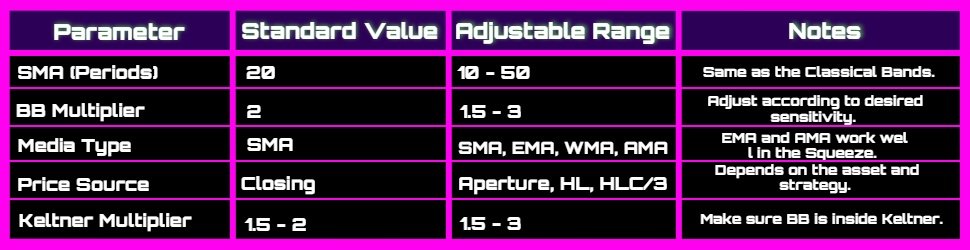
Normalized ATR Configuration 


Ever heard of the ATR (Average True Range) indicator😏? It’s the tool that shows an asset’s volatility, giving you the average price range over a set period. However, the standard ATR can sometimes be confusing—especially when comparing different assets or price ranges. That’s where the Normalized ATR comes in: it converts absolute values into a relative scale, making comparisons easier regardless of an asset’s price.


If you’re just starting out, here are some key tips to set it up properly:


1. Choose the Right Period⏱️


  • Common setting: The ATR is typically set to 14 periods by default, which works well for most traders.


  • Intraday trading: If you’re into scalping or day trading, consider shortening the period to 10 or 7 to better capture real-time volatility.


  • Swing trading/longer positions: If you’re holding positions longer, opt for a 2030 period ATR to smooth out short-term price fluctuations.


2. Adjust the Normalization📐


  • The Normalized ATR is expressed as a percentage (or ratio) relative to the asset’s price.

    • Example: If an asset is trading at $100 and the Normalized ATR is 2%, this means the absolute ATR is $2.


  • Ensure your trading platform allows you to display the ATR as a percentage, instead of a dollar value, for easier comparison.


3. Use Reference Values⚖️


  • Low Normalized ATR: When the indicator is at low values, the asset is moving within a tight range, meaning low volatility—ideal for rangebound strategies or low-risk trading.


  • High Normalized ATR: If the indicator spikes, the price is experiencing significant fluctuations—greater opportunity but also higher risk.


  • Custom Thresholds: Define your own «normal,» «high,« or «extreme« levels based on the asset type. For example, a 1% ATR might be calm for a volatile stock but extreme for a stable asset.


4. Combine with Other Indicators🔗


  • Support & Resistance: A high Normalized ATR near a resistance level could signal a potential breakout… or an upcoming consolidation.


  • Volume Confirmation: A surge in ATR along with high volume confirms a strong price movement.


  • Trend Confirmation: Use it alongside trend indicators (like moving averages) to see whether volatility supports or contradicts a potential price shift.


5. Practical Applications💡


  • Risk Management: A higher ATR (normalized or not) means you should adjust your stoploss and position size accordingly.


  • Asset Selection: New traders might prefer assets with a lower Normalized ATR to avoid excessive price swings.


  • Trading Timing: If you’re trading intraday, monitor ATR spikes to identify high-volatility moments—or avoid them if you prefer a more relaxed strategy.


Conclusion🏁:


The Normalized ATR provides a practical way to measure and compare volatility across different assets, helping you make smarter investment decisions instead of trading blindly. Adjust the period to match your strategy, set reference values to avoid surprises, and combine it with other indicators for a clearer market view.


Here at WAFFT, we’re all about sharing insider knowledge that the elites would rather keep to themselves. So, take advantage of this information, keep learning, and level up as an investor.

You got this, champ! 💪✨

Practical Example: Using the Normalized ATR


Hey, buddy! Ready to see how to apply the normalized ATR in practice? Today, we’re going to dive into NVIDIA (NVDA), which is trading around $125. And as always, here at WAFFT, the memecoin with real educational value, we love sharing these gems of knowledge 💎.

Let’s do this!

1. Quick Recap: Why the Normalized ATR?🤔


The ATR (Average True Range) measures an asset’s volatility, showing how much its price fluctuates on average.


  • The regular ATR gives you a value in dollars (e.g., $2), but it doesn’t tell you much if NVIDIA is trading at $125 or $400.


  • The normalized ATR expresses volatility as a percentage relative to the asset’s price. This lets you compare apples to apples and oranges to oranges—essentially comparing very different assets on a level playing field.
2. Set Up the Normalized ATR on Your Platform🛠️


1. Open your trading platform (TradingView, MetaTrader, or your brokers tool).

2. Find the ATR indicator and add it to NVDAs chart.

3. Generally, the ATR is set to 14 periods by default. Leave it that way if you’re a beginner, as it usually works well, although you can adjust it according to your strategy.

4. Activate the option to Show ATR as a percentage ornormalize it if your platform allows.

    • If not, you can calculate it manually: (ATR / Current Price) × 100.

For example, if the ATR is $3.00 and NVDAs price is $125:

Normalized ATR (%) = (3.00 / 125) x 100 = 2.4%
3. Interpretation of the normalized ATR with NVDA at 125 USD📊


  • A normalized ATR of 2.4% (using our example) means that, on average, the stock moves 2.4% of its price daily (or within the chosen time frame).


  • If the value rises above 3%, it indicates that volatility is increasing—something to keep an eye on!


  • If it drops below 1%, we are in a very calm period, ideal for those who want to avoid surprises.
4. Stepbystep trading example🎯


Here, we’ll dive deeper into each scenario so you get a full view of how to combine the normalized ATR with other indicators (such as moving averages or the RSI) to make better investment decisions.


Remember that at WAFFT, the educational-value memecoin, we don’t settle for the basics! 🚀


A) NVDA at 125 USD


🔹Scenario: The stock is trading calmly at 125 USD.

  • Normalized ATR (example): ~2%.


    • This means that the price fluctuates about 2.50 USD per day (2% of 125).


🔹Interpretation:

  • If the normalized ATR remains stable at 2% for several days, volatility is moderate.


  • Ideal for investors looking for calm swing trades or entries without too much turbulence.


🔹How to refine your analysis:

  • Simple Moving Average (20period SMA):

    • If the price is above the SMA20 and the normalized ATR is low, it indicates a stable, lowvolatility uptrend.


    • You can enter with a tighter stoploss, as you don’t expect large daily moves.


  • RSI (14period):

    • If the RSI hovers around neutral values (4060), it confirms that the market is neither overbought nor oversold.


    • This balance + low normalized ATR = a calm scenario.

✨Practical tip:

  • With a normalized ATR of 2%, place a stop-loss slightly beyond the typical daily range (e.g., 3 or 4 USD) to avoid gettingstopped out by regular price fluctuations.
B) Rise to 160 USD


🔹The price shoots up to 160 USD (big news, stellar earnings release, or a game-changing GPU launch).

  • Normalized ATR might climb to 3% or 4%.


    • 3% on 160 USD equals an average daily range of 4.8 USD (3% of 160).


🔹Interpretation and how to trade it:

  • Increased Volatility:

    • If the normalized ATR jumps from 2% to 34%, the market is much more active. Beware of tight stops since there is now more noise.


  • Exponential Moving Average (50period EMA):

    • In strong trends, many traders use the EMA50 to confirm bullish momentum.


    • If the price is significantly above the EMA50 and continues to rise with a high normalized ATR, it signals strength.💪


  • RSI or MACD:

    • If the RSI surpasses 70, the market is becoming overbought. However, with high volatility, the stock may keep rising—watch out for divergences!


♟️Entry or holding strategy:

  • If you entered at 130135 USD and see the normalized ATR increase, it confirms strong momentum.


  • Adjust your stop-loss further away (e.g., 56 USD below) to avoid getting stopped out by minor corrections within the main trend.


  • Monitor volume: If it rises along with the price and ATR, it indicates the market’s conviction in the move.
C) Drop to 110 USD


🔹After the euphoria, a correction hits: the stock plunges to 110 USD. What happens to the ATR?

  • The normalized ATR may stay at 3% or 4%, as declines often come with heightened volatility.


    • At 110 USD, 4% equals an average daily range of 4.4 USD (4% of 110).

🔹How to manage it:

  • StopLoss and Exit:

    • If you didn’t adjust your stop, you could get caught in the drop. A prudent investor would have moved the stop-loss with each new price high.


    • Upon seeing the drop, check for support breaks or if the RSI falls into oversold territory (<30).


  • Short Selling (if your broker allows it):

    • A high normalized ATR suggests rapid price movements, allowing you to capitalize on the bearish trend.


    • A bearish MACD crossover + price below the SMA50 or EMA50 further confirms weakness.


  • Waiting for a Rebound:

    • You may prefer to wait for a bottom to form around 110 USD if you notice selling volume starting to decline.


    • When the normalized ATR decreases and the RSI shows a bullish divergence, it could be an opportunity to buy at a lower price.

🎁Additional tip:

  • In bear markets, a high normalized ATR implies sharp short-term price swings. Adjust your risk management accordingly (smaller positions or wider stops).
Conclusion


This example with NVDA moving from 125 USD to 160 USD and then dropping to 110 USD illustrates how the normalized ATR accompanies you through each market phase:


1. Calm phase (low ATR, 2%).

2. Explosive phase (ATR rises to 34% on positive news).

3. Corrective phase (ATR remains high as the price plunges).


By combining the normalized ATR with moving averages, RSI, MACD, or volume, you’ll know if a move is strong and whether it’s worth holding or closing your position. This helps you avoid many surprises and make better entry and exit decisions.

At WAFFT, the memecoin that truly delivers educational value, our mission is crystal clear: to make it easy for you to take full control of your finances. We want you to become the investor the elites don’t want you to be—the one who plays on the same field but with the rules working in their favor. Why? Because those at the top of the system are determined to keep us trapped in an endless cycle of consumerism, debt, and financial stress… but at WAFFT, we’re heading in the opposite direction 🚀🔥.


Here’s the philosophy: Finances aren’t just about numbers and bills; they’re about controlling every aspect of your life. If you know how to manage your money, you can control your time, your decisions, and even your dreams. And that, bro, is exactly what the elites are afraid of you discovering.

It’s not in their interest for you to learn how to multiply your money or create passive income. They want you stuck living paycheck to paycheck so you remain just another cog in their machine! ⚙️🤖


But don’t worry! We’re here to give you the tools to break free from that hamster wheel🐹. Use these tips, maximize your strategy, and go all in—you’re in control! ✌️⚡