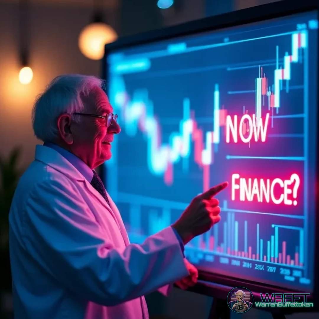
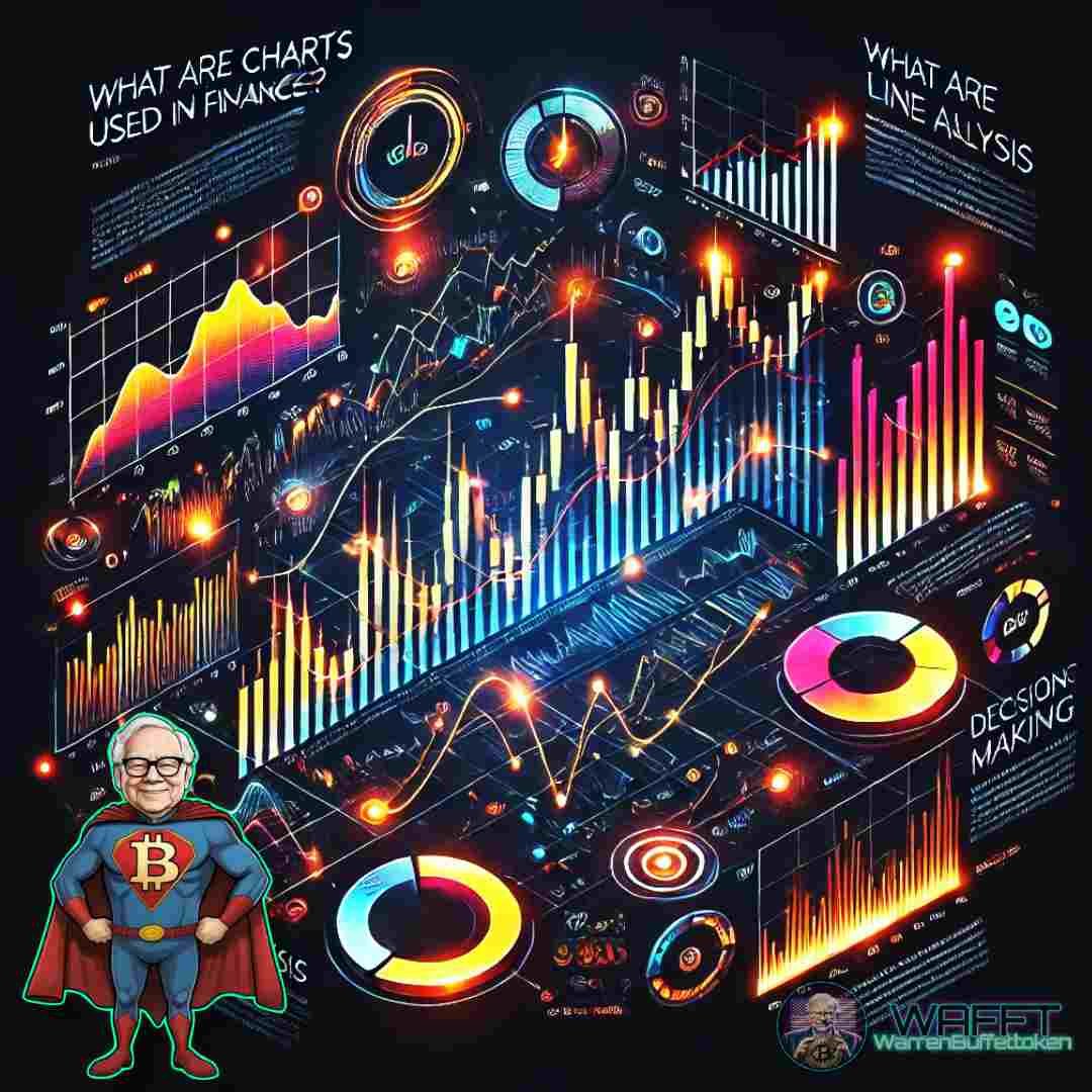
Charts:
The Compass of Financial Markets 🧭
In the vast world of investing, charts have become essential tools for any trader or investor who wants to successfully navigate the markets. These charts don't just show numbers; they tell stories about how stocks, currencies, commodities, or any other financial asset has performed over time.
Visualizing data in this way makes it easier to identify trends, patterns, and key points for making strategic decisions. An unexpected drop? An explosive rally? Charts reveal it all. Think of them as a map that guides financial explorers through the ever-changing terrain of the markets. (Although past moves don't guarantee future moves) 🌍💹
Whether you're a newbie learning the basics or a seasoned pro looking to optimize your investments, charts are your compass to keep you from getting lost in the whirlwind of financial information.
It's time to decipher what the lines, bars, and candles are trying to tell you! 🚀
What is a chart in finance? 📊
A financial chart is a visual representation that shows how an asset, such as stocks, currencies, commodities, or cryptocurrencies, behaves over time. It can include information about prices, transaction volumes, and technical data such as moving averages, support or resistance levels, among other indicators.
Essentially, a chart is like a visual diary of the market that documents the "mood" of investors. It helps you answer important questions:
- How has the asset performed in the past?
- Is it rising, falling, or moving sideways?
- When might be a good time to buy or sell?
Types of data presented by a chart
1. Price: Shows the open, close, high, and low values of an asset.
2. Volume: Represents how many units of the asset have been traded in a given period.
3. Technical indicators: These add analytical tools such as the RSI (Relative Strength Index), MACD (Moving Average Convergence/Divergence) or Bollinger bands.
5. Time: Fundamental axis that can span minutes, days, weeks or even years.
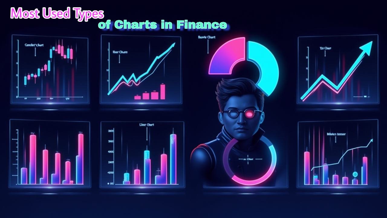
Most Used Types of Charts in Finance 📊
In the world of investing, charts are essential for analyzing trends and making decisions. Each type has its characteristics, advantages, and uses. Let's break them down with examples and practical tips to understand how to look at them and get the most out of them.
Line Chart 📈
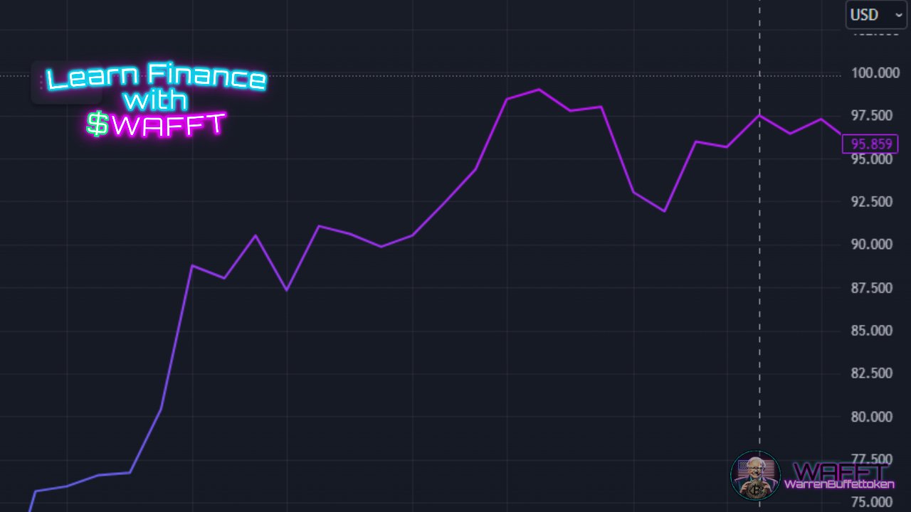
Chart provided by Trading View
A line chart is the simplest way to represent price data over time. Each point on the line connects key prices (usually the closing price) in a specific time interval. Now, let's look at its basic features:
Characteristics:
🔗 Connecting the dots: It joins the closing prices of a financial asset during each period (can be daily, weekly, monthly, or even minute-by-minute).
🕰️ X-axis: It represents time.
- 💲 Y-axis: It shows the price of the asset at that moment.
- 🎯 Visual simplicity: It only shows the general trend, ideal for those looking for a quick and uncomplicated analysis.
How to interpret it:
The line chart summarizes the general trend of an asset, making it easy to identify bullish, bearish, or sideways movements. Here are some key tips:
- 💹 Steady rise: If the line rises without interruptions, the asset is in an uptrend.
- 📉 Steep drop: A downward trend suggests a downtrend.
- ➖ Flat line: Indicates that the price is moving sideways, with no significant changes.
What can you learn from it?
- Long-term trends: Ideal for detecting whether an asset is growing or losing value over time.
- Turning points: Changes in the direction of the line can signal market turns.
- Beginner-friendly: If you're just starting out, this is the perfect chart to understand how an asset moves.
📌Example:
Let's say you're analyzing the line chart of Ethereum over the past month. If you see that the line has been steadily rising from $2,500 to $3,000, you can conclude that there has been a solid uptrend.
🪙 WAFFT Tip: While the line chart is great for general analysis, combine it with other charts (such as Japanese candlesticks) for more detailed analysis.
Bar Chart 📊
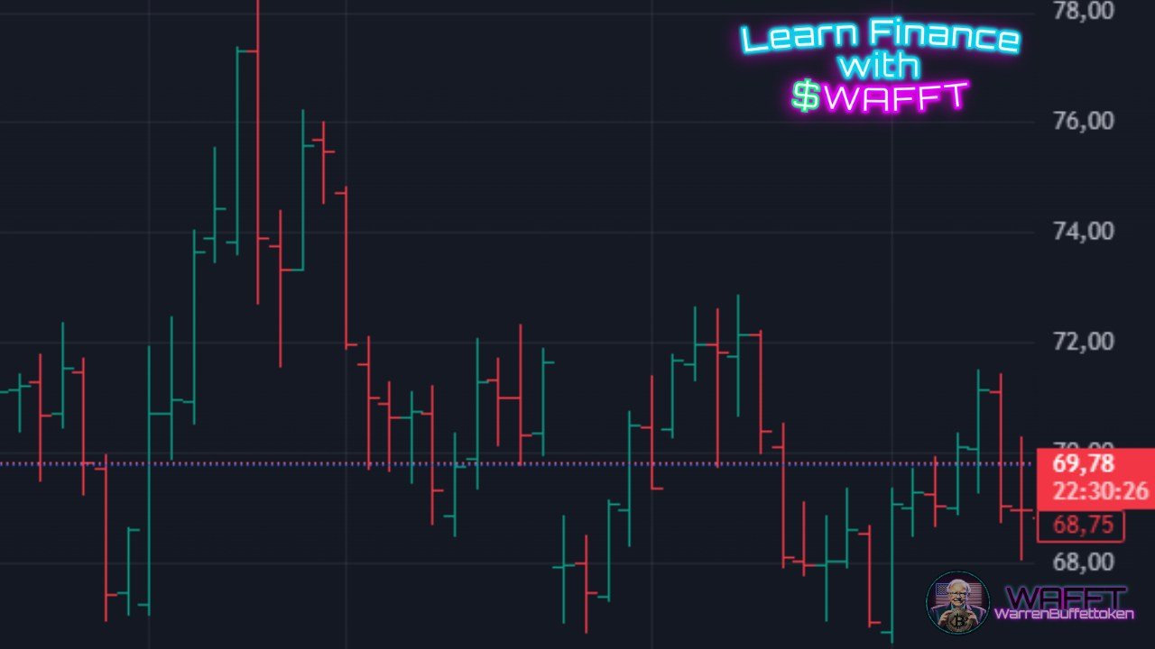
Chart provided by Trading View
A bar chart is a step up in detail, giving you a full picture of price movement during a specific time period. Each bar tells a mini-story of what happened to the asset's price. Let’s break it down:
Characteristics:
The bars: Each bar represents a specific period (minute, hour, day, etc.) and shows four critical price points:
- Opening price: A small tick on the left side of the bar.
- Closing price: A small tick on the right side of the bar.
- High price: The top of the bar (maximum price).
- Low price: The bottom of the bar (minimum price).
- 🕰️ X-axis: Represents the time frame (e.g., days, weeks, months).
- 💲 Y-axis: Shows the price of the asset.
- 🎯 Visual detail: Bar charts are more informative than line charts because they show the price range (highs/lows) and where the price started and ended for each period.
How to interpret it:
Bar charts give you key insights into market sentiment during a specific time frame:
- Tall bars: Big price movement = high volatility.
- Red/black bars: Closing price is lower than the opening price (bearish sentiment).
- Green/white bars: Closing price is higher than the opening price (bullish sentiment).
- Short bars: Indicates price stability (low volatility).
What can you learn from it?
- Bar charts help identify trends, market strength, and potential turning points:
- 1️⃣ Bullish or bearish strength: Are the bars getting taller or shorter? Taller green bars suggest increasing buying pressure.
- 2️⃣ Volatility: Wide ranges (big bars) mean the price fluctuated a lot during that period.
- 3️⃣ Reversals: Look for patterns like lower highs (potential downtrend) or higher lows (potential uptrend).
📌 Example: Imagine you’re analyzing a Bitcoin bar chart for the past week. If you see a series of tall green bars with rising closing ticks, it signals strong bullish momentum and growing demand. But if red bars appear and get taller, it could be a sign of a market reversal or selling pressure.
🪙 WAFFT Tip: Bar charts offer more details than line charts but are still beginner-friendly. To take your analysis further, mix them with candlestick charts for even clearer patterns and signals. 🚀
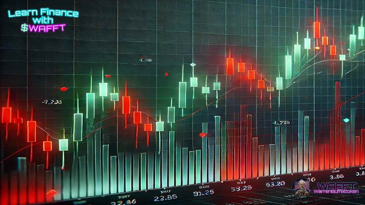
Japanese Candlestick Chart 🕯️
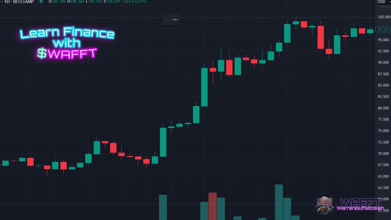
Chart provided by Trading View
Each candle tells a price story over a specific period of time (it can be a minute, an hour, a day, whatever you prefer). Here are the basics:
Characteristics:
Candle body: Represents the difference between the opening price and the closing price.- 💚 Green or white body: Price went up (close higher than open).
- 🔴 Red or black body: Price went down (close lower than open).
- Shadows (or wicks): Indicate the highest and lowest price reached in that period.
- 🔺 Upper shadow: High of the period.
- 🔻 Lower shadow: Low of the period.
So basically, a candle gives you a visual summary of all the financial drama of the day.
How to interpret it:
Look for patterns such as "Doji" (candle without a body, indicating indecision) or "Hammer" (candle with a small body and a long shadow, suggesting a possible change in trend).
Traders use it to detect supports, resistances and market reversals.
📌Example:
If on a Bitcoin hourly chart you see a series of consecutive green candles with long bodies, it is a clear sign of strong demand.
Area Chart 🌄
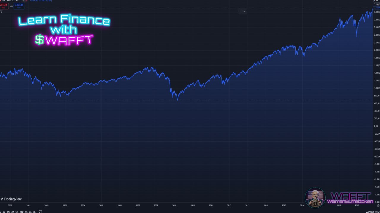
Chart provided by Trading View
The area chart is like a line chart, but with an artistic twist! The difference is that all the space under the line is shaded, making it more visual and appealing. It's like you're painting a mountain or a hill, but you're actually looking at the price trend of an asset.
Characteristics:
Similar to the line chart, but with the area under the line shaded.- It is more visually appealing and easier to interpret.
- It usually combines price and volume data to give a more complete idea of the asset's performance.
How to interpret it:
Use it to clearly and visually display historical data, such as the evolution of a stock market index.- It is useful for reports or presentations, but less practical for detailed analysis.
📌Example:
An area chart of the S&P 500 over a decade could highlight the general growth trend after the 2008 crisis, clearly marking the periods of correction.
Point and Figure Chart 📍📐
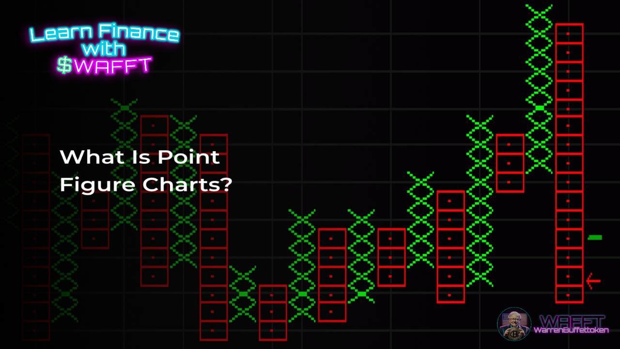
The Point and Figure (P&F) chart is a specialized tool for traders who want to focus solely on price movements, ignoring time and volume. Unlike traditional charts, this one eliminates "noise" and emphasizes the direction of the market, making it especially popular for spotting trends and breakouts.
Characteristics:
- Boxes and symbols: Instead of lines or bars, this chart uses X’s and O’s to represent price changes:
- X → Indicates an increase in price (bullish trend).
- O → Shows a decrease in price (bearish trend).
- 🚫 No time axis: P&F charts ignore the passage of time. If there’s no significant price movement, the chart won’t record anything for that period.
- 🔄 Reversal threshold: It only records price changes that surpass a specific threshold (like $1 or 5% movement), filtering out minor fluctuations.
🕵️ Focus on trends: By eliminating small price "wiggles," it highlights only the most important shifts in the market.
How to Interpret It:
- The Point and Figure Chart may look intimidating at first, but it’s easier than you think! Here’s how to decode it:
- 1️⃣ Columns of X's: These mean the price is climbing—so the bulls are in control.
- 2️⃣ Columns of O's: These mean the price is dropping—bears are taking over.
- 3️⃣ Breakouts: Look for moments when the price breaks through key levels of support or resistance.
- 4️⃣ Patterns: Common patterns include triple tops (bullish signal) or triple bottoms (bearish signal), which traders use to anticipate big moves.
What Can You Learn from It?
- 💡 Clarity of trends: Unlike other charts, P&F focuses on price movement alone, helping you see clear uptrends or downtrends.
- 💡 Key levels: It emphasizes support and resistance levels, crucial for deciding when to buy or sell.
- 💡 Reduced noise: By filtering out small price fluctuations, it lets you concentrate on the big picture.
📌 Example: Imagine Bitcoin is trading around $30,000. A Point and Figure Chart might show a column of X’s climbing higher as the price steadily rises to $32,000, signaling a bullish trend. If the price then drops significantly (say, below $29,500), a column of O’s begins, indicating a bearish reversal.
🪙 WAFFT Tip: While Point and Figure charts are excellent for identifying trends, combine them with other strategies like momentum analysis or fundamental research for a well-rounded view. If you’re looking for a breakout or reversal, this chart is your best friend—but always set clear price thresholds for better precision!
Renko Chart 🧱
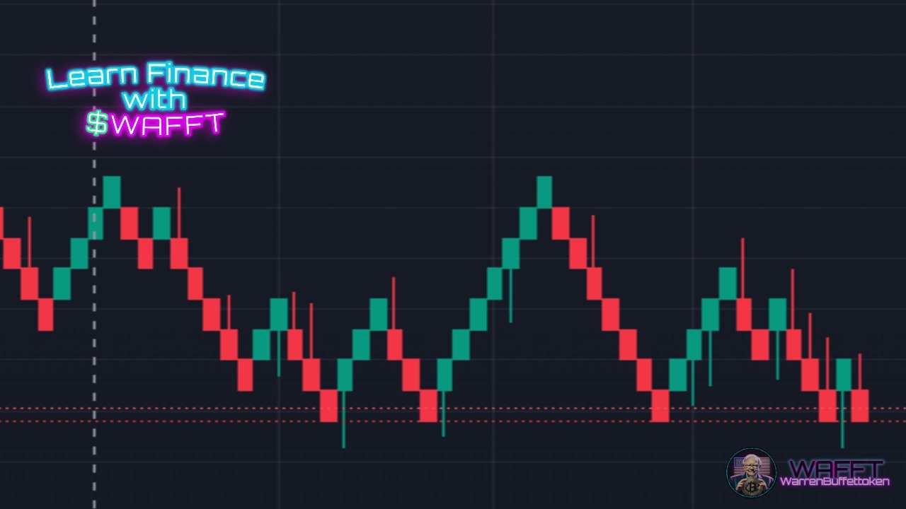
Chart provided by Trading View
The Renko Chart is a unique charting method that focuses purely on price movement, filtering out market noise and making trends easier to see. Its name comes from the Japanese word renga, meaning "brick," because it uses a series of rectangular blocks (or "bricks") to represent price changes.
Characteristics:
Brick system:- Each brick represents a set price movement (e.g., $10 or 5%).
- Green/white bricks → Price is rising (bullish trend).
- Red/black bricks → Price is falling (bearish trend).
- 🚫 No time axis: Time isn’t a factor—new bricks only appear when the price moves enough to meet the predefined threshold.
- 📏 Size matters: The brick size is set by the trader, and it determines how sensitive the chart is to price changes.
How to Interpret It:
Renko Charts are all about simplicity and trend clarity. Here’s how to read them:
- Uptrend: Consecutive green/white bricks indicate a strong upward trend.
- Downtrend: A series of red/black bricks signals a clear downward trend.
- Reversal: When the color of the bricks changes, it indicates a possible shift in the market direction.
- Support and resistance: The clear visual structure makes it easy to spot key levels where prices tend to bounce or break through.
What Can You Learn from It?
💡 Trend clarity:Renko Charts strip away noise, making it easier to focus on the bigger picture.- 💡 Smooth patterns: Unlike other charts, the bricks show smoother trends without minor price fluctuations.
- 💡 Decision points: Great for spotting breakouts and reversals at critical price levels.
📌 Example: Imagine Ethereum is trading at $3,800, and your Renko chart has a brick size of $50. If the price rises to $3,850, a green brick forms, showing an upward trend. If the price then drops below $3,750, a red brick appears, signaling a bearish reversal.
🪙 WAFFT Tip: Renko Charts are ideal for spotting long-term trends and reducing decision-making stress. Set your brick size based on your trading strategy—larger bricks for long-term moves or smaller bricks for short-term opportunities. Pair it with momentum indicators to confirm trend strength and avoid false signals!
Tips for choosing the right chart type for you🫵
Choosing the right chart depends on your experience, your goals, and the type of analysis you want to perform. Here is an extended guide so that, whether you are a beginner or an advanced trader, you can find the chart that best suits your needs.
For Beginners: Line Charts 📈
If you are just starting out in the world of finance, line charts are your best friend.
- Why choose them: They are simple, clear, and straightforward. They help you identify the general direction of the market without overwhelming you with too much information.
- What you will learn: Basic trends: Is the asset going up, down, or staying stable?
- Ideal for: Analyzing stocks, indices, or cryptocurrencies over the long term.
📌Practical example: If you look at the line chart of the S&P 500, you will see how this index has grown consistently over the past decades, except for some periods of crisis. This can help you understand the long-term growth of stock markets.
For Intermediates: Japanese Candlestick Charts 🕯️
If you already have basic experience and are looking for more details, this type of chart is for you.
- Why choose them: Each candle tells you a complete story of the period: how it started, how it ended, and the extremes the price reached.
- What you will learn:
- Identify patterns such as the Hammer, the Doji or the Engulfing patterns to predict market movements.
Differentiate between bullish trends (green candles) and bearish trends (red candles).
- Ideal for: Short- and medium-term traders looking for clear buy or sell signals.
📌Tip for interpretation: If you see a Doji pattern (candle with almost no body), it can mean that the market is indecisive and could change direction soon.

For Advanced: Specialized Technical
1. ChartsBar Chart 📊
- Why choose it: It offers more data in a single bar, which is ideal for analyzing volatile markets.
- What you will learn: Interpret key details such as highs, lows, and the relationship between open and close to detect buying or selling pressure.
- Advanced use: Use it to compare long periods in markets with high volatility.
2. Point and Figure Chart 📍
- Why choose it: This chart ignores time and focuses only on significant price changes, eliminating "noise."
- What you will learn: Identify supports and resistances with greater clarity.
- Advanced use: It is ideal for planning strategies based on major breakouts or reversals.
3. Renko Chart 🧱
- Why choose it: Similar to the point and figure chart, this chart uses "bricks" to filter out minor movements and focus on solid trends.
- What you will learn: Follow pure trends without distractions.
- Advanced usage: Combine with other indicators like RSI (Relative Strength Index) to confirm trends.
Questions to ask yourself before choosing a chart
1. What information do I need?
- If you're just looking for general trends, a line chart is sufficient.
- If you need details like opening and closing prices, go for bars or candlesticks.
2. What is my time horizon?
- Line charts are best for long-term analysis.
- For intraday movements or real-time analysis, candlesticks are more useful.
3. How comfortable am I with technical data?
- If you're a beginner, avoid advanced charts likeRenko or point and figure charts, as they require a solid foundation in technical analysis.
Common mistakes when interpreting charts and how to avoid them
1. Ignoring the time frame:
- A daily chart may show an uptrend, but on the weekly chart it could be in a down phase. Make sure to analyze different time frames.
2. Overloading the chart with indicators:
- Using too many indicators can confuse more than it helps. Choose 2 or 3 that are relevant to your strategy.
3. Not considering volume:
- Volume is crucial to confirming moves. A price that rises on high volume indicates genuine interest, while a move on low volume can be misleading.
Combine charts with other tools for a more complete analysis
A chart alone offers a good visual perspective of market movements, but its true potential is unlocked when used in conjunction with other tools. Combining charts with technical indicators, fundamental analysis, and risk management strategies can give you a more comprehensive and accurate view of what is happening in the market.
For example, when looking at a Japanese candlestick chart, you can complement the analysis with support and resistance levels to identify key points where the price could bounce or break. Additionally, combining charts with trading volumes or trend indicators can help you confirm signals and make more informed decisions.
Remember that charts are only one part of the puzzle. Using them in conjunction with other tools will allow you to better understand market dynamics and anticipate possible movements, which is key to any investment or trading strategy.
Some of the tools to complement your charts
- Trend indicators: Such as moving averages or the MACD, which help you identify whether the market is rising or falling.
- Oscillators: Like the RSI or Stochastic, perfect for detecting overbought or oversold points.
- Trading volume: Tells you how much activity there is in the market, confirming whether a trend has strength.
- Support and resistance levels: Identify key areas where the price tends to stop or change direction.
👉 If you're ready to dive with WAFFT into the exciting universe of Technical Indicators and Chart Analysis, you're in the right place. Learn to master key tools such as RSI (Relative Strength Index), Moving Averages and MACD, while exploring chart analysis fundamentals such as support and resistance, shoulder-head-shoulder patternsand triangles. 🚀📊
With these tools in your arsenal, you'll be one step closer to becoming a true financial expert. 🌟
Where do you want to start?
🔹 Technical Indicators: Discover how to interpret key signals to make wise decisions.
🔹 Chart Analysis: Learn how to identify critical patterns and levels on price charts.
And remember:
Charts are like a map, but you are the navigator. No matter which type you choose, the important thing is to practice, learn from your mistakes, and adapt your analysis to your style and goals.Over time, you will master the art of reading charts like a pro. 🚀
What are charts used for in finance? 🖥️📊
Financial charts are not just decorative drawings, they are crucial tools for any investor or trader! They allow us to visualize the past, interpret the present, and predict possible future market movements.
Let's break it down:
Identifying trends 📈
One of the most important functions of charts is to show you the general direction of an asset:
- Uptrend: The price rises steadily. This can indicate optimism in the market or company growth.
- Downtrend: The price falls consistently, a sign of trouble or uncertainty.
- Sideways trend: The price moves in a defined range, indicating indecision between buyers and sellers.
Detecting patterns 🔍
Charts are like maps of human behavior in the markets. Some common patterns include:
- Triangles: These indicate consolidation and often precede significant movements.
- Flags: Signals of a trend continuation.
- Head and Shoulders: Usually marks a change in market direction.
Identifying these patterns can give you an edge in predicting moves before they happen.

Technical Analysis ⚙️
Do you like math and statistics? Then charts will be your best friend. They allow you to apply technical indicators such as:
- Moving Averages: Help you smooth out price fluctuations and confirm trends.
- RSI (Relative Strength Index): Detects whether an asset is overbought or oversold.
- MACD (Moving Average Convergence/Divergence): Measures market momentum and possible changes in trend.
These indicators turn charts into true precision tools for making informed decisions.
Emotional Control 🧠
Investing can be emotionally draining. Charts offer an objective representation of what is happening, helping you avoid impulsive decisions based on rumors, panic, or overconfidence. Remember: calm and analysis are your best allies in the markets.
Facilitate communication 🗣️
If you work in a team or present your ideas to clients, charts are the clearest and most visual way to explain what is happening in the market. A well-presented chart can say more than a thousand words and back up your arguments with solid data.
👉 WAFFT Tip: Charts are powerful tools, but they are not everything. Accompany them with good fundamental analysis and always keep your financial goals in mind. This way you will have a comprehensive approach to conquer the markets! 🚀

How to Read a Financial Chart? 🧐📊
Reading a financial chart can seem complicated at first, but once you understand the basics, it becomes an essential tool for analyzing any market. Let's break down each element of a chart so you can interpret it like a pro.
X-Axis and Y-Axis:
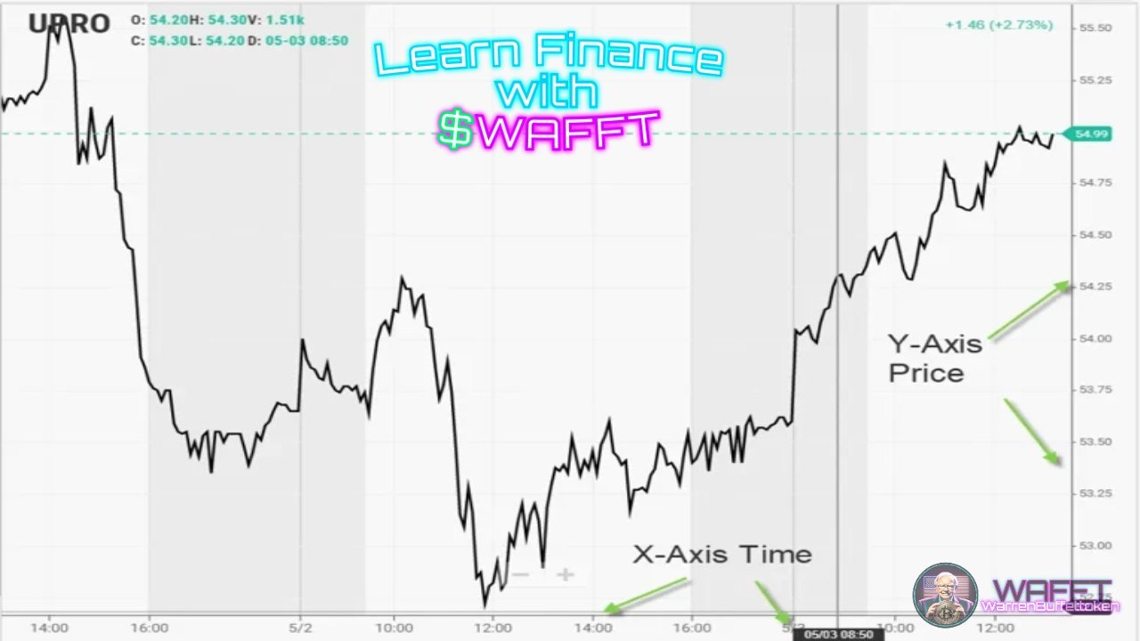
- X-Axis (horizontal): Represents time. Depending on the analysis you perform, this axis can show years, days, weeks, months, or even minutes if you're day trading.
- Y-Axis (vertical): Shows the price of the asset or indicator you're analyzing.
👉 Practical example: If you're looking at a daily stock chart, the X-axis will show you recent days, while the Y-axis will show you the closing prices for those days.
Colors: Green and Red, the Language of the Markets
Financial charts are highly visual, and the use of colors plays an important role:
- Green: Indicates a gain, an increase in price, or an upward movement.
- Red: Represents a loss, a decrease in price, or a downward movement.
👉 Key Fact: In Japanese candlestick charts, green candles usually mean that the closing price is higher than the opening price, while red candles indicate the opposite.
Volume: The driving force behind price

At the bottom of many charts, you'll find vertical bars representing the volume of trades made over a specific period.
- Higher volume: Signals increased interest or participation in the asset.
- Lower volume: Indicates lower activity, which may reflect apathy or consolidation.
👉 WAFFT Tip: When you see a big move in price accompanied by high volume, pay attention - it could be the start of a new trend.
Support and resistance: The key levels
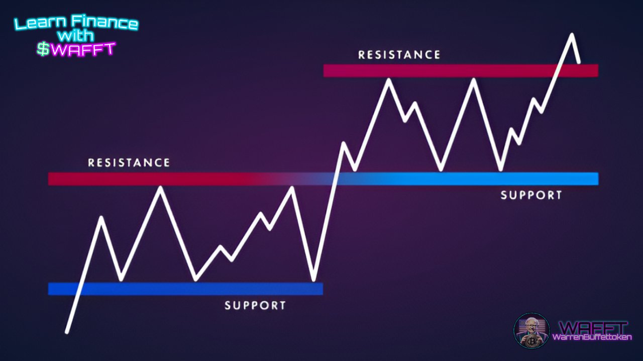
- Support: It is a price level where the asset tends to stop its fall and bounce back up. It is like a floor that "supports" the price.
- Resistance: It is a price level where the asset usually stops its rise and goes back down. It works like a "ceiling".
👉 Practical example: If a stock has a support at $100 and a resistance at $120, the price could move between these levels until a breakout occurs.
Combined interpretation: The art of reading the market
A chart is not just a boring tool full of lines and numbers; it is like an open book that tells you the story of the market 📖✨. If you learn to combine axes, colors, volume and those magic levels like supports and resistances, you will be seeing the market like a pro.
The key is to connect the dots: do you see a triangle? A head-and-shoulders pattern? And if you also add technical indicators like moving averages or RSI, your analysis will be almost like reading a crystal ball 🔮.
So go ahead, don't be afraid of charts. With a little practice, you will become a crack at making decisions with confidence 🚀💹.

Why are charts so important in finance? 🧠📈
Charts are much more than just visual representations; they are key tools that allow investors and traders to effectively analyze and understand financial markets. Whether you are a beginner or a seasoned professional, charts are the backbone of technical analysis and an essential guide to making informed decisions.
What charts offer
1️⃣ Visual clarity:
Charts remove the complexity of raw financial data and turn it into easy-to-understand representations. This allows you to quickly identify trends, patterns, and anomalies that would be difficult to spot in numerical tables.
2️⃣ Past analysis:
One of the main advantages of charts is that they allow you to look back and study how an asset has historically behaved. This helps to identify:
- Trends: Whether the price generally rises, falls, or moves sideways.
- Key points: Support and resistance levels where the price usually reacts.
3️⃣ Anticipation of the future:
Although no chart can predict the future with certainty, analyzing it can help you:
- Detect repeating patterns that indicate possible movements.
- Apply tools such as trend lines, technical indicators, and oscillators to strengthen your predictions.
4️⃣ Versatility:
Charts are not only useful for analyzing prices; they are also useful for studying trading volumes, technical indicators, relationships between different assets, and more.
Why do all levels of investors need them?
Beginners:
Charts help understand basic concepts such as whether an asset is in an uptrend or a downtrend. With simple charts such as line or area charts, a new investor can decide whether it is a good time to enter the market or wait.
Intermediate investors:
Those with more advanced knowledge can take advantage of Japanese candlestick or bar charts to detect patterns and adjust their strategies.
Advanced traders:
Advanced charts like Renko, point and figure, or volume charts are critical to spot complex patterns and trade accurately.
Key benefits of using charts
🔍 Make decisions based on data, not emotions:
Financial markets can be volatile, and emotions like fear and greed can negatively impact decisions. Charts help you stay objective by providing data-driven insights.
📊 Facilitate technical analysis:
Tools like moving averages, RSI, MACD, Bollinger bands, and more are built right into charts for deeper analysis.
⏱️ Time-saving:
Charts condense a wealth of information into a visual format that allows for quick decisions.
🌍 Universal access:
From beginners at home to giant financial institutions, everyone uses charts as a basis for their strategies.
Practical example of the importance of charts
Let's say you're analyzing Apple (AAPL) stock. Instead of looking through hundreds of rows of historical data, you can look at a chart:
A bullish trend line shows you that the price has been steadily rising over the past year.- A sudden drop in price, followed by high volume, could indicate that investors are buying at a key support point.
- By overlaying technical indicators like the RSI, you can confirm whether the asset is overbought or oversold.
Conclusion: Your compass in the financial world🧭
Charts are indispensable for any investor or trader, regardless of their level of experience. They are a tool that combines historical data with advanced prediction techniques, allowing for more confident and strategic decisions.
📌Remember: A chart alone is not enough. Complement your analysis with technical indicators, solid fundamentals, and risk management to maximize your chances of success. 🚀💹

Chart History: From Paper to Smartphone 📜📱
What a journey financial charts have had! From the days when Japanese rice traders drew candles on parchment, to today, where you can analyze the market from your smartphone while sipping coffee.
Don't miss this history lesson on charts, you'll be amazed, let's get to it:
Although humans have been using drawings to tell stories and record information for thousands of years, it was in the vibrant rice market in Japan that charts made the leap into the modern world. 🌾📜 The most fascinating story begins with Munehisa Homma
Munehisa Homma: The Master of Rice and Candles
Back in the 18th century in Japan, rice was not only the staple food, but also the currency. In this context, Homma, a merchant from Sakata, decided that he did not want to leave his profits to chance. By observing rice prices, he noticed patterns and trends that others overlooked. Thus, he developed Japanese candles, a tool that allowed him to visualize not only prices, but also market psychology. A true visionary!
Japanese Candles: Much More Than Just a Flame
Japanese candles are not just pretty charts; each one tells a story. The thick part, called the "body," shows whether the price went up or down. The thin lines, known as "shadows" or "wicks," indicate the highest and lowest prices reached. With these candles, Homma could interpret the emotions of the market: whether traders were euphoric, fearful or indecisive. Quite an art!

The God of the Markets
Homma was not satisfied with just inventing Japanese candles. It is said that he made more than 100 consecutive profitable trades, amassing a fortune equivalent to 10 billion dollars today. His success was so great that the Japanese government named him an honorary samurai. From rice merchant to financial samurai!🥋
Market Psychology: Homma's Secret
Homma understood that the market is not only moved by economic factors, but also by the emotions of the participants. In his book "The Golden Fountain: The Record of the Three Money Monkeys" (1755), he highlighted the importance of psychology in trading. He claimed that when everyone was bearish, there were reasons for prices to go up, and vice versa. A true master of the market mind!
Homma's Legacy: Beyond Rice
Homma's teachings transcended the rice market. His "Sakata Rules" laid the foundation for modern technical analysis. Today, traders around the world use Japanese candlesticks to analyze financial markets, from stocks to cryptocurrencies. A legacy that endures more than two centuries later!
Conclusion
Munehisa Homma was more than just a rice trader; he was an innovator who combined observation, psychology, and statistics to create tools that are still fundamental in the world of trading today. His story reminds us of the importance of understanding not only the numbers, but also the emotions behind them.
A true samurai of the markets! 🥋📈
Although humans have used drawings to represent information since time immemorial, the graphical representation of statistical data took an innovative turn in the late 18th century. During this time, Scottish engineer and economist William Playfair emerged as a key figure in data visualization.
William Playfair: The Pioneer of Statistical Charts
Born in 1759, Playfair was a visionary who introduced graphical methods to simplify the understanding of complex data. In his 1786 work, The Commercial and Political Atlas, he first introduced the bar chart , a tool that allowed different sets of economic and commercial information to be clearly and visually compared.
Playfair didn't stop there. In 1801, he published The Statistical Breviary, where he introduced the pie chart, used to show part-to-whole relationships.
These innovations laid the groundwork for the graphical representation of statistical data, making it easier to compare and analyze information in a more intuitive and effective way. And boy did he succeed! 🚀
The Importance of Charts in Data Analysis
The charts developed by Playfair transformed the way data was presented and analyzed. Before his innovations, information was mostly displayed in numerical tables, making it difficult to interpret. With the introduction of bar and pie charts, comparisons between different data sets became easier, allowing for a faster and more effective understanding of information.
Today, charts are essential tools in a variety of fields, from economics to social sciences, allowing analysts and the general public to visualize trends, patterns, and relationships in a clear and concise manner.

Conclusion
William Playfair's contribution to data visualization is undeniable. His innovations not only made it easier to understand complex information in his time, but also laid the groundwork for the data visualization techniques we use today. Thanks to his ingenuity, we have tools that allow us to interpret and analyze data more effectively, enriching our ability to make informed decisions in an increasingly information-oriented world.
the master!👑
Continuing our list of “the founding fathers of graphs,” the following visionary stood out in the period when the graphical representation of statistical data took an innovative turn in the late 19th century. During this era, American journalist and co-founder of The Wall Street Journal, Charles Dow, emerged as a key figure in financial analysis.
Charles Dow: The Father of Technical Analysis
Born in 1851 in Sterling, Connecticut, Dow began his career in journalism, eventually co-founding Dow Jones & Company and The Wall Street Journal. His keen observations of market behaviors led him to develop the Dow Theory, a pioneering framework for understanding market movements.
Dow's theory postulated that stock prices reflect all available information and that markets move in clear, easily identifiable trends. He identified three types of market movements:
primary trends, secondary reactions and minor fluctuations.
- Primary trends represent the main direction of the market, lasting from several months to years;
- secondary reactions are shorter-term counter-movements within the primary trend;
- minor fluctuations are daily or weekly price movements.
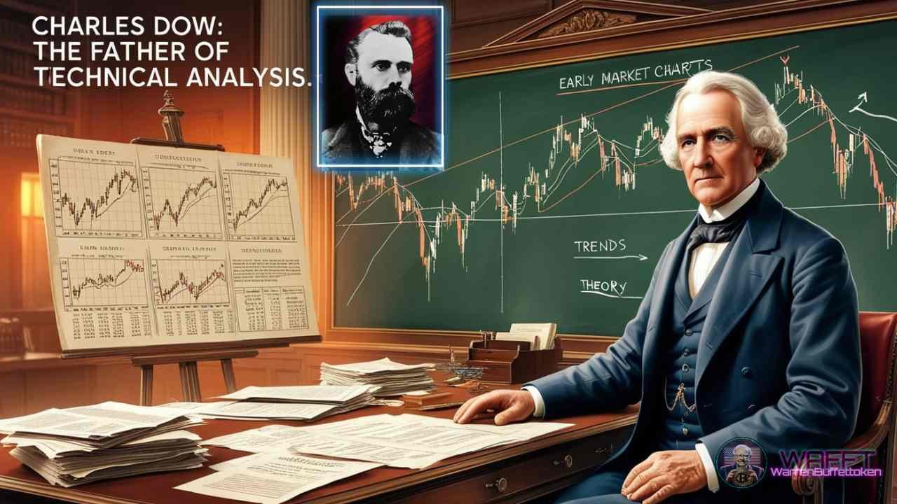
A fundamental aspect of Dow Theory is the idea that different market indices must confirm each other's trends. Originally, this referred to the Dow Jones Industrial Average and the Dow Jones Transportation Average; if one reached a new high or low, the other was expected to follow suit to confirm the trend. This principle underscores the interconnectedness of different sectors in the economy.
The Importance of Dow Theory in Market Analysis
Dow's insights laid the groundwork for modern technical analysis. By emphasizing the significance of market trends and the necessity for multiple indices to confirm these trends, he provided investors with tools to make more informed decisions. His work highlighted the importance of analyzing market behavior to anticipate future movements, a practice that remains central to financial analysis today.
Conclusion
Charles Dow's contributions to financial journalism and market analysis are profound. His development of the Dow Theory not only enhanced the understanding of market dynamics in his era but also established principles that continue to influence modern technical analysis. Through his innovative thinking, Dow provided investors with a framework to interpret market trends, enabling more informed and strategic investment decisions in the ever-evolving financial landscape.
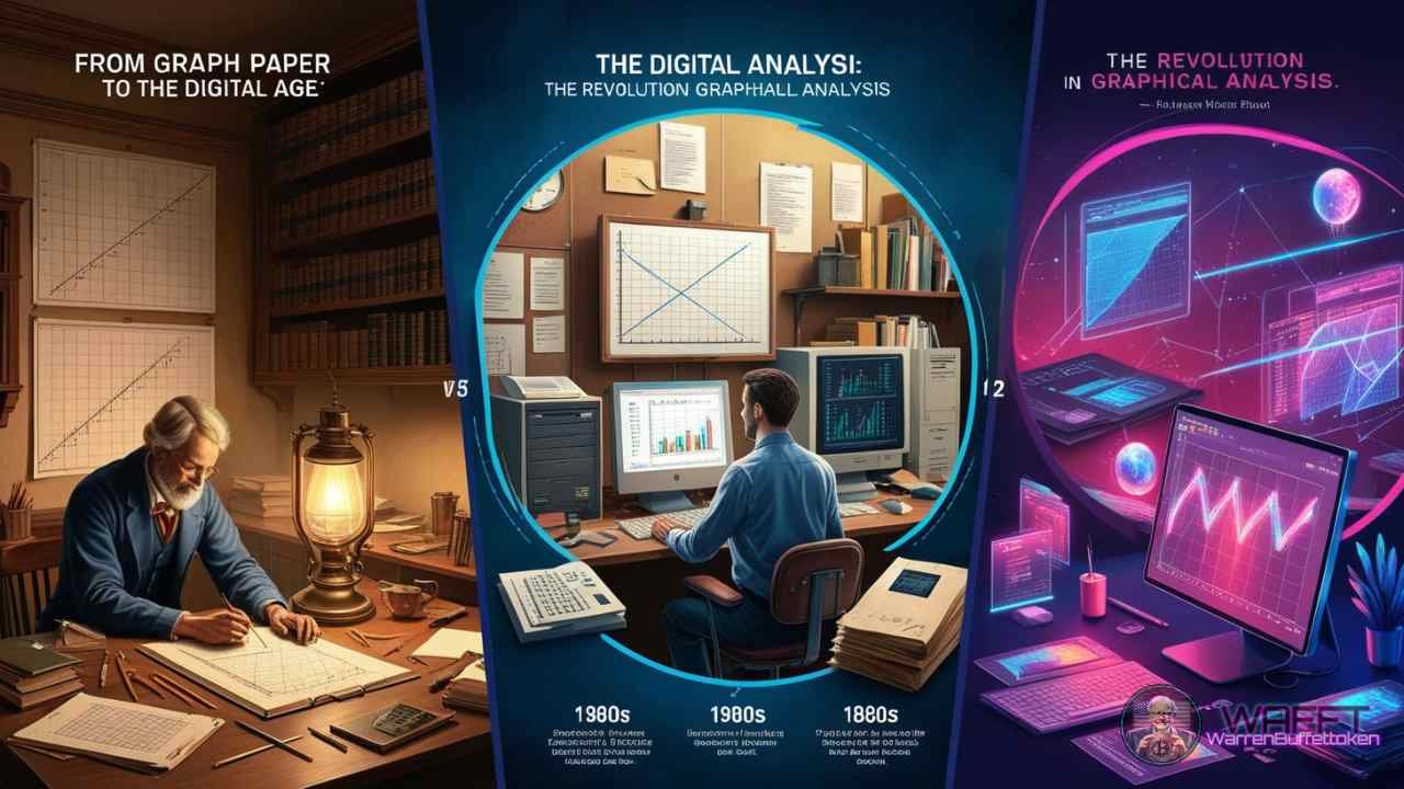
From Graph Paper to the Digital Age: The Revolution in Graphical Analysis 📊💻
In the world of financial and statistical analysis, few changes have been as significant as the transition from graph paper to digital tools. This transformation has not only revolutionized the way we create and analyze graphs but has also democratized access to sophisticated analytical tools. Let’s explore this fascinating evolution.
The Era of Graph Paper: A Manual Art 📏✍️
Not too long ago, analysts were true artists of graph paper. Armed with pencils, rulers, and infinite patience, these professionals dedicated hours to hand-drawing graphs. Every point and line required meticulous precision, and any mistake could mean starting over. Imagine having to update a trend graph daily; it was a Herculean task that demanded not only technical skills but also exceptional concentration.
Analysts of that time needed a steady hand and great attention to detail. Each graph became a work of art but also a mental endurance exercise. Despite the challenges, this manual era laid the groundwork for what was to come.
The Digital Revolution: Power at Your Fingertips 🖱️💻
With the advent of personal computers and specialized software, the landscape of graphical analysis changed dramatically. Suddenly, generating complex graphs became a task that could be accomplished with just a few clicks.
Digital tools enabled analysts to:
- Create instant visualizations
- Update data in real-time
- Easily manipulate and analyze large datasets
Now, analysts could focus on interpreting data rather than spending time on the manual creation of graphs. This revolution not only accelerated the process but also improved the accuracy and complexity of analyses.
Impact on Financial and Statistical Analysis 📈🧮
The impact of this transition has been profound and multifaceted. First, it has democratized analysis; tools that were once reserved for large institutions are now accessible to individual investors. This has allowed more people to actively participate in financial markets.
Moreover, the ability to handle more sophisticated models and larger datasets has changed how decisions are made. Real-time updates allow for immediate reactions to market changes, which is crucial in such a dynamic environment.
New forms of visualization have also transformed how we interpret data. Interactive and dynamic graphs provide insights that were previously impossible to obtain with graph paper.
The Future: AI and Predictive Analysis 🤖🔮
The evolution of graphical analysis doesn’t stop here. With artificial intelligence and machine learning, we are entering a new era. Modern tools are capable of performing advanced predictive analyses, automatically recognizing patterns, and generating reports and recommendations without human intervention.
This not only increases efficiency but also opens up new possibilities for exploring complex data. As these technologies continue to develop, we can expect even more innovations in how we analyze and visualize information.
Conclusion: A Quantum Leap in Capabilities 🚀
The shift from graph paper to digital tools has not merely been a change in medium; it has been a complete revolution in our analytical capabilities. What once required hours of manual labor can now be accomplished in seconds, allowing us to focus more on strategy and interpretation than on mere graph creation.
This transformation reminds us that in the world of analysis, having the right tools is as important as possessing the necessary knowledge. As we look toward the future, it is clear that the era of digital graphical analysis is just beginning, and the possibilities are endless. 🌟
Overview:
Financial charts are not just colorful lines and candlesticks; they are the visual heart of the market. 🖼️💹 With them you can interpret the emotions, decisions and movements of millions of investors in real time. Whether you're trend hunting, assessing support and resistance, or looking for that one pattern that can change the game, charts are your map in the vast ocean of finance. 🗺️✨
Whether you're just starting out or have been trading for years, a good chart is like an open book that tells you a story: is the market bullish or fearful? Is it time to buy, sell or wait? 📉📈 Next time you see one, look at it with new eyes, because behind those lines are lessons, strategies and opportunities waiting to be deciphered.
master them and take your investments to the next level! 🚀